
Since the 1970s there has been a well-documented and persistent increase in income inequality in the United States. As the country slowly emerges out of a deep recession, it is instructive to seek out the geographic variation by states in the degree of inequality and the variation in both median and mean incomes.
Data in this article are for households (basically IRS data), for 2009-2011. Median household income is considered the “typical” income of an area. The mean income is the aggregate income of all households in an area, divided by the number of households. This latter measure can be heavily influenced by high numbers of very affluent as well as poor households.
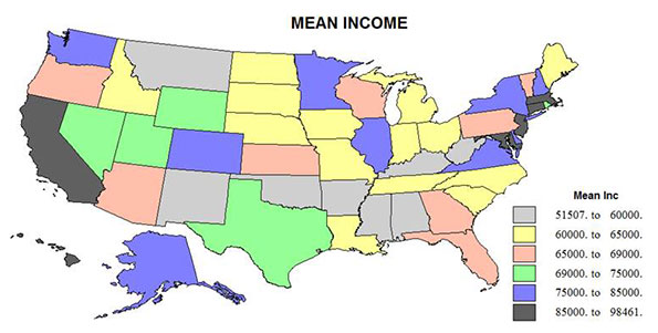
Inequality is a measure of how far the distribution of incomes differs from if all households had the same income. The gini coefficient is the most popular measure of income inequality. But for my maps I instead use a simple measure of the difference between the median and mean, divided by the median, or the percent by which the mean is higher (or lower) than the median. Values above .39 (the figure for the US as a whole) are considered quite high. It should be noted that areas of highest or lowest incomes are not necessarily very unequal, if mostly all are rich or all are poor. Rather it is the juxtaposition of poor and rich households in the same state or area that best demonstrates the true geography of inequality.
Median income is the best descriptive measure of the relative income of areas. The state map is often reproduced and will not surprise the informed reader. The highest median incomes, in descending order, are in Connecticut, New Jersey. Maryland, Alaska, Hawaii, Massachusetts, New Hampshire, Virginia and California, all over $60,000. All but the far western AK, HI, and CA are parts of Megalopolis (minus the NY and PA core!). The next “richest” (over $55,000) are selected northern and western states with large metropolitan populations: Washington, DC; Delaware; Washington; Minnesota; Colorado; Utah; Nevada; Illinois; and New York.
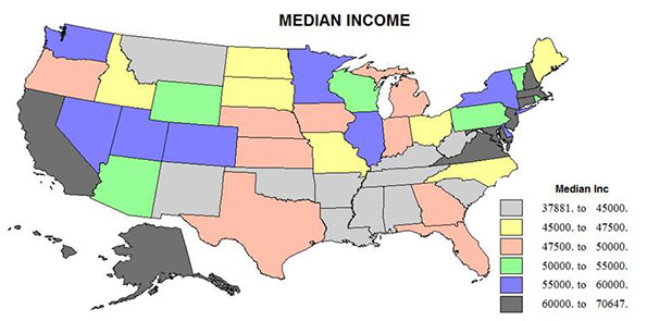
States with median incomes from $50,000 to $55,000 are the ”typical” US set ( the US median income is $51,914) and include Arizona, Pennsylvania, Rhode Island, Vermont, Wisconsin and Wyoming – but no state from the Old Confederacy outside Virginia. The 16 states with median incomes between $45,000 and $50,000 include the remaining big metropolitan states of the northeast, Indiana, Michigan, Missouri, Ohio, some more agricultural states in the Midwest, such as Iowa, Nebraska, North and South Dakota, and the most sophisticated, metropolitan southern states , Georgia, Texas, Florida and North Carolina.
Lower down on the income totem pole are six southern states, including Kentucky, South Carolina, Oklahoma, Alabama, Tennessee and Louisiana, and two western states, Montana and New Mexico, with median incomes between $40,000 and $45,000. Three states, Arkansas, Mississippi, and West Virginia, are at the bottom with median incomes under $40,000. These states lack large urban areas, and in the case of Arkansas and Mississippi, retain a large and mostly poor African-American population.
Inequality
With the exception of New York, and its spillover to Connecticut, the northern part of the country has much lower inequality than the southern half, presumably because of a less severe racial and ethnic history, but also because of the differential history of unionization and welfare measures between north and south. The most egalitarian states are also in the North, establishing a band of lower inequality from Wisconsin through Iowa, Nebraska, Wyoming to Utah, northern New England (Maine, Vermont and New Hampshire), as well as the newest states, Hawaii, and Alaska.
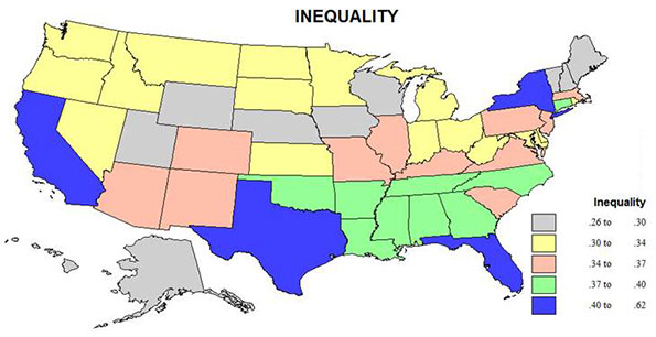
Then these are abutted by the relatively more equal states (in yellow) across the northern tier from Oregon and Washington to Indiana, Ohio, West Virginia, Maryland, and Delaware. There may be several historic reasons for this greater degree of equality ranging from relatively low percentages of poorer minorities such as African-Americans and Latinos; the presence of large Scandinavian and German descendants who have a historic attachment to egalitarian notions; and in some states, the strong influence of private sector unions.
The middle set of states, orange on the map, sort of take a middle position geographically too, comprising in the east the highly urbanized states of Massachusetts, New Jersey, Pennsylvania and Virginia, the Mid-America trio of Missouri, Illinois and Kentucky, and then the western redoubts of Colorado, Arizona, and New Mexico, affected by Hispanic and American Indian populations. I can’t say why South Carolina is more equal (slightly) than any other state in the deeper South.
The states in green with higher inequality are a contiguous set across the traditional South, a region united by a difficult history of race relations and underdevelopment, as well as hostility to unions and public intervention on economic issues. The exception to the rule, Connecticut is due to its proximity to New York, bringing exceptionally wealthy households, overcoming otherwise more egalitarian institutions.
Only four states, New York, California, Texas, and Florida, plus Washington, DC have inequality above the national average of .39, indicating both their very large populations, their very complex ethnicity, and large metropolitan economies rich in high income earners, entrenched concentrations of poverty, and high levels of immigration. Surprisingly, these states are even more unequal than the poorest states with the most difficult racial history and delayed development: Mississippi, Alabama, Arkansas, and Louisiana.
Poverty
How does the level of poverty relate to income levels and the geography of inequality? Consider first these simple correlations: Median income and poverty, -.62, mean income and poverty, -.44, and poverty and inequality, .57. These relations reflect the complex patterns of income, inequality, and poverty across the states. While richer states tend to have lower levels of poverty, the weaker relation with mean rather than with median income reflects the fact that some richer states, especially New York and California, have moderately high poverty, which in turn is related to their high degree of inequality. The moderate positive correlation of poverty and inequality is most evident in the giant states of New York, California, Texas and. Florida (and Washington DC) as well as in the deep south states of Louisiana, Mississippi, Alabama, and Georgia. In contrast there is relatively low rates of both poverty and inequality in the same northern tier (Plains, Midwest, and Mountain) states of Wisconsin, Minnesota, Iowa, Nebraska, Wyoming, and Utah, plus the northern New England states of Vermont and New Hampshire.
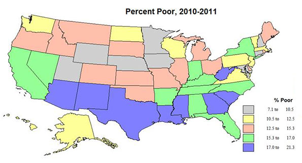
The geography of poverty, even more than that of inequality is reflective in large part of the deep and abiding income and education divide between whites and Asians versus Blacks and Hispanics. But the poverty of West Virginia and perhaps of Kentucky, and even Tennessee and Indiana also reflects an alternative Appalachian history of settlement and culture that is largely white. At the opposite end the low poverty of Maryland, despite a high minority population, perhaps reflects the importance of federal employment.
Conclusion
For an old Roosevelt Democrat, the persistence of widespread poverty and deepening inequality, even while the extremely rich capture ever higher shares of income and wealth, is outrageous. It brings the United States back to the degree of inequality last recorded in 1929. It is ironic that the lowest degree of inequality in American history was 39 years ago in 1974, during a Republican administration, and fifty years after the great March on Washington. These new maps are not pretty, and sadly there is little prospect for improvement.
Richard Morrill is Professor Emeritus of Geography and Environmental Studies, University of Washington. His research interests include: political geography (voting behavior, redistricting, local governance), population/demography/settlement/migration, urban geography and planning, urban transportation (i.e., old fashioned generalist).


hmmm
Maybe you should map the distribution of government jobs, whether they be state, federal, or local. My guess is you would find those areas with the highest concentration of overpaid government workers also have the highest levels of poverty and income inequality for non-government workers.