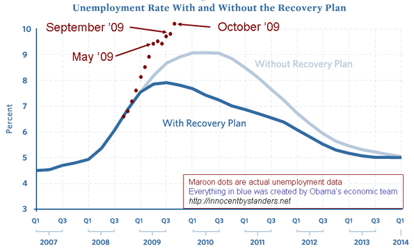
Check out this chart from geoff at Innocent Bystanders plotting the actual recent unemployment rates against the predicted stimulus-reduced rate from Obama's recovery team:

Google's chart interface is one of the easiest ways to explore unemployment data, allowing for easy comparisons for any state or county.


