
The Wall Street Journal just ran an interesting interactive feature looking at where college grads move after graduation. They looked at 445 schools, and tracked destinations by metro area. They discovered that graduates, particularly from stronger schools, are flocking to major metro areas. The Big East, Ivy League, Pac-12, Big-12, ACC, and Big Ten are all over 70% in sending college grads to major metro areas (but see below for caveats).
The Ivy League grads are even more concentrated. A quarter of all Ivy League grads live in New York, Washington, or San Francisco. Here’s the WSJ map of cities where more than 2% of Harvard grads go.
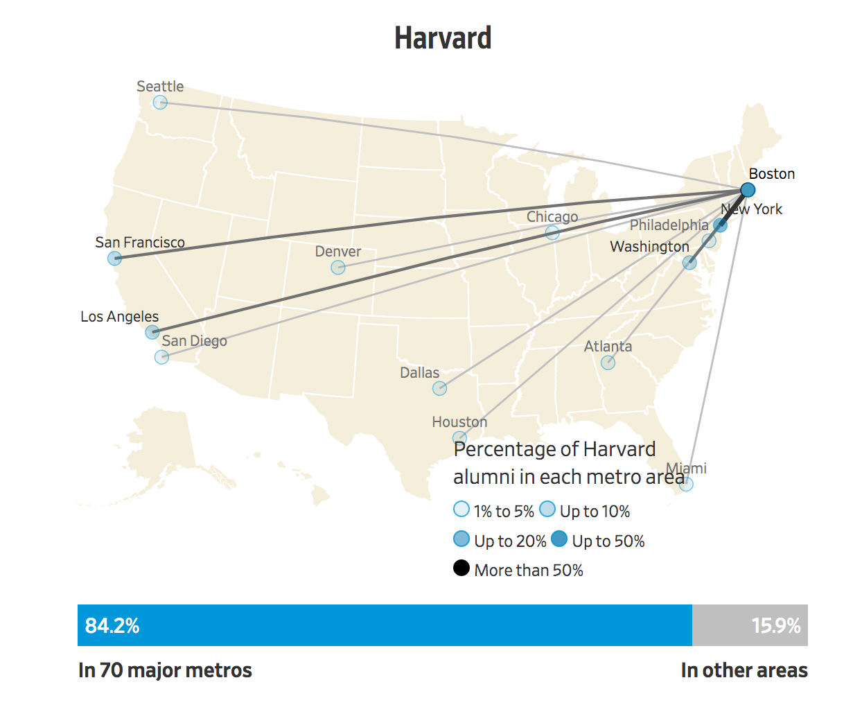
Relative to population, Washington, San Francisco, and Boston punch well above their weight. Washington comes in #2 to NYC in the number of schools sending more than 2% of their grads there.
Alas, the Journal selected an unfortunate definition of major metro. They define them as the top 55 metro areas, plus the largest metro in the state, plus the largest metro in any state without one in the top 55, excluding Alaska. I don’t know anyone else slicing data this way. A more typical method would be to look at metro areas with more than a million people, of which there are 53. There are some clear midsized and lower tier cities below that on the Journal’s list, so the midsize city advocates are also going to claim this data for themselves. I can understand why they would want to include every state, but this definition of major metro raises questions about analysis based on it. I would like to see a re-slice, or better yet another field in their interactive tool to allow readers to set threshold sizes.
I’m also not quite sure what the graphs for schools mean. They are labeled as “Percentage of alumni in each metro area.” The top bucket is greater than 50%, yet some schools (e.g., Wisconsin) have multiple cities in that category.
College vs. College
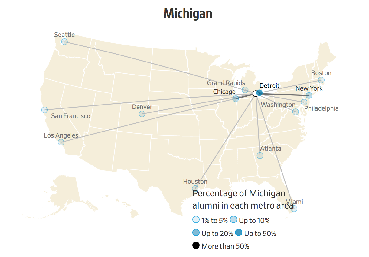
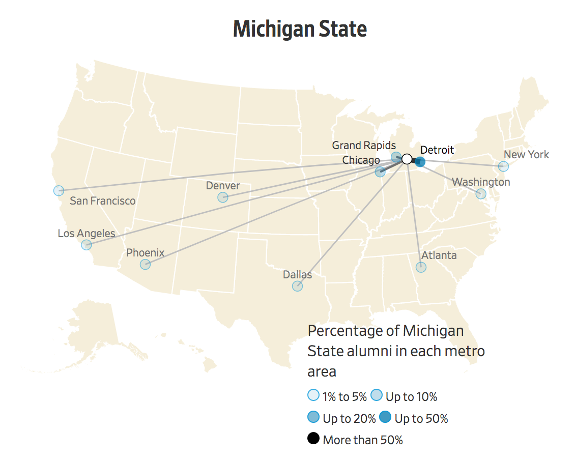
I played around with comparing colleges, particularly within the same state. If we look at Michigan and Michigan State for example, we see U of M’s stronger east coast links.
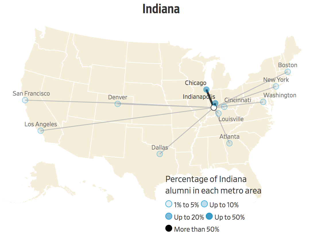
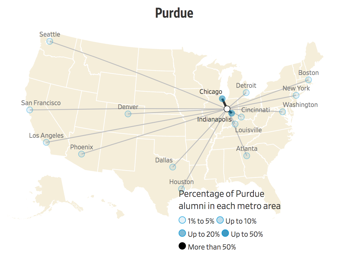
Looking at Indiana vs. Purdue, we see that Purdue has a bigger national footprint.
City Draws
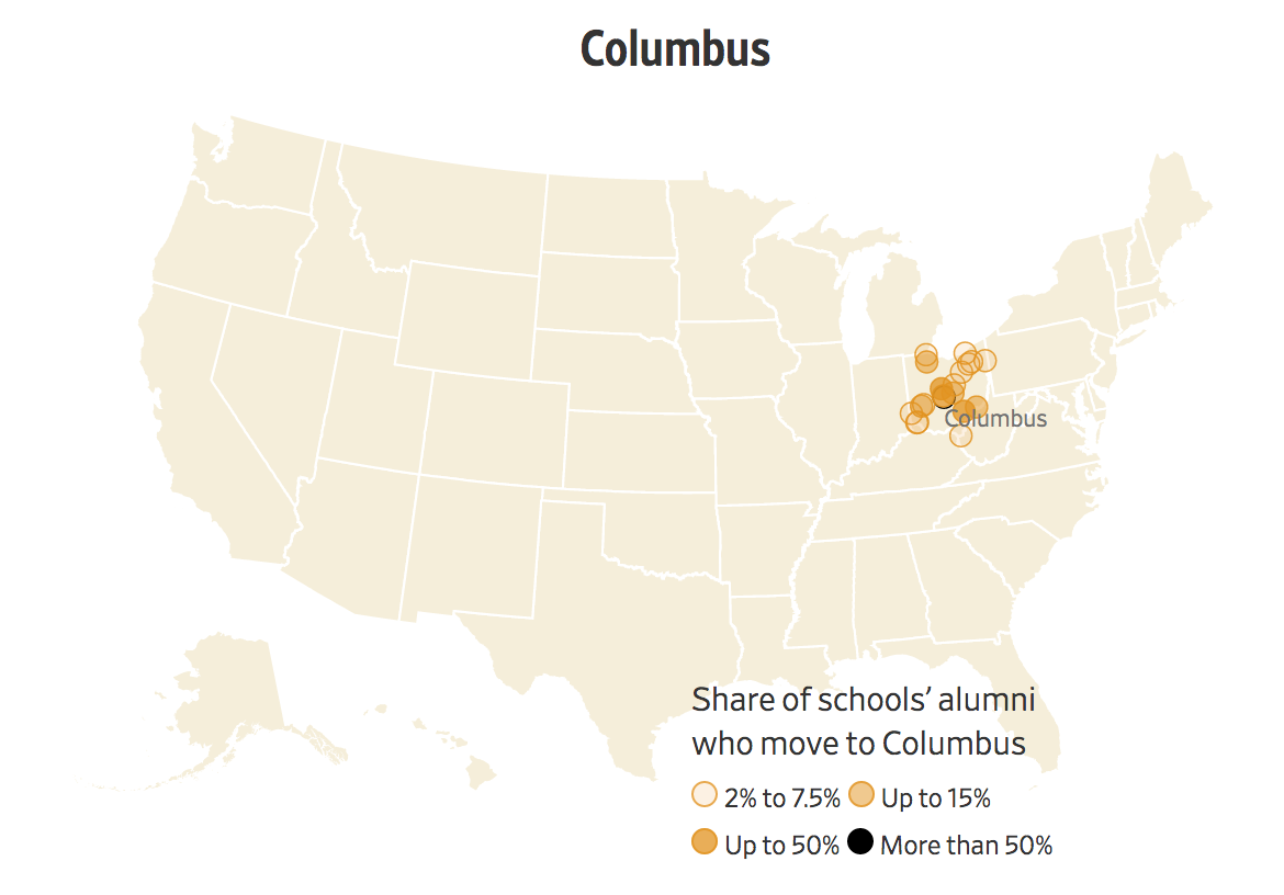
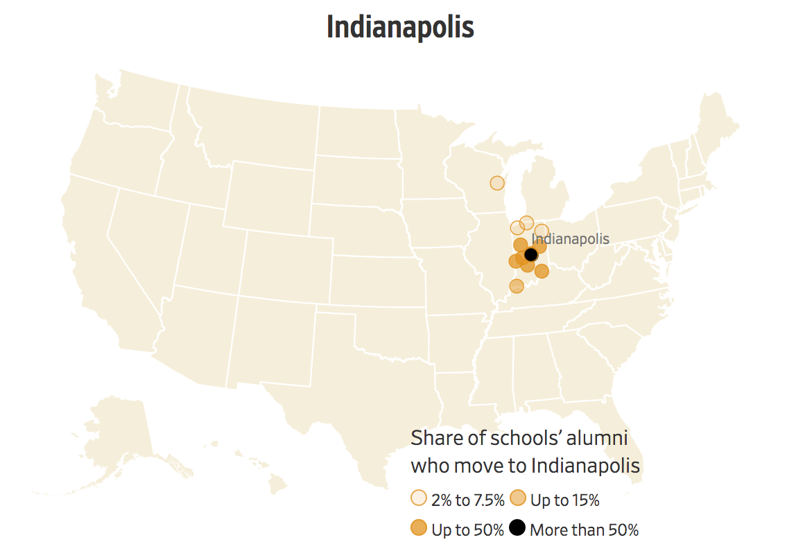
I’ve mentioned before that Indianapolis and Columbus draw migrants overwhelmingly from within their own states. The college draw maps confirm this.
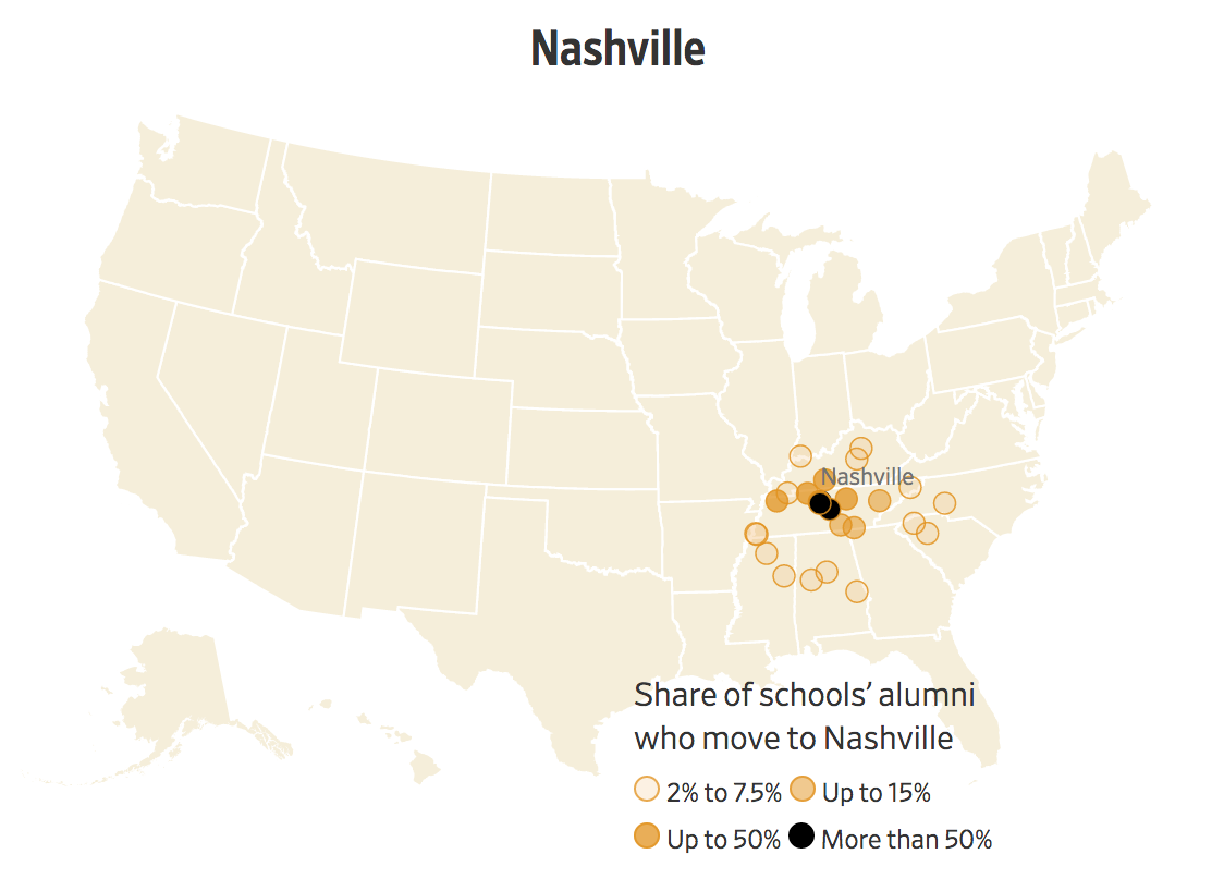
In fairness, every region in the 1-2 million range I looked at was a regional draw. Here’s Nashville.
The city data look like follow some kind of gravity model based on size and distance, so many of the maps look vaguely the same with different origin points. Nevertheless, it’s fun to look at. Check it out.
This piece originally appeared on Urbanophile.
Aaron M. Renn is a senior fellow at the Manhattan Institute, a contributing editor of City Journal, and an economic development columnist for Governing magazine. He focuses on ways to help America’s cities thrive in an ever more complex, competitive, globalized, and diverse twenty-first century. During Renn’s 15-year career in management and technology consulting, he was a partner at Accenture and held several technology strategy roles and directed multimillion-dollar global technology implementations. He has contributed to The Guardian, Forbes.com, and numerous other publications. Renn holds a B.S. from Indiana University, where he coauthored an early social-networking platform in 1991.
Photo: [Public domain], via Wikimedia Commons


