
The Census Bureau just finished releasing all of the state redistricting file information from the 2010 Census, giving us a now complete portrait of population change for the entire country. Population growth continued to be heavily concentrated in suburban metropolitan counties while many rural areas, particularly in the Great Plains, continue to shrink.
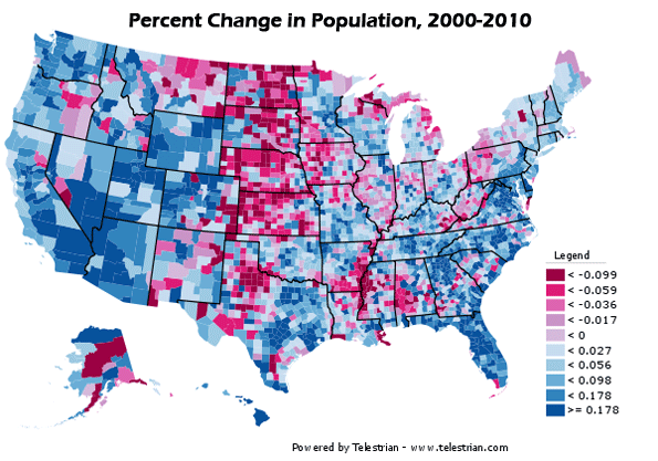
Percentage change in population, 2000-2010. Counties that grew in population in blue, decliners in red. Note: Legend values not multiplied by 100.
Dividing counties by those growing faster or slower than the US average paints the picture even more starkly:
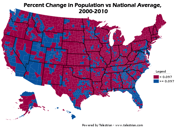
Percentage change in population, 2000-2010. Counties growing faster than the US average in blue, slower than the US average in red. Note: Legend values not multiplied by 100.
The release of all county data means it is also possible to take an unofficial, preliminary look at metropolitan area growth. The biggest gainers were Sunbelt cities in the South, Texas, and the Midwest, while the Midwest and Northeast continued to lag, particularly the old heavy manufacturing axis stretching from Detroit to Pittsburgh. But this picture was not monolithic. Many Southern cities with Rust Belt profiles like Birmingham failed to grow much compared to neighbors, nor did coastal California with its development restrictions.
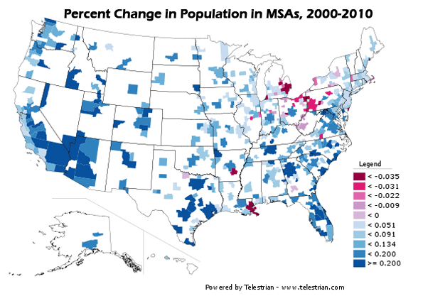
Percentage change in population, 2000-2010. MSAs that grew in population in blue, decliners in red. Note: Legend values not multiplied by 100.
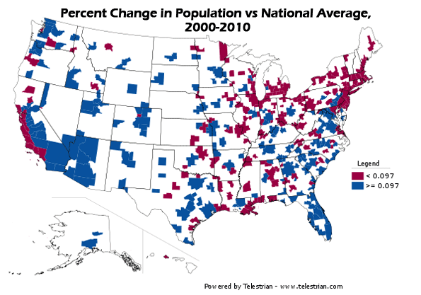
Percentage change in population, 2000-2010. Counties growing faster than the US average in blue, slower than the US average in red. Note: Legend values not multiplied by 100.
A full table of population change for large metro areas (greater than one million people) is available at the bottom of this post.
Basic race information is also available in this data release, since it is used to ensure redistricting complies with the requirements of the Voting Rights Act. Here's a map showing the concentration of Hispanic population the US:
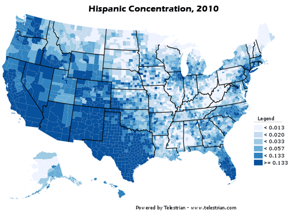
Population of Hispanic Origin, as a percentage of total population. Note: Legend values not multipled by 100.
Hispanic population remains heavily concentrated in the Southwest, but the interior, and especially parts of the South one would not expect, such as Alabama, posted significant gains in Hispanic population share.
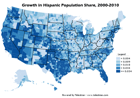
Hispanic population as change in percentage of total population, 2000-2010. Note: Legend values not multiplied by 100.
As the highest concentrations of Hispanics remain in the Southwest, similarly the Black population is at its heaviest concentrations in the South:
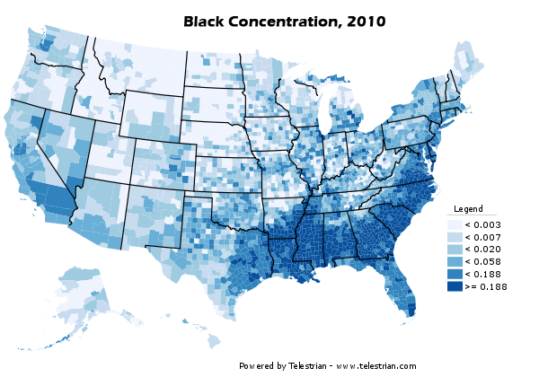
Black Alone population as a percentage of total population, 2010. Note: Legend percentages not multiplied by 100.
A lot has been written about the so-called reverse Great Migration of blacks from the North to the South. These results show something of that effect, but less of a general than a specific migration. Some cities both North and South are becoming magnets for Blacks, while other traditional Black hubs like Chicago are no longer favored. Note that some northern cities that showed a larger increase in concentration started off on a low base, like Minneapolis-St. Paul:
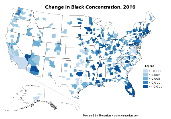
Black Alone population as change in percentage of total population, 2000-2010. Note: Legend values not multiplied by 100.
As noted above, here are all US metro areas with a population greater than one million people in 2010, ranked by percentage change in population:
| 2000-2010 Population Growth, MSAs of 1 Million or More | |||||
| Rank | Metropolitan Area | 2000 | 2010 | Total Change | Pct Change |
| 1 | Las Vegas-Paradise, NV | 1,375,765 | 1,951,269 | 575,504 | 41.8% |
| 2 | Raleigh-Cary, NC | 797,071 | 1,130,490 | 333,419 | 41.8% |
| 3 | Austin-Round Rock-San Marcos, TX | 1,249,763 | 1,716,289 | 466,526 | 37.3% |
| 4 | Charlotte-Gastonia-Rock Hill, NC-SC | 1,330,448 | 1,758,038 | 427,590 | 32.1% |
| 5 | Riverside-San Bernardino-Ontario, CA | 3,254,821 | 4,224,851 | 970,030 | 29.8% |
| 6 | Orlando-Kissimmee-Sanford, FL | 1,644,561 | 2,134,411 | 489,850 | 29.8% |
| 7 | Phoenix-Mesa-Glendale, AZ | 3,251,876 | 4,192,887 | 941,011 | 28.9% |
| 8 | Houston-Sugar Land-Baytown, TX | 4,715,407 | 5,946,800 | 1,231,393 | 26.1% |
| 9 | San Antonio-New Braunfels, TX | 1,711,703 | 2,142,508 | 430,805 | 25.2% |
| 10 | Atlanta-Sandy Springs-Marietta, GA | 4,247,981 | 5,268,860 | 1,020,879 | 24.0% |
| 11 | Dallas-Fort Worth-Arlington, TX | 5,161,544 | 6,371,773 | 1,210,229 | 23.4% |
| 12 | Nashville-Davidson--Murfreesboro--Franklin, TN | 1,311,789 | 1,589,934 | 278,145 | 21.2% |
| 13 | Jacksonville, FL | 1,122,750 | 1,345,596 | 222,846 | 19.8% |
| 14 | Sacramento--Arden-Arcade--Roseville, CA | 1,796,857 | 2,149,127 | 352,270 | 19.6% |
| 15 | Denver-Aurora-Broomfield, CO | 2,179,240 | 2,543,482 | 364,242 | 16.7% |
| 16 | Washington-Arlington-Alexandria, DC-VA-MD-WV | 4,796,183 | 5,582,170 | 785,987 | 16.4% |
| 17 | Tampa-St. Petersburg-Clearwater, FL | 2,395,997 | 2,783,243 | 387,246 | 16.2% |
| 18 | Salt Lake City, UT | 968,858 | 1,124,197 | 155,339 | 16.0% |
| 19 | Portland-Vancouver-Hillsboro, OR-WA | 1,927,881 | 2,226,009 | 298,128 | 15.5% |
| 20 | Indianapolis-Carmel, IN | 1,525,104 | 1,756,241 | 231,137 | 15.2% |
| 21 | Richmond, VA | 1,096,957 | 1,258,251 | 161,294 | 14.7% |
| 22 | Oklahoma City, OK | 1,095,421 | 1,252,987 | 157,566 | 14.4% |
| 23 | Columbus, OH | 1,612,694 | 1,836,536 | 223,842 | 13.9% |
| 24 | Seattle-Tacoma-Bellevue, WA | 3,043,878 | 3,439,809 | 395,931 | 13.0% |
| 25 | Miami-Fort Lauderdale-Pompano Beach, FL | 5,007,564 | 5,564,635 | 557,071 | 11.1% |
| 26 | Kansas City, MO-KS | 1,836,038 | 2,035,334 | 199,296 | 10.9% |
| 27 | Minneapolis-St. Paul-Bloomington, MN-WI | 2,968,806 | 3,279,833 | 311,027 | 10.5% |
| 28 | Louisville/Jefferson County, KY-IN | 1,161,975 | 1,283,566 | 121,591 | 10.5% |
| 29 | San Diego-Carlsbad-San Marcos, CA | 2,813,833 | 3,095,313 | 281,480 | 10.0% |
| 30 | Memphis, TN-MS-AR | 1,205,204 | 1,316,100 | 110,896 | 9.2% |
| 31 | Birmingham-Hoover, AL | 1,052,238 | 1,128,047 | 75,809 | 7.2% |
| 32 | Baltimore-Towson, MD | 2,552,994 | 2,710,489 | 157,495 | 6.2% |
| 33 | Virginia Beach-Norfolk-Newport News, VA-NC | 1,576,370 | 1,671,683 | 95,313 | 6.0% |
| 34 | Cincinnati-Middletown, OH-KY-IN | 2,009,632 | 2,130,151 | 120,519 | 6.0% |
| 35 | San Jose-Sunnyvale-Santa Clara, CA | 1,735,819 | 1,836,911 | 101,092 | 5.8% |
| 36 | Hartford-West Hartford-East Hartford, CT | 1,148,618 | 1,212,381 | 63,763 | 5.6% |
| 37 | San Francisco-Oakland-Fremont, CA | 4,123,740 | 4,335,391 | 211,651 | 5.1% |
| 38 | Philadelphia-Camden-Wilmington, PA-NJ-DE-MD | 5,687,147 | 5,965,343 | 278,196 | 4.9% |
| 39 | St. Louis, MO-IL | 2,698,687 | 2,812,896 | 114,209 | 4.2% |
| 40 | Chicago-Joliet-Naperville, IL-IN-WI | 9,098,316 | 9,461,105 | 362,789 | 4.0% |
| 41 | Los Angeles-Long Beach-Santa Ana, CA | 12,365,627 | 12,828,837 | 463,210 | 3.7% |
| 42 | Milwaukee-Waukesha-West Allis, WI | 1,500,741 | 1,555,908 | 55,167 | 3.7% |
| 43 | Boston-Cambridge-Quincy, MA-NH | 4,391,344 | 4,552,402 | 161,058 | 3.7% |
| 44 | New York-Northern New Jersey-Long Island, NY-NJ-PA | 18,323,002 | 18,897,109 | 574,107 | 3.1% |
| 45 | Rochester, NY | 1,037,831 | 1,054,323 | 16,492 | 1.6% |
| 46 | Providence-New Bedford-Fall River, RI-MA | 1,582,997 | 1,600,852 | 17,855 | 1.1% |
| 47 | Buffalo-Niagara Falls, NY | 1,170,111 | 1,135,509 | -34,602 | -3.0% |
| 48 | Pittsburgh, PA | 2,431,087 | 2,356,285 | -74,802 | -3.1% |
| 49 | Cleveland-Elyria-Mentor, OH | 2,148,143 | 2,077,240 | -70,903 | -3.3% |
| 50 | Detroit-Warren-Livonia, MI | 4,452,557 | 4,296,250 | -156,307 | -3.5% |
| 51 | New Orleans-Metairie-Kenner, LA | 1,316,510 | 1,167,764 | -148,746 | -11.3% |
Aaron M. Renn is an independent writer on urban affairs based in the Midwest. His writings appear at The Urbanophile. Maps and analysis done using Telestrian.


