Here's a quick map of the newly released May 2009 metropolitan area unemployment numbers. On this map, color signifies the rate in May 2009 and size of bubble indicates the rate point change since May of last year. Green dots are below the national unemployment level of 9.1 in May, and red dots are above the national number.
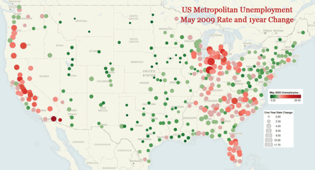
We can see that highest unemployment is concentrated on the west coast and California, manufacturing dependend Michigan, Indiana, and Ohio, parts of Appalachia, the Carolinas, and Florida.
Unemployment is increasing the fastest in Kokomo and Elkhart-Goshen, IN; Bend, Eugene, Medford, and Portland, OR; Hickory-Lenoir-Morganton, NC; and Muskegon and Monroe, MI.
While every metropolitan area of the country saw increased unemployment over May 2008, the Great Plains from Texas to North Dakota, the Mountain West, and parts of New England are still holding employment better than the rest of the nation.


