
This week the Census Bureau released its 2010 data from the American Community Survey. The ACS is what contains many of the core demographic characteristics that are frequently opined upon, such as college degree attainment, commute times, etc.
It used to be that the Census Bureau collected this information during the decennial census using the so-called “long form” that went to one out of every ten households. But that was discontinued as of this census and has been replaced with with the ACS. The ACS reports data more frequently (annually for geographies larger than a certain size), but has a smaller sample size and so there’s lot of statistical noise that I don’t think we are used to dealing with yet. For example, in 2008 the Indianapolis metro area ranked #3 in the US for growth in college degree attainment over the course of the decade to date among metros greater than one million people. But in the 2010 data Indy ranked #28 on the same measure. There are fluctuations year to year and the margin of error needs to be accounted for in serious statistical analysis. Nevertheless, this is what we have to work with.
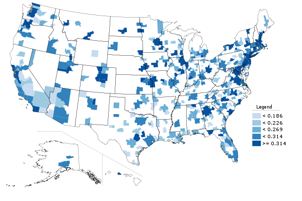
Metro area college degree attainment, 2010
I’m going to roll out a series of posts covering the highlights of some of this data. I’ll start with educational attainment, since that is something that is so key to upward social mobility and urban economic success.
But first I’ll put in a brief plug for my Telestrian tool. The Census Bureau site for distributing this data is a disaster. As one Brookings senior fellow put it, “Lots of Census data yesterday, today. Lots of angles, stories, conclusions. One shared sentiment: new American Factfinder is AWFUL” and “New Factfinder making mainframe punchcards look appealing.” Telestrian is designed for very rapid basic analysis and comparative benchmarking moreso than simple fact lookups (though it can do that do). In fact, I generated every table, graph and map in this post in ten total minutes with it. Even if you aren’t in the market for a commercial product, there’s a no credit card required free trial period, so if you are interested in perusing the ACS data and don’t want to beat your head against the wall with the Census Factfinder, I encourage you to check it out. Telestrian doesn’t have every data element, but it has a lot of interesting stuff.
College Degree Attainment
College degree attainment (the percentage of adults with a bachelors degree or higher), is one of the most critical factors in urban success. If you’d like to know more, just check out all the great research on it under the heading of “talent dividend” over at CEOs for Cities.
The map at the top of the post is 2010 college degree attainment for metro areas. Here are the top ten, among those with a population greater than one million, showing total number of people with degrees and the attainment percentage:
| Row | Metro Area | 2010 |
| 1 | Washington-Arlington-Alexandria, DC-VA-MD-WV | 1,758,297 (46.8%) |
| 2 | San Jose-Sunnyvale-Santa Clara, CA | 558,519 (45.3%) |
| 3 | San Francisco-Oakland-Fremont, CA | 1,317,354 (43.4%) |
| 4 | Boston-Cambridge-Quincy, MA-NH | 1,335,276 (43.0%) |
| 5 | Raleigh-Cary, NC | 301,012 (41.0%) |
| 6 | Austin-Round Rock-San Marcos, TX | 429,163 (39.4%) |
| 7 | Denver-Aurora-Broomfield, CO | 651,661 (38.2%) |
| 8 | Minneapolis-St. Paul-Bloomington, MN-WI | 822,321 (37.9%) |
| 9 | Seattle-Tacoma-Bellevue, WA | 867,193 (37.0%) |
| 10 | New York-Northern New Jersey-Long Island, NY-NJ-PA | 4,613,445 (36.0%) |
And here’s the bottom ten:
| Row | Metro Area | 2010 |
| 1 | Riverside-San Bernardino-Ontario, CA | 499,663 (19.5%) |
| 2 | Las Vegas-Paradise, NV | 278,387 (21.6%) |
| 3 | Memphis, TN-MS-AR | 209,987 (25.1%) |
| 4 | San Antonio-New Braunfels, TX | 344,247 (25.4%) |
| 5 | Louisville/Jefferson County, KY-IN | 224,392 (25.8%) |
| 6 | Tampa-St. Petersburg-Clearwater, FL | 513,182 (26.2%) |
| 7 | Birmingham-Hoover, AL | 198,856 (26.3%) |
| 8 | New Orleans-Metairie-Kenner, LA | 209,916 (26.8%) |
| 9 | Jacksonville, FL | 241,801 (26.9%) |
| 10 | Phoenix-Mesa-Glendale, AZ | 731,643 (27.2%) |
While we are on the topic, here is a map of college degree attainment by state:
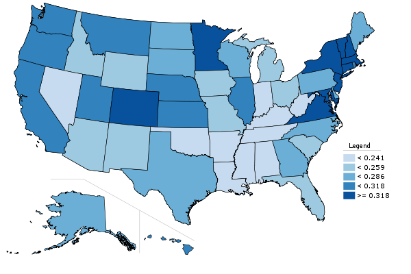
State college degree attainment, 2010
And here is county level college degree attainment for those counties covered by the 1-year ACS:
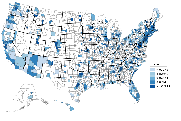
County college degree attainment, 2010
Changes in College Degree Attainment
Beyond just the raw 2010 numbers, it’s interesting to look at which places are growing their college degree attainment the most. That is, which places are growing their talent base. So here’s a look at metros by their change in college degree attainment over the last decade:
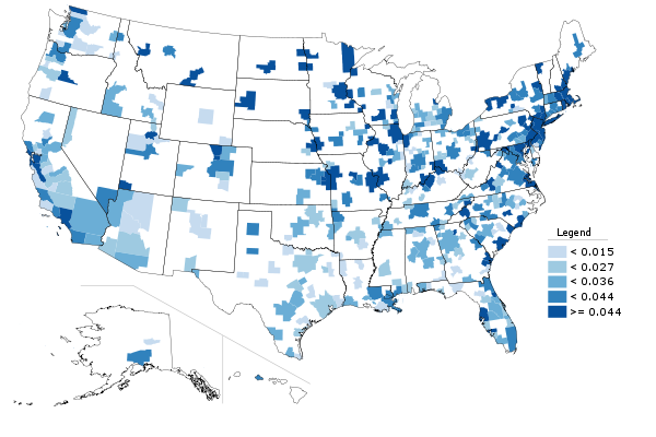
Change in percentage of adults with college degrees, 2000-2010.
Some places already have very high college degree attainment, which can make it tougher to grow even higher. Speaking of which, the US as a whole raised its college degree attainment as well. To some extent, this is purely a function of demographics. Older generations have lower educational levels than younger ones. (None of my grandparents had a college degree, and my father’s parents never even finished high school. I don’t think that was atypical for their day).
What might be more interesting to look at is whether places are increasing their college degree attainment faster or slower than the US overall. There’s a measure that does capture that. It’s called location quotient, and is used in economic analysis to measure the concentration of industries in certain locations.
An economist told me once that he likes to look at this for all sorts of things, not just industry clusters. The formula works for other stuff. I really haven’t seen this used before, so caveat emptor, but here’s a look at shifts in location quotient for metro areas over the course of the decade:
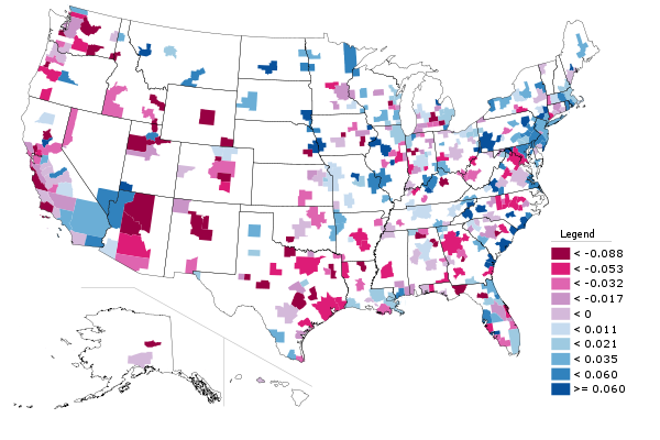
Metro area change in location quotient for college degree attainment, 2000-2010. Increase in LQ in blue, decrease in red.
The blue metro areas had a higher concentration of college degrees relative to the nation as a whole in 2010 than they did in 2000. The red ones a lower concentration. This is certainly an interesting area for further exploration.
While I’m on the topic, here’s the same chart, only limited to graduate and professional degrees. There’s some interesting variability here.
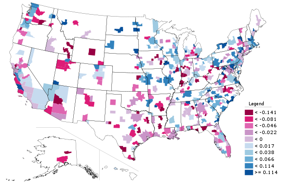
Metro area change in location quotient for graduate and professional degree attainment, 2000-2010. Increase in LQ in blue, decrease in red.
A Closer Look at Indianapolis
Just as one more granular example, I wanted to take a look at the Indianapolis vertical. Here’s 2010 college degree attainment for the city, metro, state, and America as a whole:
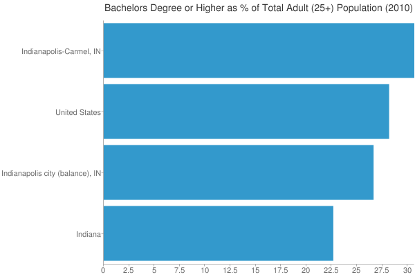
College degree attainment, 2010
As we know, urban regions tend to be more highly educated. Here we see that while Indiana is one of the lowest states in terms of college degree attainment, the Indy metro area actually beats the US average. However, the city of Indianapolis falls short of the US average. Because Indy is a consolidated city-county government that includes a lot of inner ring suburban areas, it’s hard to draw conclusions about the true urban core, but it does seem clear that the center is less educated than the periphery of the metro.
Now lets look at the change in attainment for the decade:
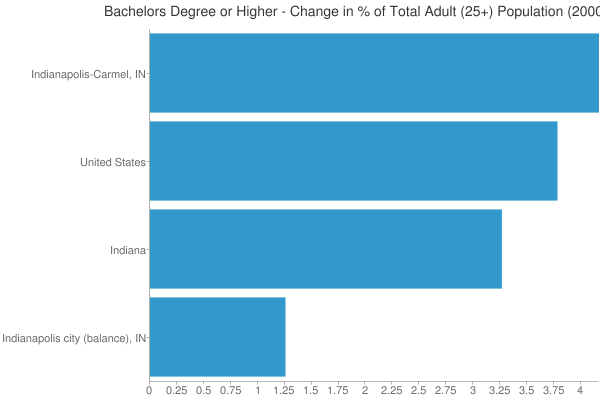
Change in the percentage of adults with a college degree, 2000-2010.
Here we see that the rich get richer, as Indy metro not only started out on a higher base, but had the best showing in attainment growth as well. OTOH, going back to our LQ measure, Indiana actually boosted its LQ while the Indy region was stagnant. That’s because this is a percentage point change, not a percentage change, and growing from a low base makes it easier to boost LQ. It’s one of the quirks of that formula.
The poor showing of the city of Indianapolis is something that should definitely be worrying. It would be interesting to do a similar analysis for other metros, but alas that’s all for today.
Aaron M. Renn is an independent writer on urban affairs based in the Midwest. His writings appear at The Urbanophile, where this piece originally appeared. Telestrian was used to analyze data and to create charts for this piece.


This week the Census Bureau
This week the Census Bureau released its 2010 data from the American Community Survey. The ACS is what contains many of the core demographic characteristics that are frequently opined upon, such as college degree attainment, commute times, etc. high quality anime online
It used to be that the Census Bureau collected this information during the decennial census using the so-called “long form” that went to one out of every ten households. But that was discontinued as of this census and has been manga free replaced with
This week the Census Bureau
This week the Census Bureau released its 2010 read manga online data from the American Community Survey. The ACS is what contains many of the core demographic characteristics that are frequently opined upon, such as college degree attainment, commute times, etc.
It used to be that the Census Bureau collected this watch anime online information during the decennial census using the so-called “long form” that went to one out of every ten households. But that was discontinued as of this census and has been replaced with
cause & effect
Correlation does not prove cause and effect. Does more college make a community richer? Or are rich people more likely to go to college?
The causal arrow likely goes both ways, but probably more towards rich people going to college. Hence college in our day is more accurately described as a consumer good rather than a capital investment.
Daniel Jelski