
It has been widely accepted that geographic areas with more unconventional forms of family formation – cohabitation; children born to cohabitors; postponement of partnership, marriage and parenthood to much later ages; acceptance of interference with fertility through abortion and efficient contraception – would vote for Democrats. Conversely, those geographic areas that retain classic forms of family formation – early marriage and parenthood – and more conventional gender roles would display a preference for Republicans.
The “Culture War” issues were prominent during the George Bush-Al Gore and the George Bush-John Kerry contests of 2000 and 2004. One of the consequences was that the spatial pattern of the election results, both by state and by county, exhibited a marked correlation with the prevalence of new patterns of family formation The shift to these new demographic patterns is often referred to by demographers as “the second demographic transition,” or SDT.
One of the criticisms formulated against the theoretical underpinning of the Election-SDT correlation for the US was that this link was only a temporary phenomenon. If economic issues instead of cultural ones would dominate the debate during the presidential elections, critics theorized, this correlation would become unstuck.
The 2008 elections provided us with a very nice test indeed. Both candidates initially shunned the culture war issues as too divisive, and only with the choice of Sarah Palin as John McCain’s running mate was there a brief revival of this debate. Shortly thereafter, the banking crisis and the resulting economic upheaval took center stage. And very forcefully so.
Did the link between the maps of the second demographic transition and of election results weaken or vanish as the “It’s-the-economy, dummy-” proponents predicted? The answer is a resounding ‘No,’ as our studies showed empirically.
We examined the SDT-dimension in an analysis of a set of 22 indicators, all dealing with patterns of family formation. We looked at typical SDT features such as the postponement of marriage, greater prevalence of cohabitation and same sex households, postponement of parenthood, sub-replacement fertility, and a higher incidence of abortion.
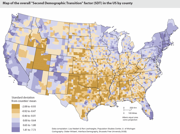
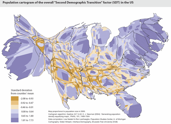
Two maps were prepared for the counties we studied. The first is a classic map with blue shadings for counties that are further advanced on the “second demographic transition” dimension and red ones for those with the slowest shift in that direction. The second map is a cartogram with the counties now drawn proportionally to the size of their population in the 2000 census.
Now take a look at the scattergrams and correlations at the state level between the SDT-dimension and the Republican vote for Bush in 2004 and McCain in 2008 (Figure 1). The conclusion is obvious: the correlation that existed in 2004 is very largely replicated in 2008, and the relative positions of the states in the scattergram are essentially maintained.
For those who like details: Indeed, Arizona voted in 2008 for McCain more than would be expected on the basis of its SDT-score, while the reverse holds for Hawaii. Also, Utah had to yield its top position on the Republican vote to Wyoming and Oklahoma, despite its very low score on the SDT.
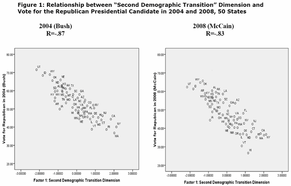
Nevertheless, when the correlations between the “second demographic transition” features and the vote for the Republican candidate are calculated for more than 3000 counties, the results are even stronger for the 2008 elections than they were in 2004 (corr. coeff. improves from -.57 to -.65). Moreover, that statistical link remains highly significant after controlling for competing explanations based on the degree of urbanity, income and education levels, ethnic and religious composition, and relative size of immigrant populations. And Appalachian and Southern counties, which were not following the fit so closely in 2004, now conform much better to the overall pattern.
Hence, the spatial differentiations of the last presidential elections at the levels of states and counties have remained over this period of time. The maps may color darker or lighter, depending on the issues in the period preceding the elections and the themes that dominate the debate, but the position of counties is relatively stable.
In other words, we cannot possibly predict the winner, but we can produce a pretty good guess when it comes to predicting in which counties each of the candidates will do well or poorly. When it comes to this type of prediction, the SDT-dimension is by no means sufficient, but it is definitely a necessary ingredient of the engine.
While many western countries have displayed a close connection between voting results and patterns of family formation and fertility, the correlation holds particularly well in the US. The predominance of the two party system, the philosophical link of these parties to the defense of different life styles, and the very wide ideational spectrum particularly contribute. No other developed nation has retained the presence of a vocal and large “religious right” capable of organizing reactions against secular and non-conformist tendencies. The US continues, therefore, to be a textbook example of spatial connections between demographic innovation and political orientation.
Economic issues definitely played a role in designating the winner in 2008. But the spatial map of the election results is more a reflection of sociological differences in lifestyles and their underpinning ideologies – issues which are captured so well via the “second demographic transition” features.
Ron Lesthaeghe is emeritus professor of demography at the Free University of Brussels (VUB) and has been visiting professor at the Universities of Michigan (Ann Arbor) and of California (Irvine). Lisa Neidert is senior research associate at the Population Studies Center of the University of Michigan. Relevant materials pertaining to the SDT concept and 2004 election results (maps, cartograms, articles) can be downloaded from our University of Michigan website.
The map and cartogram of the SDT by county has been produced by Didier Willaert at the Interface Demography Unit of the Free University in Brussels.


