
Today, useful demographic, real estate, and economic information is instantly accessed from your bedroom laptop. A few decades ago you would have to make a trip to city hall and wait for someone to go through hundreds of files.
Information (data) is only as good as the source, hand entered from someone - subject to human error. Yet in reality, after 3 decades of use, mapping software --- used by virtually every city and county agency --- is actually getting worse not better.
What is occurring
To understand the decline of mapping data, let’s go back in time - three decades ago when GIS was first introduced. There were many players competing to be the leader in the industry, however, the graphic capability and speed of computers was pitiful back then. Yet even today, with much faster computers and infinitely more storage, the quality of mapping programs has declined.
Today’s GIS industry leader, ESRI, a company from Redlands, California, overcame speed limitations by defining parcel of land into a single ‘polyline’ which is a series of straight lines along a boundary bypassing the need to draw curves. They coined these parcels (or lots): ‘shapes’, thus a GIS ‘shape map’ is essentially the parcel information of a city.
How can a curve be represented by straight lines? By having a series of itsy-bitsy lines drawn along an arc so that it appears as a curve, requiring a massive number of additional points to be generated.
The problem is that in the typical city with many curved streets, a shape map would add hundreds of thousands (likely millions) of inaccurate traced points.
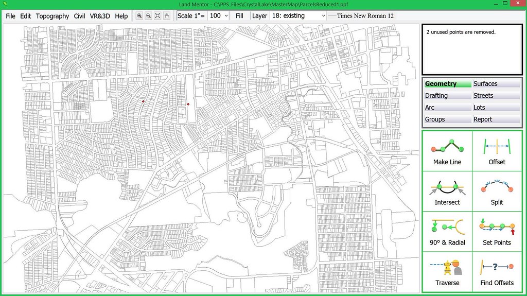
Take for example this small area in Pontiac, Michigan which took over 160,000 lines to define – none of which are precise:
Today, ESRI pretty much controls the multi-billion dollar GIS industry. There’s no intent in this article to say ESRI provides bad or good software, but to hopefully reverse a very disturbing trend in the data in which maps are based upon and why it’s counter-productive to sustainable growth.
Ask yourself:
• With multiple billions of dollars invested in GIS technology and mapping – most by you - the tax payer, why is the very fabric of today’s growth worse, than that of the 1960’s - before any digital technology existed?
• Why is it that at every city council and planning commission meeting are presentations and submittals materially no different today than in the past 6 decades?
• Why is it that the regulatory system continues to produce (actually promote) the cookie-cutter mundaneness that plagues every city?
Why we need to go back to surveying
At this point to understand the problem in GIS mapping, you need a short lesson on land surveying. The person in blue jeans standing on the roadside looking into the scope of the transit is a land surveyor.
Land surveying is more art than science. A proper boundary survey requires those in the field to find the corners along the streets and nearby. The land surveyor looks for differences between adjacent site dimensions of what is recorded, if any. Using judgments based upon extensive knowledge, the land surveyor can adjust the inconsistencies and set new corners.
Why Accuracy is Critical
Once the actual corners of a boundary are known, the land surveyor collects all man-made improvements (stuff) on the site to determine if fences overlaps onto the neighbor’s property, or their shed encroaches within the parcels boundary. Is the home set the required minimum 10’ from the side yard or is it less? This would be a violation. This is stuff lawsuits are made of.
How can bad data be fixed?
Those purchasing the GIS are told that they could quickly put a map in and then later on collect accurate control points which cold be ‘rubber sheeted’ (stretched). In other words, an inaccurate map that was traced decades ago, then rubber sheeted 10 or 20 feet (or more) to be made ‘accurate’, produces results in 4 good points and hundreds of thousand bad ones. Those GIS purchasers with no knowledge of surveying somehow saw logic in this false premise.
Are there any accurate base maps?
Yes! For example, decades ago, Gary Stevenson the County Surveyor in Dakota County, Minnesota decided to hand key in the plat dimensions of deeds and recorded plats (site plans of developments) into a coordinated geometry system upon which land surveying and civil engineering is based upon.
The Dakota County Surveyors office created a map, complete with parcels of land and subdivision plats that conflict with each other showing overlaps and void areas. This precision map using recorded information adjusts each parcel and plat to a common angle basis (rotation). This way a land surveyor can use the information to determine problems in the adjoining property and can make an attempt to adjust conflicts and solve them ultimately fixing the map and creating a geometrically perfect city.
Technology that changed land surveying
Today’s Global Positioning Systems (GPS) has a much higher degree of accuracy for land surveying applications and has made exact measurements of control points along great distances without error possible. However, with all the technology, the skill and knowledge of the land surveyor is required to work the puzzle pieces of creating an accurate base map, as well as correctly defining any property – even yours!
Can an inaccurate map be fixed over time?
Absolutely, but only if a city or county wanted to pay far more to fix a bad map than starting over with a good map from scratch. Today, there are far better software technologies, based upon the future of mapping without data structures designed in the past when speed was the ball and chain.
The ‘not good’, bad & ugly of today’s mapping
The software our firm develops is designed the same way as we did nearly four decades ago – extremely efficient with data to let the lightning fast processor work, needing very little disk space for storage and access.
The problem in particular with the leading CAD and GIS software developers is that they have access to a massive amount of memory and disk space. This allows programmers to work with less effort.
Throwing excessive amount of information to the disk is a quick way to write software code – why not? - you got the space.
Efficient coding is painfully long and expensive.
The problem with monopoly
Today’s mapping systems have essentially the same data structure as four decades ago because they have almost no competition that forces change. This is an increasingly common problem in a tech world increasingly dominated by an ever smaller group of increasingly giant companies.
One thing about inefficiency: For those with overwhelming market share, it’s also potentially very profitable, as Microsoft, Google, Apple and Facebook can tell us.
Back to Basics
It was just few decades ago that contours showing the varied organic shape of the land surface was somewhat efficient and accurate.
With just a few hundred points collected on the ground by a land surveyor an accurate representation of the ground surface could quickly be computed and drawn by software. You could clearly see where the elevation of the ground changed direction and where walls, curb lines, or drainage ditches were.
In other words, in general, from a physical data structure perspective, there was little to be concerned with working with contours of the land. Below is an example from decades ago of an on the ground survey with all the boundary and improvements, created from a total 640 field collected points:

The depiction above is the exact land surface essential for reconstruction and earthwork calculations. Note the contours along the street which show the fine detail of the center of the street along with contour lines that adjust at the street curb line. Because of the digital terrain model is created with only 640 total data points, all calculations such as earthwork and street redesign will be instant.
Modern laser-based remote sensing technology allows the creation of complete topographic maps without requiring any manual labor to create as was the case in the past, or at least in theory – but not in the real world use for using the data for design and 3D application.
Essentially the industry was really efficient until modern computers effectively threw topographic efficiency into the garbage, and producing what can be best described as ‘spastic’ jiggly contour lines as shown on this typical LiDAR map:
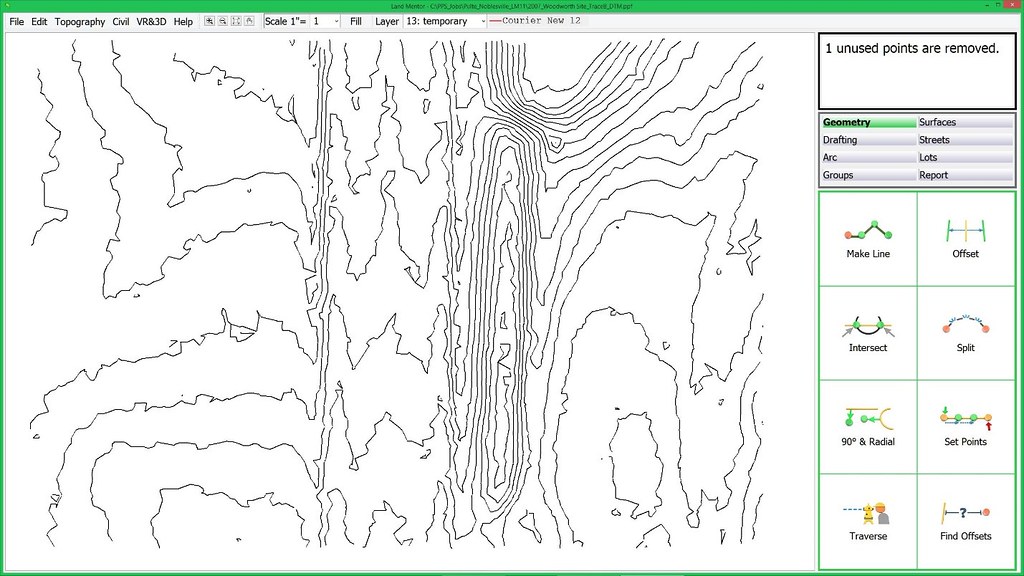
The Mayors and Administrators in charge of tax payer funded contracts approving contours such as the above are not aware that this information is pure garbage, because they, nor did their staff (who should have known better) did not have this knowledge.
With all the information and technological abilities we have today, why are these contours so awful? Because software cannot think – it can only use math. When the land is relatively flat, as most land, streets, and parking areas are, to draw a contour line when points exist within a few feet of each other, it will need to create a short line a particular direction, a few feet in length. Then it needs to determine a direction for the next short line, and ignores a trend or path and simply goes ‘to and fro’ not ‘knowing’ where to go. This of course, is because software cannot ‘know’ anything – only a person can make such judgments.
You take the person out of the equation, and bad things like this happen.
Can this excess data be filtered?
Why has nobody brought this up as a key issue?
Well, the consultants serving cities – why should they give up all that continual updating of a map to reinvent their services offering accurate consulting requiring the services of a Professional Land Surveyor instead of CAD and GIS technicians? Virtually every convention, periodical, and blog that serves government agencies depend heavily of the advertising dollars of the current GIS and CAD leaders – they would never print a series like this which could damage their relationships with the enormous companies and cut their income stream.
We can reverse the damage, but it will take key decision makers in government to stop writing tax payer funded checks for substandard, wasteful, and just plain bad – mapping data.
Rick Harrison is President of Rick Harrison Site Design Studio and Neighborhood Innovations, LLC. He is author of Prefurbia: Reinventing The Suburbs From Disdainable To Sustainable and creator of LandMentor. His websites are rhsdplanning.com and LandMentor.com
By Karen Capria (esri.com) [Public domain], via Wikimedia Commons


