
While doing some research for a forthcoming presentation, I was looking at some data about younger people with college degrees and put together some maps I’ll share with you today.
The Census Bureau tracks educational attainment by age cohort. I decided to look at 25-34 year olds with a bachelors degree or higher. This is roughly today’s “young, educated Millennial” segment. Here is a chart showing the change in the share of 25-34yos with degrees between 2000 and 2016:
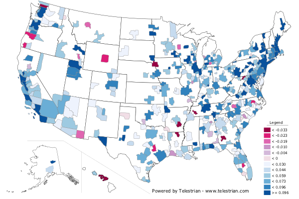
Keep in mind these aren’t the same people – this is not a longitudinal study. The 25-34yos in 2000 are Generation X – my generation. This is simply a look at how the concentration of people in that age group has shifted over time. (To interpret the scale, multiply by 100 and that’s the percentage point change in college degree attainment).
You can see right away that the big increases here are in the “usual suspect” cities: NYC, Boston, DC, Bay Area, LA, Seattle, Portland, Chicago. Also Pittsburgh’s brain gain is shown and also a great showing for Nashville.
Some metro areas – the ones in red – actually saw a decline in educational attainment in that age group. Not good.
Because the nation as a whole grew more educated during that time, another way to look at it is the change in college degree attainment vs. the national change for that age group, which was 7.4 percentage points. Because of some system quirks, the color scheme is different on this one. Blue is a change higher than the national average, purple is a change below the national average.
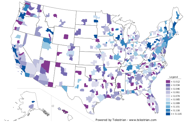
Interesting to say the least.
Now there are many caveats on this. One, your ability to grow your share of people with college degrees in part depends on your base. Pittsburgh started with low share in that age range. It’s a lot harder to post gains when you’re already high. So some of these coastal markets may slow down in growth over time. After all, you can’t get above 100% by definition.
Secondly, this is the share of people with college degrees, not the total people with college degrees. Partisans of Texas or Atlanta will be quick to note that they grew so much total population that their total number of people with degrees went up a lot more than some of these coastal cities. That’s true.
But it’s obvious these maps are telling us something important about what’s been happening in America. It helps us understand why, for example, Pittsburgh became a hot story and tech center. Or why Nashville went from just another Sunbelt sprawlburg to a hip and trendy city. Or the boom in Chicago’s Loop. The poor showing by Atlanta foots to its per capita income erosion vs. the national average and weak per capita GDP figures.
While the total number of people with degree matters, the share also matters. A city dominated by highly educated people will have a different culture, attitude, etc. vs. one where interests are more divided between highly educated and lesser educated, for example. Something of the divergence between coastal elite cities and the interior is illuminated, if not necessarily in causal form. There have been some very divergent trends in demographics in these places.
This piece originally appeared on Urbanophile.
Aaron M. Renn is a senior fellow at the Manhattan Institute, a contributing editor of City Journal, and an economic development columnist for Governing magazine. He focuses on ways to help America’s cities thrive in an ever more complex, competitive, globalized, and diverse twenty-first century. During Renn’s 15-year career in management and technology consulting, he was a partner at Accenture and held several technology strategy roles and directed multimillion-dollar global technology implementations. He has contributed to The Guardian, Forbes.com, and numerous other publications. Renn holds a B.S. from Indiana University, where he coauthored an early social-networking platform in 1991.
Photo: Aaron Hawkins, via Flickr, using CC License.


