
Data on incomes of households for US counties allow us to see the geographic patterns of poorer, average and richer households. Covering the numbers of households and shares of households that are relatively poor to rich, we get a fascinating picture of American economic diversity.
Four maps are used, one each for numbers and shares of lower income: under $40,000, middle income: $40,000 to $100,000, and higher income: over $100,000. These three are the main focus, but I also show a map of mean incomes (aggregate income of the county divided by the number of households), instead of the familiar map of median or typical income, which provides us with some interesting insight into the impact of ultra-affluent households.
In addition, I present a few tables listing the more “extreme” counties: those highest and lowest in mean income, those with the highest share of rich, middle class and poorer households, and counties with the greatest inequality. These numbers, it should be add, do not factor in the cost of living, nor distinguish between families and non-families, which might produce very different results.
Lower income households
Areas with highest shares of lower income households (< $40,000), shown in orange, red and almost black, are quite distinct. Poorest America is concentrated within a massive contiguous zone, punctuated by less poor urban islands, spreading over much of the South and border states, and also encompassing Appalachia and Ozarkia. The northern portion, MO, northern AR, KY, TN, WV, into OH, and western VA and NC, are mainly white and rural, small town. And there are some mainly white rural low income counties in TX, LA, MS, AL, GA, SC, and NC. But lower income black households dominate in AR, MS, AL, GA, SC, NC into VA, and some American Indian areas in OK.
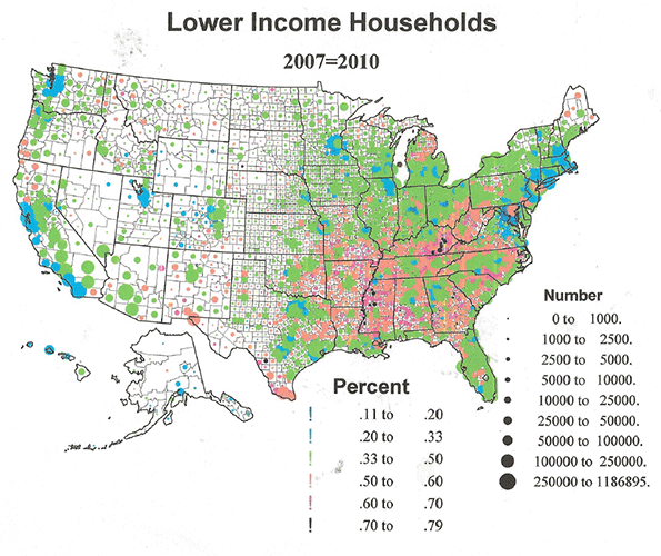
Outside the southern core region, there are several distinct areas of poorer households, (1), core metropolitan counties in Megalopolis (Baltimore, Philadelphia, NJ-NY), (2), heavily Hispanic areas in Texas, along the border with Mexico, (3), Indian reservation areas across the West, (4) and most interesting, several clusters of declining resource dependent counties in ME, northern MI, and a relatively unknown stretch of resource dependent communities in the Pacific Northwest and CA. .
In contrast areas with the lowest shares of low income households include suburban Megalopolis, Minneapolis and Chicago, and the Pacific coastal metropolitan areas in general.
Table 1 lists the very highest share of poorer households for the lower income, < $40,000. The map shows the 30 counties from Table 1 with a higher than 70% share of lower income. These include 11 from Appalachia. Even more counties, 19, are minority dominated. Two are Hispanic and one American Indian. Of the 44 counties with highest share of the poorest category, < $25,000, 14 are in Appalachia, 8 are Hispanic, mostly in TX, 19 are black majority counties in the south, 1 is Indian and 2 are characterized by many poor whites as well as blacks.
| Table 1: Highest shares of low income households | ||
| Counties | Poor % | Mean Income |
| Owsley County, Kentucky | 64.4% | $ 30,654 |
| Brooks County, Texas | 58.0% | $ 38,721 |
| Allendale County, South Carolina | 57.5% | $ 37,662 |
| Breathitt County, Kentucky | 57.0% | $ 36,737 |
| Holmes County, Mississippi | 57.0% | $ 31,294 |
| Zavala County, Texas | 56.7% | $ 30,994 |
| Hancock County, Georgia | 56.2% | $ 30,209 |
| Wolfe County, Kentucky | 56.2% | $ 28,594 |
| Clay County, Kentucky | 55.7% | $ 33,904 |
| Chicot County, Arkansas | 55.5% | $ 37,631 |
| McDowell County, West Virginia | 55.1% | $ 31,002 |
| McCreary County, Kentucky | 55.1% | $ 31,517 |
| Knox County, Kentucky | 54.6% | $ 35,052 |
| Leflore County, Mississippi | 54.6% | $ 35,095 |
| Noxubee County, Mississippi | 54.5% | $ 34,046 |
| Wilcox County, Alabama | 54.4% | $ 34,585 |
| Issaquena County, Mississippi | 54.3% | $ 33,698 |
| Willacy County, Texas | 53.6% | $ 36,137 |
| Magoffin County, Kentucky | 53.3% | $ 36,653 |
| Clinton County, Kentucky | 53.0% | $ 33,799 |
| Jackson County, Kentucky | 53.0% | $ 32,884 |
| Greene County, Alabama | 52.7% | $ 36,678 |
| Lee County, South Carolina | 52.6% | $ 36,284 |
| Hancock County, Tennessee | 52.6% | $ 31,170 |
| Taliaferro County, Georgia | 52.4% | $ 35,122 |
| Galax city, Virginia | 52.2% | $ 39,006 |
| East Carroll Parish, Louisiana | 51.9% | $ 51,241 |
| Quitman County, Mississippi | 51.7% | $ 33,462 |
| Hudspeth County, Texas | 51.5% | $ 34,453 |
| Telfair County, Georgia | 51.4% | $ 34,131 |
| Shannon County, South Dakota | 51.3% | $ 31,875 |
| Kinney County, Texas | 51.0% | $ 36,953 |
| Claiborne County, Mississippi | 51.0% | $ 33,386 |
| Elliott County, Kentucky | 51.0% | $ 34,786 |
| Zapata County, Texas | 51.0% | $ 42,526 |
| Williamsburg County, South Carolina | 51.0% | $ 36,065 |
| Jefferson County, Mississippi | 50.9% | $ 33,777 |
| Starr County, Texas | 50.9% | $ 39,871 |
| Costilla County, Colorado | 50.8% | $ 38,967 |
| Tallahatchie County, Mississippi | 50.8% | $ 34,418 |
| Lake County, Tennessee | 50.7% | $ 37,016 |
| Coahoma County, Mississippi | 50.6% | $ 42,045 |
| Bell County, Kentucky | 50.4% | $ 36,482 |
| Sunflower County, Mississippi | 50.0% | $ 37,361 |
It is fascinating that while the poor black, Hispanic and Indian poorer areas tend to vote Democratic, the northern poor white areas, especially in Appalachia, now generally support Republicans.
Middle income households: $40,000-$100,000
While it could be argued that my $40 to $100k range is too narrow for middle classes, I don’t think so, at least for most areas, and I feel that the data reveal the income polarization of American society, with middle classes getting squeezed by the rising shares of the poorer and richer.
From the map the most telling feature is how sparse are counties with the highest shares of middle incomes. There is a polarization, reflecting a processes of deindustrialization, and the increasing income disparities between professional and the new service workers. Shares over 40% are predominantly suburban and exurban in the eastern half of the country. They are well represented across the South, most prominently in TX, OK, TN, and VA, but far more pervasive in the Midwest, most notably in MN (greater Minneapolis), WI, IA, MO, IL, IN, and to some degree around cities that still have an industrial base and/or a productive hinterland. A secondary set of counties with high middle income shares are spread across the Mountain West, but different in character, often rural to small city, and notably in UT, CO, and WY. Note their total absence in mighty CA, where the middle class, as we define it, is clearly shrinking.
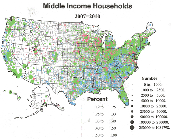
In table 2 I list the 45 counties with 46 to 64% middle income shares. Many are quite small and none is very populous. The state with the most such counties is UT, then MN, CO, VA, NE, and IA. It may be significant that Utah has by far the highest share of these high middle income counties. Generally counties with high shares of middle class households have the lowest income inequality.
| Table 2: Highest shares of middle income households | ||||
| Counties | Mid-Income Households | Low Income % | Mid-Income % | High Income % |
| Skagway Municipality, Alaska | 206 | 16.8% | 53.4% | 27.2% |
| Craig County, Virginia | 1,045 | 32.9% | 52.5% | 10.0% |
| McPherson County, Nebraska | 104 | 27.5% | 51.0% | 5.9% |
| Reagan County, Texas | 581 | 27.7% | 50.9% | 14.2% |
| Bath County, Virginia | 1,029 | 36.6% | 50.8% | 5.6% |
| Rich County, Utah | 386 | 24.7% | 50.7% | 12.1% |
| Tooele County, Utah | 8,937 | 27.5% | 50.4% | 18.0% |
| Storey County, Nevada | 912 | 28.4% | 49.9% | 18.0% |
| Moody County, South Dakota | 1,281 | 33.5% | 49.4% | 9.6% |
| Manassas Park city, Virginia | 2,071 | 17.9% | 49.2% | 28.5% |
| Iowa County, Iowa | 3,230 | 35.0% | 48.5% | 12.9% |
| Grundy County, Iowa | 2,442 | 32.9% | 48.4% | 13.5% |
| Lyon County, Iowa | 2,095 | 38.4% | 48.0% | 8.4% |
| Grand County, Colorado | 2,557 | 28.8% | 48.0% | 18.9% |
| Chisago County, Minnesota | 9,267 | 26.6% | 47.9% | 20.8% |
| Lincoln County, Wyoming | 3,094 | 32.5% | 47.8% | 15.7% |
| Greenlee County, Arizona | 1,586 | 38.5% | 47.7% | 6.3% |
| Box Elder County, Utah | 7,436 | 32.8% | 47.6% | 13.9% |
| King William County, Virginia | 2,814 | 26.7% | 47.6% | 20.7% |
| Lincoln County, South Dakota | 7,494 | 25.2% | 47.5% | 23.4% |
| Teton County, Idaho | 1,791 | 32.8% | 47.3% | 14.1% |
| Routt County, Colorado | 4,766 | 22.6% | 47.0% | 21.9% |
| Paulding County, Georgia | 21,807 | 28.7% | 47.0% | 18.9% |
| Sherburne County, Minnesota | 13,684 | 22.2% | 46.8% | 26.7% |
| Juab County, Utah | 1,422 | 34.8% | 46.7% | 13.8% |
| Calumet County, Wisconsin | 8,505 | 27.7% | 46.6% | 20.6% |
| Wayne County, Utah | 418 | 37.5% | 46.5% | 13.3% |
| Dodge County, Minnesota | 3,392 | 27.3% | 46.5% | 21.7% |
| Sioux County, Iowa | 5,351 | 37.3% | 46.4% | 10.0% |
| Stanton County, Kansas | 339 | 34.6% | 46.4% | 8.9% |
| Iowa County, Wisconsin | 4,498 | 35.3% | 46.3% | 14.1% |
| Cameron Parish, Louisiana | 1,233 | 35.1% | 46.3% | 16.4% |
| Nicollet County, Minnesota | 5,624 | 31.7% | 46.3% | 16.1% |
| Wabaunsee County, Kansas | 1,272 | 39.3% | 46.3% | 11.1% |
| Wasatch County, Utah | 3,308 | 24.5% | 46.2% | 23.9% |
| Pershing County, Nevada | 914 | 37.6% | 46.2% | 11.2% |
| Ouray County, Colorado | 783 | 30.0% | 46.0% | 19.0% |
| Morgan County, Utah | 1,247 | 21.0% | 45.9% | 27.0% |
| Park County, Colorado | 3,248 | 24.1% | 45.9% | 24.0% |
| Logan County, Nebraska | 147 | 42.8% | 45.9% | 4.4% |
| Carson County, Texas | 1,109 | 34.9% | 45.9% | 16.1% |
| Emery County, Utah | 1,735 | 38.4% | 45.9% | 9.6% |
| Cass County, Nebraska | 4,408 | 27.5% | 45.9% | 21.2% |
| Jasper County, Indiana | 5,602 | 33.7% | 45.8% | 15.0% |
| Polk County, Nebraska | 1,019 | 40.1% | 45.7% | 8.6% |
High Income counties
The geography of higher income counties is again completely different - and rather amazing. Higher shares of richer households are located overwhelmingly in large metropolitan areas in all regions of the country, predictably but most dominant around greater New York City. The few rural small town counties are generally the resort playgrounds of the rich, as found in CO.
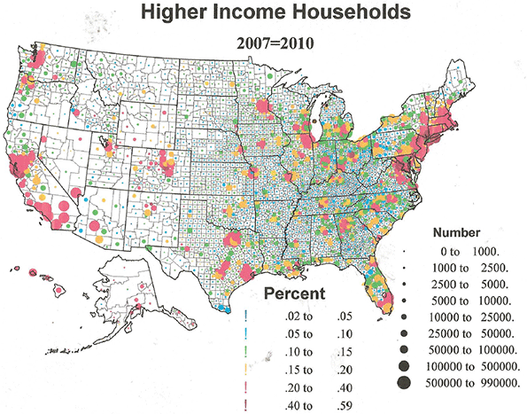
Table 3A lists the counties with the highest shares of higher incomes (>$100,000). Of the 32 higher income counties, 23 are in Megalopolis, including the 3 richest areas, from 53% to 59% high income. Of the 32 richest counties, 11.1% to 19% of the households are above $200,000, again 22 counties are in Megalopolis, then 4 in CA (Bay Area).
| Table 3A: Highest share of rich households | |||
| Counties | Rich % $100-200,000 | Rich % Above $200,000 | Mean Income |
| Falls Church city, Virginia | 35.4% | 19.6% | $ 134,264 |
| Hunterdon County, New Jersey | 33.0% | 17.5% | $ 130,723 |
| Fairfax County, Virginia | 35.8% | 17.4% | $ 132,662 |
| Loudoun County, Virginia | 41.7% | 17.4% | $ 134,098 |
| Marin County, California | 28.2% | 16.8% | $ 128,544 |
| Somerset County, New Jersey | 32.6% | 16.0% | $ 129,222 |
| Fairfield County, Connecticut | 25.0% | 16.0% | $ 130,074 |
| Westchester County, New York | 24.7% | 15.8% | $ 128,127 |
| New York County, New York | 19.5% | 15.8% | $ 122,620 |
| Morris County, New Jersey | 32.7% | 15.6% | $ 128,371 |
| Howard County, Maryland | 36.3% | 15.4% | $ 123,234 |
| Montgomery County, Maryland | 31.6% | 15.3% | $ 125,557 |
| Pitkin County, Colorado | 20.0% | 15.1% | $ 134,267 |
| Arlington County, Virginia | 32.4% | 15.1% | $ 121,315 |
| Nantucket County, Massachusetts | 26.3% | 14.4% | $ 137,811 |
| Nassau County, New York | 33.0% | 13.9% | $ 121,567 |
| San Mateo County, California | 29.1% | 13.8% | $ 118,774 |
| Santa Clara County, California | 30.3% | 13.5% | $ 113,161 |
| Skagway Municipality, Alaska | 14.2% | 13.0% | $ 93,822 |
| Fairfax city, Virginia | 35.4% | 12.6% | $ 114,007 |
| Goochland County, Virginia | 27.9% | 12.5% | $ 118,743 |
| Los Alamos County, New Mexico | 40.3% | 12.3% | $ 117,400 |
| Williamson County, Tennessee | 31.1% | 12.3% | $ 114,801 |
| Bergen County, New Jersey | 28.4% | 12.1% | $ 111,219 |
| Borden County, Texas | 16.4% | 11.9% | $ 93,417 |
| Chester County, Pennsylvania | 29.6% | 11.8% | $ 110,798 |
| San Francisco County, California | 24.9% | 11.7% | $ 102,267 |
| Monmouth County, New Jersey | 29.3% | 11.7% | $ 109,042 |
| Alexandria city, Virginia | 28.4% | 11.2% | $ 110,671 |
| Norfolk County, Massachusetts | 28.7% | 11.2% | $ 108,887 |
| Douglas County, Colorado | 38.4% | 11.1% | $ 117,692 |
| Rockland County, New York | 30.1% | 11.1% | $ 105,450 |
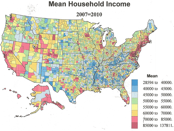
Table 3B which lists the 37 counties with the highest MEAN incomes, including 9 around Washington DC, 8 around New York, and 3 around San Francisco, reinforcing the fact of the concentration of wealth.
| Table 3B: Mean Income (highest) | |||
| County | Rich % $100-200,000 | Rich % Above $200,000 | Mean Income |
| Nantucket County, Massachusetts | 26.3% | 14.4% | $ 137,811 |
| Pitkin County, Colorado | 20.0% | 15.1% | $ 134,267 |
| Falls Church city, Virginia | 35.4% | 19.6% | $ 134,264 |
| Loudoun County, Virginia | 41.7% | 17.4% | $ 134,098 |
| Fairfax County, Virginia | 35.8% | 17.4% | $ 132,662 |
| Hunterdon County, New Jersey | 33.0% | 17.5% | $ 130,723 |
| Fairfield County, Connecticut | 25.0% | 16.0% | $ 130,074 |
| Somerset County, New Jersey | 32.6% | 16.0% | $ 129,222 |
| Marin County, California | 28.2% | 16.8% | $ 128,544 |
| Morris County, New Jersey | 32.7% | 15.6% | $ 128,371 |
| Westchester County, New York | 24.7% | 15.8% | $ 128,127 |
| Montgomery County, Maryland | 31.6% | 15.3% | $ 125,557 |
| Howard County, Maryland | 36.3% | 15.4% | $ 123,234 |
| New York County, New York | 19.5% | 15.8% | $ 122,620 |
| Nassau County, New York | 33.0% | 13.9% | $ 121,567 |
| Arlington County, Virginia | 32.4% | 15.1% | $ 121,315 |
| San Mateo County, California | 29.1% | 13.8% | $ 118,774 |
| Goochland County, Virginia | 27.9% | 12.5% | $ 118,743 |
| Douglas County, Colorado | 38.4% | 11.1% | $ 117,692 |
| Los Alamos County, New Mexico | 40.3% | 12.3% | $ 117,400 |
| Williamson County, Tennessee | 31.1% | 12.3% | $ 114,801 |
| Fairfax city, Virginia | 35.4% | 12.6% | $ 114,007 |
| Santa Clara County, California | 30.3% | 13.5% | $ 113,161 |
| Bergen County, New Jersey | 28.4% | 12.1% | $ 111,219 |
| Delaware County, Ohio | 32.3% | 10.6% | $ 110,917 |
| Chester County, Pennsylvania | 29.6% | 11.8% | $ 110,798 |
| Alexandria city, Virginia | 28.4% | 11.2% | $ 110,671 |
Table 3C lists the counties with the most extreme income inequality, characterized by high shares of the poorer and the richer, with lower shares of the middle classes. The list includes both inequality based on high shares of lower income (<$4,000) and higher income (>$100,000), and as estimated from highest shares of the poorest (<$25,000) and richest (>$200,000) households. Many counties are on both lists. New York (Manhattan) and San Francisco top both lists. Other counties prominent on both include Fairfield, CT; Westchester, NY; Norfolk, MA; Monmouth, NY; Contra Costa, CA; Rockland NY; and Goochland, VA – all suburban or exurban. Summit, UT and Pitkin, CO are rural resort areas in the west. Many of the core counties on the lists are high in minority populations, e.g., New York; Fulton, GA; Washington, DC; and Alameda, Contra Costa, Orange, and Ventura, CA.
| Table 3C: Most Unequal Counties | |||
| Counties | <$40k | $40-$100k | >$100k |
| New York County, New York | 35.0% | 26.5% | 35.2% |
| San Francisco County, California | 30.9% | 28.8% | 36.5% |
| Pitkin County, Colorado | 30.0% | 29.8% | 35.1% |
| Fulton County, Georgia | 36.7% | 29.9% | 28.7% |
| Westchester County, New York | 25.7% | 30.1% | 40.6% |
| District of Columbia, District of Columbia | 35.8% | 30.1% | 29.6% |
| Fairfield County, Connecticut | 25.1% | 30.5% | 41.0% |
| Rappahannock County, Virginia | 35.3% | 30.5% | 31.3% |
| Goochland County, Virginia | 25.2% | 30.8% | 40.4% |
| Rockland County, New York | 24.6% | 31.2% | 41.2% |
| Monmouth County, New Jersey | 24.2% | 31.4% | 41.0% |
| Kendall County, Texas | 31.4% | 32.0% | 33.2% |
| Boulder County, Colorado | 32.4% | 32.1% | 31.3% |
| Alameda County, California | 29.6% | 32.5% | 34.1% |
| Norfolk County, Massachusetts | 24.1% | 32.6% | 39.9% |
| Mercer County, New Jersey | 28.7% | 32.9% | 35.0% |
| Middlesex County, Massachusetts | 25.6% | 33.0% | 37.7% |
| Contra Costa County, California | 24.9% | 33.0% | 38.4% |
| Essex County, Massachusetts | 32.6% | 33.1% | 30.6% |
| Summit County, Utah | 23.5% | 33.5% | 38.9% |
| Union County, New Jersey | 30.2% | 33.7% | 32.0% |
| Bristol County, Rhode Island | 30.7% | 33.9% | 31.6% |
| Santa Cruz County, California | 31.2% | 33.9% | 30.8% |
| Napa County, California | 29.4% | 33.9% | 32.4% |
| Richmond County, New York | 29.1% | 34.2% | 33.0% |
| Ventura County, California | 25.1% | 34.6% | 36.1% |
| Orange County, California | 25.3% | 34.6% | 36.0% |
| St. Johns County, Florida | 30.8% | 34.9% | 29.0% |
| Montgomery County, Pennsylvania | 24.5% | 35.2% | 36.3% |
| Oakland County, Michigan | 29.9% | 35.2% | 30.8% |
| Newport County, Rhode Island | 29.4% | 35.5% | 30.3% |
| King County, Washington | 28.4% | 35.6% | 31.8% |
| Placer County, California | 25.6% | 35.6% | 34.6% |
| San Diego County, California | 31.4% | 35.6% | 28.5% |
| Counties | <$25k | >$200k | |
| New York County, New York | 24.5% | 15.8% | |
| San Francisco County, California | 20.9% | 11.7% | |
| Borden County, Texas | 18.9% | 11.9% | |
| Fairfield County, Connecticut | 15.3% | 16.0% | |
| Westchester County, New York | 15.2% | 15.8% | |
| Norfolk County, Massachusetts | 15.0% | 11.2% | |
| Pitkin County, Colorado | 14.6% | 15.1% | |
| Monmouth County, New Jersey | 14.4% | 11.7% | |
| Contra Costa County, California | 14.3% | 10.7% | |
| Rockland County, New York | 14.2% | 11.1% | |
| Bergen County, New Jersey | 13.9% | 12.1% | |
| Santa Clara County, California | 13.5% | 13.5% | |
| Nantucket County, Massachusetts | 13.5% | 14.4% | |
| Goochland County, Virginia | 13.3% | 12.5% | |
| Summit County, Utah | 13.2% | 10.8% | |
| Marin County, California | 13.1% | 16.8% | |
| Lake County, Illinois | 12.6% | 10.9% | |
| Chester County, Pennsylvania | 12.0% | 11.8% | |
| Alexandria city, Virginia | 11.6% | 11.2% | |
| San Mateo County, California | 11.6% | 13.8% | |
| Nassau County, New York | 11.4% | 13.9% | |
| Williamson County, Tennessee | 10.8% | 12.3% | |
| Delaware County, Ohio | 10.7% | 10.6% | |
| Fauquier County, Virginia | 10.5% | 10.1% | |
| Arlington County, Virginia | 10.3% | 15.1% | |
| Putnam County, New York | 10.0% | 10.4% |
It doesn’t take much of a cynic to conclude that the way to get rich is to be around Wall Street (the pinnacle of capital) or around the U.S. Congress, the pinnacle of government largess (including lobbyists for Wall Street). Do you doubt? Please see the final map of mean income. Yes, Seattle, Denver, Chicago, Minneapolis, and Atlanta are represented at the table, as is the San Diego to San Francisco corridor, but Megalopolis dwarfs them all.
As if this were not scary enough, consider the relation between these income figures and how Americans voted in for president in 2012. Without showing a map, I can simply state that the areas that provided the extra millions of votes for Obama are precisely the giant metropolitan areas, suburbs and exurbs as well as core counties, with the highest mean income and shares of the rich. While it is also true that Obama carried poorer minority areas, rural as well as metropolitan, he LOST most areas of poor to middle income whites, urban and rural. Weirdly, both the rich (professionals) and the poor (minorities) in the most unequal counties are cores of Democratic strength. The traditional economic basis for Democrat versus Republican partisan difference has essentially disappeared, replaced by distinctions of culture and race, leading to the current screwed up state of not only our political party system, but of governance more widely, and yes, of society itself.
Richard Morrill is Professor Emeritus of Geography and Environmental Studies, University of Washington. His research interests include: political geography (voting behavior, redistricting, local governance), population/demography/settlement/migration, urban geography and planning, urban transportation (i.e., old fashioned generalist).


Maps misrepresent US poverty
Using counties to define poverty is a poor tool. Counties vary tremendously in population and land area which produces a true apples to oranges comparison on these maps. The first map gives the impression that Appalachian Kentucky has the most poverty in the nation when the truth is that a few square miles in any of our ten largest urban areas dwarfs the number of impoverished in Kentucky east of Knoxville.
I wish the site produced a map that showed the highest concentrations of poverty in uniform areas, say 5 square miles, throughout the country. Then a visitor would get a true idea of where poverty exists in America.