
Although inequality is the current focus of concern with income, it is in the end a story of the rich, the middle and the poor, who of course have not gone away. It is valuable to remind ourselves, particularly the young, about how pervasive poverty was 50 years ago, how poverty declined markedly between 1960 and 1980, after which it has risen again. Most important is to understand what led to the poverty reduction between 1960 and 1980, in order to further understand the power and lure of forces which would return us to the good old days of 1960, or before!. This piece is inspired by the pioneering book from 1970 on the Geography of Poverty, with Ernest Wohlenberg, based on 1960 data. The data updates come mainly from US Census Bureau.
I start with the basic data, the numbers of the poor and the percent below the poverty level for 1960, for 1980 and for 2010, plus a summary table. These are supplemented by some maps of the poverty rates for whites and for blacks (or non-whites), and for the elderly (only available for 1980).
Overall for the nation the poverty rate fell from 22% in 1960 steeply down to 12% in 1980 then moved up moderately to 15% during the current era of rising inequality. I look first at broad patterns of relative poverty for the three times, and then turn to the more interesting or surprising story of the differences in the reduction of poverty across the states, and then the story for whites, blacks and the elderly.
Broad Patterns
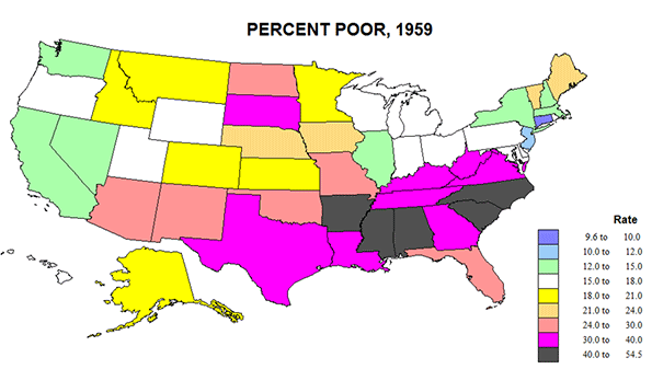
The United States was so different in 1960, with a poor rural south and southwest, and a fairly poor Great Plains. (Figure 1). While the west coast was better off and metropolitan, the main area of lower poverty was the historic urban-industrial core from IL and WI to southern New England, where unionized industry prevailed. CT was richest with less than 10 percent poverty; this compared to MS with a poverty rate of 55! The deep south was amazingly poor and not just for Blacks.
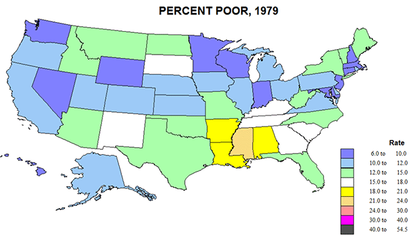
Changes by 1979 were indeed revolutionary (Figure 2). Areas of lower poverty extended from the old industrial core to the rest of New England and down Megalapolis to Virginia, and to the “old northwest”, MN, WI, IA, and to most of the US West. Most improved were the corners of the south, TX, OK, and FL, NC, due to energy development, new industries moving to the south and poor blacks escaping to the north. Only a small lower Mississippi region (AR, LA, MS, and AL) remained fairly poor.
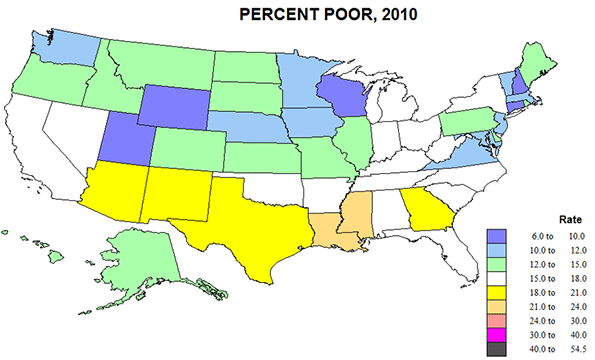
2010 saw a rather general resurgence of poverty – related certainly to globalization and industrial off shoring, deindustrialization in the old northeastern core, and greater poverty across the southern tier from CA to FL, in part related to heavy immigration from Latin America. Some of this shift could, in my opinion, be pegged as well to the shift to more conservative Republican Party rule.
| Numbers of States | |||||||
| White | Black | Over 65 | |||||
| Rate | 1960 | 1980 | 2010 | 1980 | 1980 | 1980 | |
| <12% | 2 | 27 | 14 | 41 | 0 | 11 | |
| 12-18% | 19 | 19 | 30 | 10 | 7 | 21 | |
| 18-24% | 11 | 5 | 7 | 8 | 8 | ||
| 24-40% | 14 | 36 | 11 | ||||
| >40% | 5 | ||||||
Poverty rates fell broadly between 1960 and 1980, especially for the half of states with 1960 rates above the 22% average level, while the number of states with rates below the 1980 average of 12% rose from 2 to 27 states. Rates increased modestly in the ensuing years in the then states with the lowest rates.
The Relative Fates of States
Several states fared relatively best, with poverty rates falling at least in half or more in 2010 than in 1980. These are in two disparate sets: first southern states with very high poverty in 1960: AL, AR, KY, MS, NC, and VA, and another northern set in ME, NE, NH, ND, SD, UT, and VT. Other states in which poverty rates fell at least in half, but were lower in 1980 than in 2010 include GA, IA, SC, and TN. FL and TX poverty rates fell to less than half the 1960 rates in 1980, but poverty growth by 2010 showed some back-tracking. At the other extreme three states actually had higher rates of poverty in 2010 than way back in 1960: CA, NV, and NY.
The particular gains for the south reflect two dominant forces, the out-migration of large numbers of black people to the north and west, slowing the reduction in poverty rates for the north and west, as well as the successful shift of industry from the north to the south, both forces including millions of families and of jobs. TX and FL stand out because of high migration from Latin America. The exceptional story of CA and NY is similarly one of massive migration of minorities from the rest of the country but of even larger immigration from Latin America. The opposite story of very low poverty in NH, VT, and ME is one of overflow of opportunities and wealth from Massachusetts. The reason for ND, SD, NE, and UT is pre-oil development, and reflects broader forces for poverty reduction.
Poverty in White and Black
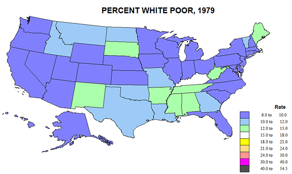
White poverty rates fell from 17 to 9.4 in 1979 but then edged up to 10% in 2010. At the same time, black poverty rates fell from a horrendous 55% in 1959 to just under 30% in 1979 and appears to have remained at 30 in 2010. Note that black poverty rates remain three times that of whites, and are comparatively as high as they were in 1959. The gap remains worse (Figure 6) in the south and extreme generally across the north, but much lower in places like the Dakotas and upper New England in 1979 in part because of small numbers, and also due to the fact that the 1959 rates included Native Americans while the 1979 numbers did not. The only good estimates for white poverty were for 1979, and reveal a remarkable uniformity across much of the country, lagging slightly in Appalachia-Ozarkia. (Figure 5)
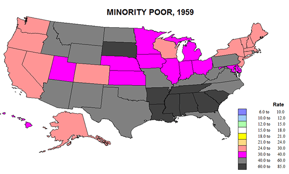
Meanwhile, rates for blacks fell more in the parts of the South SC, VA, NC, FL, and TX, but even more so in the historic ”black belt” of AL, LA, MS, AR, and SC where the poverty rate dropped from 77 to 33 %. Less improvement is evident for early northern destinations of blacks from the south: NY, IL, MI, OH, and NJ, or in CA and OR.
Please refer back to the table. While whites had rates below 12% in 46 states, for blacks the number is 0. While 0 states had white rates above 18%, 44 states had black rates above 18%. This is shameful. I am unable to find any positive spin for this story. The racial gap remains deeply entrenched.
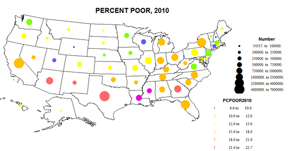
I close with a variant of the 2010 poverty map, showing the absolute numbers as well as the rates (Figure 8). Poverty remains serious across the southern tier, especially on CA, TX and GA, but also in the north, especially in NY and the eastern Great Lakes states. While direct causality is unlikely, one can understand the worry of the increased numbers and shares of the poor clear across the southern tier of the country- CA to FL.
Poverty of the Elderly
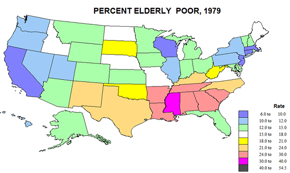
Compared to the generally poor picture of black poverty, the story for the elderly is much more positive. If anyone won the “war on poverty”, it was the elderly. Is this because of their political clout? Not just that, but it obviously matters. The data for 1959 and 2010 are not fully comparable, so the only map is for 1979. But the elderly poverty rate in 1959 was a striking 46 percent, not that much below the outcast blacks, so the fall in the rate to under 15% in 1979 is quite astonishing. The reasons for this are discussed below. Here we can compare the pattern for elderly with that for all persons.
Actually the correlation between age and poverty is quite high; elderly rates average about 5% above those for all people. CA, AZ, FL, and NY achieved lower senior poverty rates in 1979 than for all persons, probably a result of selective migration, perhaps a role of political influence in AZ and FL.
Why did poverty fall so much from 1960 to 1980, and then increase again? This is no big mystery! The two powerful and complementary forces reducing poverty were America’s robust economic expansion, in the 1960s especially, combined with social programs, starting with the New Deal (especially Social Security and the minimum wage), and the era of union growth, followed by the 60s Civil Rights revolution, including women’s rights, and the Great Society’s War on Poverty, above all Medicare and Medicaid. Of course these programs had to be paid for, but this was accomplished by vast economic investment and gains in productivity of the economy.
The elderly were a huge part of poverty in 1960 but a relatively low part by 1980. And despite the nation’s ongoing inability to overcome racial discrimination and unrest, the social programs have greatly helped the emergence of a black middle class, as much in the south as in the north.
Factoring in the Cost of Living
But wait! Isn’t the cost of living higher in New York and San Francisco than in West Virginia and Nebraska? Should this affect the estimates of poverty across the state? The answer is yes, and fortunately, the Census Bureau has just completed a new series of poverty estimates for 2010-2012 adjusting for variations in the cost of living, and compared these to their official figures. The effects are not trivial.
Essentially, the cost of living is significantly higher in the biggest, densest and richest metropolitan cores, and correspondingly lower is most of the rest of the country. The higher costs in these few giant but populous places is sufficient to raise the number in poverty nationally, by 2.6 million, raising the US rate from 15.1 to 16 percent.
The critical states for underestimating poverty are actually few: CA, 2,750,000 more, up 7.3%: NJ, 415,000 more, up 4.8%; FL, 771,000 more, 4.1%; MD, up 195,000, up 3.3%; NV, 102,000, 3.8%; and NY, up 308,000, 1.6%. California dominates the rise in poverty, by itself adding more poor than the country as a whole. But some other states with big metropolitan areas do not suffer this cost of living adjustment: TX, -338,000. -1.3%; OH, -252,000, -2.2%; MI, -130,000, -1.3%; IN -106,000, -1.7%; and NC, -249,000, 2.6%. I do not know that these states have in common, perhaps less stringent growth management and lower tax rates.
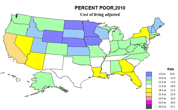
There are seven states with a drop in the number of poor of 3% or more after adjusting for cost of living, including MS, -136,000, -4.6%; NM, -86,000, -4.2%; WV, -75,000, -4.3%; and KY, -165,000, -3.8%. As a consequence, we end up with a US pattern that is counter-intuitive, and contrary to conventional long-term wisdom about poverty. Big, rich mega-urban California earns the nation’s highest poverty rate as well as in total numbers (24%), followed by DC with 22.7; NV, 19.8; and FL, 19.5. Long maligned poor states like MS has the same rate as the country, at 16%, AR, 16.5; SC, 15.8; and especially extreme, WV, 12.9 and KY, 13.6. Rather than having the lowest poverty rate at 9.6, CT moves up to 12.5, while IA, 8.6; ND, 9.2; WY, 9.2; and MN, 9.7, fall below 10% poor. Counter-argument can be made that the story is not so different as first appears, if the richest states with higher cost of living also tend to have higher levels of services to those in poverty. But this has not been measured.
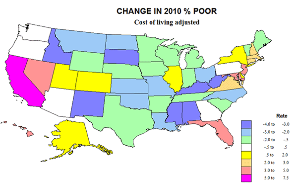
Perusing the two new maps of the percent poor in 2010,cost of living adjusted, and the change in rates and numbers, highlights the key role of California-Nevada and of Megalapolis-Florida, historic cores of urban wealth, are also incubators of higher poverty. This also supports the idea that that immigration from Latin America must play a role in the heightened poverty along most of the southern border, and especially California. The curse of poverty remains everywhere, but it’s clearly become more severe in some places, and less so in others.
Richard Morrill is Professor Emeritus of Geography and Environmental Studies, University of Washington. His research interests include: political geography (voting behavior, redistricting, local governance), population/demography/settlement/migration, urban geography and planning, urban transportation (i.e., old fashioned generalist).


the demographics shows that
the demographics shows that the poverty of US citizens are increasing in an alarming manner buy youtube worldwide views
This also supports the idea
This also supports the idea ,M88bet online – Link m88 casino asia
Wow! What a great article -
Wow! What a great article - full of information. Thanks for taking the time to put that together for all of the readers!
Sincerely,
Rick in Phoenix
Scottsdale Homes
"But some other states with
"But some other states with big metropolitan areas do not suffer this cost of living adjustment: TX, -338,000. -1.3%; OH, -252,000, -2.2%; MI, -130,000, -1.3%; IN -106,000, -1.7%; and NC, -249,000, 2.6%. I do not know that these states have in common, perhaps less stringent growth management and lower tax rates."
The simplest explanation is that these states are generally "lower housing cost" and/or "lower food cost" and/or "lower energy cost" states. Since those three expense categories (shelter, food, transportation/heating/cooling) are a significant portion of the spending on necessities, in places where those costs are lower more working poor people at the margins can pay for them.
All the listed states with significantly lower living costs are significant agricultural (food) production states. And these states' largest metros have few physical or political barriers to geographic expansion in all directions so housing is cheaper than in places with constraints. All but NC have significant oil refining operations, which reduces the local price of gasoline, and most of the listed states rely heavily on coal-fired electricity and natural gas for home energy as opposed to more-expensive sources.
Putting the Carreer Ladder Out of Reach
In that last graph of changes in poverty, the Republican-leaning states tended to do better than the Democratic-leaning ones. It's not a perfect correlation, to be sure, but higher payroll taxes, minimum wage increases and other regulations have often made it harder to get that first rung on the job ladder.
They might benefit those who have managed to climb onto that career ladder, but those reaching for the first rung have a harder time these days.