NewGeography.com blogs

Interactive Data Visualization: The Connection Between Manufacturing Jobs and Exports

By Hank Robison and Rob Sentz

We recently observed that there are only about 50 manufacturing sectors out of 472 (6-digit NAICS) that actually gained jobs over the past 10 years. This made us wonder because we keep hearing that manufacturing output is actually improving. Politicians and policymakers tend to assume that an uptick in output would naturally result in an uptick in employment. So we investigated.

What we found

We placed national export data on top of job totals for each of the 472 manufacturing sectors, and found that manufacturing exports (inflation-adjusted) actually grew by 56% from 02-10 while manufacturing jobs contracted by 23%. Growth in exports have clearly not resulted in more domestic jobs. See the interactive graphic at the bottom of this post for a visualization.

Across the manufacturing sectors we are actually seeing a predominantly inverse relationship between jobs and exports. To explore this further, we placed each of the 472 industries into one of four categories (again see the graphic):
1) Those that gained both exports and jobs,
2) Those that gained exports but lost jobs,
3) Those that lost exports but gained jobs, and
4) Those that lost both exports and jobs.

Some observations

Those advocating for increased exports as a way of resuscitating jobs in manufacturing need to look at this data. Only 11% of all manufacturing sectors showed gains in jobs and exports, which is not a huge surprise given manufacturing decline. 19% lost jobs AND exports at the same time. Now here is the stat really worth noting — 71% of all manufacturing sectors increased their exports while decreasing their domestic workforce.

There are some political ramifications here. The Obama Administration has proposed exports as a key to kick-starting the U.S. labor market (see this post from Brookings). Economists and policy experts as well as all of us here at EMSI are huge fans of improving exports. Exports are a principal source of foreign exchange and an important driver for U.S. goods. Export industries also tend to pay higher wages and connect with the rest of the economy through greater multiplier effects, which mean they are key for income and job formation.

However, as the data suggests things are not that simple. Domestic manufacturers appear to be outsourcing large parts of their work to foreign suppliers. In the process, they employ fewer domestic workers but become more competitive in foreign markets. As a result, exports go up while employment goes down. This is something that policymakers need to consider before pinning too much hope on exports as a way of reviving manufacturing sector employment.

Conclusion

There may be a conflict of goals here. On one hand we want high-wage, high-benefit jobs; on the other, “full employment.” But in manufacturing can we have both? If wages, and benefits are pushing producers to outsource then either wages go down (an unattractive prospect), or we adopt policies that spawn productivity growth needed to support high-wages. Are there any other choices?

Data Graphic

In this interactive graphic, you can explore EMSI’s data on manufacturing jobs and exports. The data is based on 4-digit NAICS manufacturing sectors. NOTE: 6-digit data was used in the previous analyis.

Click on the chart to highlight an industry or use the drop-down box. Data in the top half of the graphic shows percentage change in jobs (on the y-axis) and exports (on the x-axis). The bottom line graph simply compares manufacturing jobs and exports over time.

As we highlighted above, 71% of all manufacturing sectors increased their exports while decreasing their domestic workforce from 2002 to 2010.

For more information, email Rob Sentz.

Development Plans for Old Hong Kong Airport Announced

The government of the Hong Kong Special Administrative Region has outlined plans to create a "second central business district" at Kai Tak in eastern Kowloon, site of the now former international airport. Kai Tak airport was abandoned in 1998 when the new Hong Kong International Airport at Chep Lap Tok opened.

Kai Tak is in the middle of the most dense urban development in the high income world. The government intends that the development will have 43 million square feet of office space (4 million square meters) and will cost HK$100 Billion (approximately $13 billion).

The development would be served by a monorail, which would connect with MTR (metro) lines at Kwun Tong and to a proposed central link MTR line to the new town of Sha Tin.

Photo: Kai Tak Airport and East Kowloon (by author)

Placing Amtrak Records in Context

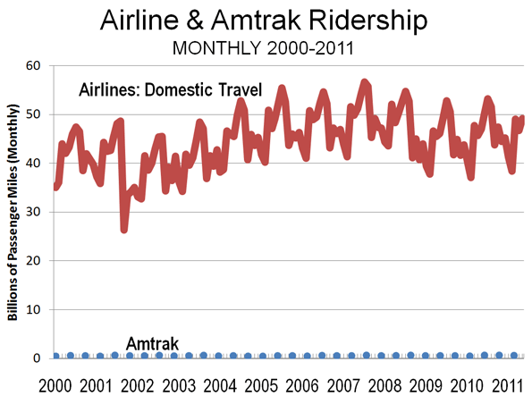
The state of Michigan recently announced record ridership on three routes supported by Michigan taxpayers. Records mean little when the numbers are insignificant.

That, to say the least, is the situation with Amtrak in Michigan. For example, the additional passengers (this year versus last) on the Pere Marquette (between Chicago and Grand Rapids) was small enough to be carried in a once daily round trip by an airport shuttle van. The additional passengers on the Wolverine, which operates from Detroit to Chicago would not have filled a single intercity bus operating each way on a daily basis. The same is true of the Blue Water, which operates between Port Huron and Chicago.

But there's more. High quality bus service, featuring on-board high speed wireless internet (wi-fi), costs passengers less between Detroit and Chicago and takes about the same time. There is a big difference, however. Train riders are subsidized by taxpayers, while bus riders pay their full fare. Even so, the unsubsidized bus fares are lower than the subsidized train fares.

In a nation that needs to cut spending, unnecessary transportation subsidies, such as for intercity rail services should be at the top of the list.

OECD Cites Shorter US Work Trip Travel Times

Catherine Rampell of The New York Times describes a new Organization for Economic Cooperation and Development report concluding that Americans have among the shortest work trip travel times in the developed world (Link to chart in The New York Times).

Out of 23 OECD nations, only three have shorter one way work trip travel times than in the United States. These are Sweden, Denmark and Ireland. These are nations without the larger metropolitan regions that characterize the United States and some other nations. For example, the largest metropolitan area in these three nations, Stockholm, with barely rate among the top 30 in the United States.

The OECD report confirms similar earlier data, such as from Eurostat on the relative ease of commuting in the United States.

The US average of 28 minutes to and from work was 10 minutes less than the OECD average and 9 minutes less than Canada. South Korea, with the highest urban densities in the high income world, had an average one-way commute time approximately double that of the United States.

Among the nations in the survey, the United States has the lowest urban population densities. This reality is at odds with the contentions of some analysts who have associated longer travel times and greater traffic congestion with lower urban population densities.

But shorter commute times are about more than density. This is illustrated by comparing the Los Angeles and Toronto urban areas. The two urban areas have almost identical population densities, at 7068 and 7040 persons per square mile respectively (2,729 and 2,718 per square kilometer). The density of the core areas is similar with proportions of land areas at above 10,000 persons per square mile (4,000 per square kilometer). The most important differences are that in Los Angeles, the transit commuting share is one third that of Toronto, and automobile commuting is more prevalent. Employment in Los Angeles is much more dispersed, with less than 5% of jobs being in the downtown area (central business district), compared to approximately 15% in Toronto.

Each of these factors might be thought to contribute to longer commuter times for those in Los Angeles. However, one way commute times in Los Angeles are nearly one-third less than in Toronto. The latest data indicates that the work trip averages 28 minutes in Los Angeles and 40 minutes in Toronto.

This illustrates important dynamics of commuting and mobility. The keys to shorter commutes in the US are adequate roads, personal mobility (the US has the highest share of travel by automobile) and decentralization (lower density) of both jobs and housing.

------
Addendum:

Commenting on the same report, the Washington Post's Brad Plumer stumbled into fantasyland:

The Department of Transportation found that, in 2009, commutes by private car took, on average, 23 minutes. Public transportation, by contrast, took an average of 53 minutes. You could read that as an argument that more people should drive so that their commutes are shorter or as an argument that we need to bolster public transportation.

The idea of bolstering transit to equal car travel times is empty romanticism. Today, only 7 percent of metropolitan area workers can reach their jobs in 45 minutes by transit, according to the Brookings Institution (see Transit: The 4 Percent Solution). To cut transit travel times in half, and making it available to all of the metropolitan area is unrealistic.

How Cities Grow: Dispersion, not Densification

Analysts occasionally note that urban areas ("cities") are becoming larger and denser. This is only half right. It is true that most of the world's urban areas are becoming larger, with megacities like Delhi, Jakarta, Shanghai, Beijing and Manila adding more than five million people in the last decade and most other urban areas are growing, but not as fast.

Understanding Urban Areas: However almost without exception, urban areas are getting less dense. Because there is so much confusion about city "definitions," a clarification is required. The only geography for which overall urban density can be measured is the urban area, which is the area of continuous development. The urban area is not constrained by municipal or other jurisdictional boundaries and does not include rural (undeveloped) territory, even if it is in a "central city" (such as Rome, Ho Chi Minh or Marseille, with their expansive boundaries). An urban area is also different from a metropolitan area, because metropolitan areas (as labor markets) always include rural territory, which is by definition not urban.

1960-1990 Data: Historical urban population density is not readily available. Kenworthy and Laube were pioneers in this area, publishing estimates from 1960 to 1990 for a number of urban areas. That data indicates density losses in the more than urban areas for which they were able to develop comparable data. The world average decline was 20 percent, ranging from 15 percent in the United States to 29 percent in Europe and 33 percent in Australia. While Tokyo was doubling in population, its population density was dropping 17 percent between 1960 and 1990. While Zurich was adding 21 percent to its population, it was becoming 13 percent less dense.

Recent Data: The dispersion continues, which is indicated by these high-income world cases:

Today, the ville de Paris has 700,000 fewer people than at its peak, and inner London (generally the former London County Council area) has lost more than 1,500,000 people since its peak. All growth has been in lower density suburban areas in both the London and Paris urban areas.

In the United States, urban areas with more than 1,000,000 population more than doubled in population from 1950 to 2000 (2010 data not yet available), while the population density dropped by nearly one-third. Detailed analysis indicates that this trend has continued over the past decade in New York, Los Angeles, Chicago, Dallas-Fort Worth, Seattle, St. Louis and other major US urban areas.

The dense core city of Seoul has been losing population and all growth has been in the suburbs, which are lower density.

The dense urban core of Milan has experience substantial population losses, while the less dense suburbs have captured all the growth.

Dispersion is not limited to high income urban areas, with declining densities in evidence across lower and middle income nations as well. For example:

Nearly all of the growth in Jakarta has been in the suburbs for the last 20 years, while the core has gained little in population. The net effect is a less dense, but much larger urban area, because the suburbs are not as dense.

Nearly all of the growth for 30 years in Manila has been in the suburbs, while the core city. Again, the urban area has become much larger, but much less dense because the suburbs are much less dense.

The dense core of Shanghai has lost population and all growth has been in the suburbs, which are lower density.

The population in the dense core of Beijing has nearly stopped growing, with nearly all population in the suburbs, which are lower density.

The core of Mumbai has lost population in two of the last three census periods, while all growth has been in the suburbs, which are lower density.

The urban core of Mexico City has been declining in population since 1960 and all of the growth has been in the suburbs, which are less dense.

The dense core city of Buenos Aires has fewer people today than in 1947, while at least 8 million people have been added to nearly 1,000 square miles of lower density suburbs.

Urban growth continues to be overwhelmingly in less dense suburban areas, rather than in the more dense urban cores, and as a result even as urban areas grow, they become less dense. This is how cities grow.