
Texas Governor Rick Perry entered the Republican presidential nomination race bragging about the job creation record of Texas during his term as his primary pitch to a nation starved for jobs. This triggered a flurry of debate on whether or not Texas is really all Perry claims for it. But while there is certainly nuance in numbers, and Texas doesn't win on every single measure, on the whole it seems indisputable that Texas did very, very well during the 2000s.
This may or may not be the doing of Perry. Nor are the national struggles clearly the fault of Obama. The man at the top always reaps the credit for the blame for what happens on his watch, but the realities of the modern economy are quite complex and there's only so much influence a governor or president has – and that usually comes with a lag. Nevertheless, the Texas story can't simply be discounted.
Let's take a look at the top level data. While reviewing, keep in mind that the data for the US as a whole actually includes Texas. If you stripped the Texas data out of the US total, the comparisons would generally get even better for the Lone Star State.
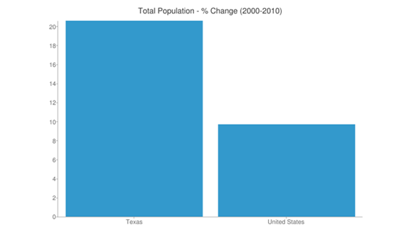
Population
The root of the Texas story is in its massive population growth during the last decade. While historic growth champions like California stumbled, Texas powered ahead, adding 4.3 million new residents for a growth rate of 20.6% - double that of the 9.7% US average.
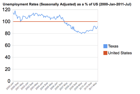
Unemployment
Despite challenging times at both the beginning and end of the decade, Texas actually managed to keep those people busy at work too. While it started out the decade with an unemployment rate above the US average, by decade's end, with population growth and all, it was well below it:
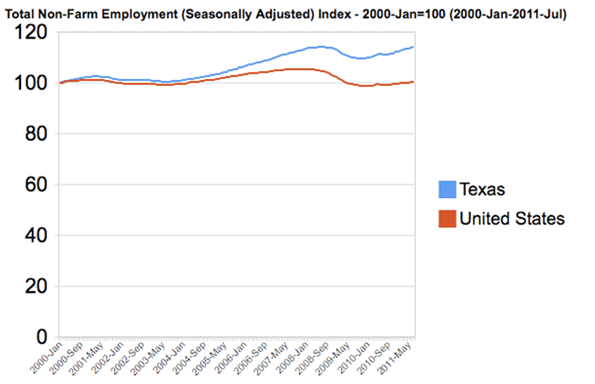
Jobs
One reason Texas was able to keep its unemployment rate under control is that it added jobs – nearly a million between 2000 and 2010 in a nation that lost jobs during that period. The chart below, rendering the US and Texas on the same base, shows that the two moved closely in tandem during the first half of the decade, followed by an ever-widening gap in Texas' favor.
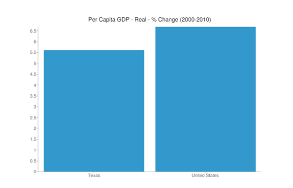
Gross Domestic Product
It's not enough, perhaps, to merely ask if there are more jobs. Are these jobs that are producing significant economic output, as measured by statistics like GDP? Looking at the data, we see that Texas again outperformed.
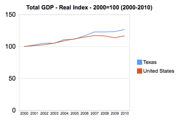
This one, however, can mislead if looked at alone. With all that population and job growth, of course Texas' GDP would go up. When considering the average output, GDP per job or GDP per capita is a better measure. The latter is reported by the US government, and shows that Texas actually fell short on boosting this figure. Texas GDP per capita is slightly higher than the US average, but it fell during the decade from 104.7% of the US to 103.7%.
Personal Income
Another way to look at this is by examining personal income. As with GDP, the total values are highly correlated with population and job growth. The per capitas tell the story. In this case we see a mirror image of GDP, with Texas somewhat trailing the average, but growing faster than the nation as a whole, improving from 94.0% of the US average to 97.3%.
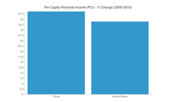
Interestingly, the portion of personal income attributable to earnings is higher in Texas than in the US, on both a percentage and per capita basis. Texas trails the US average because it lags in investment income and transfer payments, which have nothing to do with the quality of jobs.
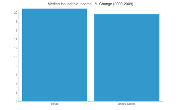
Household Income
Household income gives an almost identical tale. Texas is below average but caught up during the 90s, going from 95.1% of the US average to 96.1%
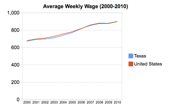
Wages
More directly, we can look at the wages being paid in Texas, which flipped from lower to higher than the US average during the 2000s, though tracking extremely closely the entire way:
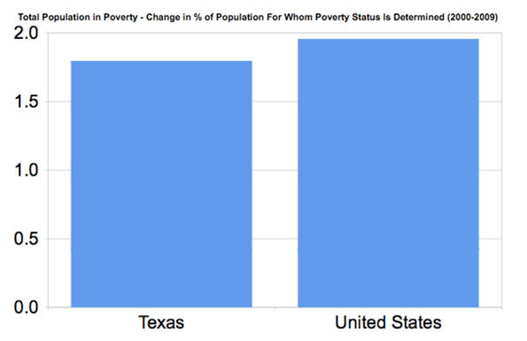
Poverty
Lastly, the poverty rate is higher in Texas than in the US as a whole – 17.2% vs. 14.3%, not a small difference. However, the gap actually narrowed between the two during the 2000s, as the chart below in the percentage point change in the poverty rate illustrates.
Conclusion
While every statistic isn't a winner for Texas, most of them are, notably on the jobs front. And if nothing else, it does not appear that Texas purchased job growth at the expense of job quality, at least not at the aggregate level. There are certainly deeper places one might drill into and find areas of concern or underperformance, but that's true of everywhere. And these top line statistics are commonly used to compare cities and states. Unless Texas critics are ready to retire these measures from their own arsenal, it seems clear that Texas is a winner. The Texas story is real.
Aaron M. Renn is an independent writer on urban affairs based in the Midwest. His writings appear at The Urbanophile, where this piece originally appeared. Telestrian was used to analyze data and to create charts for this piece.
Photo from Governor Rick Perry's flickr photo stream.


here are certainly deeper
here are certainly deeper places one might drill into and find areas of concern or underperformance, but that's true of everywhere. And these top line statistics are commonly used to compare cities and states. Unless Texas critics http://www.lubietopale.pl/c1,e-papierosy are ready to retire these measures from their own arsenal, it seems clear that Texas is a winner. The Texas story is real.
The graphics were very
The graphics were very useful for understanding the article, thank you. Regards, http://www.femme-ukraine.com/en/ Russian women in Canada
This is great story that you
This is great story that you have shred in you blog and is really nice and the things that has been entitled her is unbelievable and here they are comparing all poverty ,income, wages etc and also the graphical comparison shown here is easy for analyzing those things. OmniTech Support Scam