
We earlier mapped inequality of the US states. Now I show the geography of inequality for metropolitan areas over 1,000,000. These measures of inequality are gini coefficients, calculated by the US Census Bureau for 2005-2009. These indicate how amazingly severe inequality, or the concentration of income and wealth at the top, has become. The gini is a measure of the departure of a curve of accumulated income, ranking from the poorest to the richest. The current US gini is .467, up from .39 back in 1974, and much higher than other rich countries, such as Canada at .32, Germany at 27, France at .33, and Sweden at .23.
Interpretation of these indices is relative. Even the lowest value, for Salt Lake City, is absolutely high compared to high-income-country norms, or even our own recent past. But in the contemporary US context, ginis from .41 to .44 are low, between .44 and .447 medium low, .448 to .46 moderate, .46 to .47 moderately high, and over .47 very high inequality. Note that the US average is .467, and that most of the metropolitan areas are below that. This is a reflection of the demographic influence of the high levels of inequality of the following few large metropolitan areas:
| Region | Population | Gini |
| New York | 18.9 million | 0.502 |
| Miami | 5.5 | 0.493 |
| LA | 12.8 | 0.484 |
| Houston | 5.6 | 0.478 |
| San Francisco | 4.2 | 0.473 |
These national or regional capitals are highly unequal because of the concentration of wealthy families or wealth-producing sectors like finance. Other contributors are a dearth of middle income jobs and large numbers of the poor. These higher than the US average metro areas are joined by three southern metropolitan areas, New Orleans, Memphis, and Birmingham, where in equality is more explainable instead by racial inequality.
Metro areas around or just below the national average (in red) similarly include a mix of regional economic and financial capitals, along with southern large metros, including Chicago, Philadelphia, Cleveland, Dallas, and Charlotte plus Oklahoma City and San Antonio.
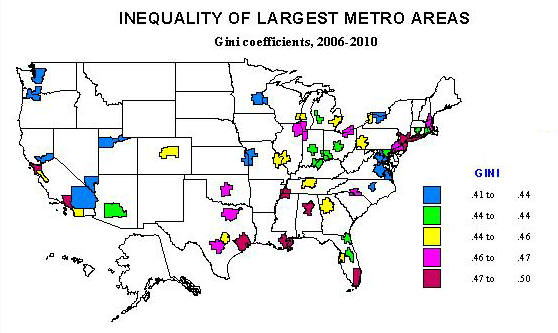
A handful of metro areas, shown in yellow, are moderately lower than the national average and dominantly in the east central part of the country, and include a mix of sizes, from Detroit, St. Louis and Atlanta, Pittsburgh, Buffalo and Milwaukee, Nashville, Tampa, and Austin, with only Denver and San Diego in the west.
Less unequal areas, shown in green, are with the exception of Phoenix, all in the east, from Hartford and Providence, to Baltimore, Jacksonville and Orlando, and a cluster in the north central states, with Cincinnati, Columbus, Louisville, Indianapolis, and Grand Rapids. These mostly follow the pattern observed in our recent state analysis where inequality was generally lower across the northern tier of the country.
The least unequal metro areas are even more focused on the Germanic belt that stretches across the Midwest to far west, with Minneapolis, Kansas City, Salt Lake, Seattle and Portland, Sacramento Las Vegas and Riverside-San Bernardino, plus some in the Atlantic states, including Rochester, Raleigh, Richmond and the government dependent Washington DC and Virginia Beach-Norfolk. Salt Lake, influenced both by Mormonism and a moderately Scandinavian population, is the least unequal followed by Virginia Beach and Minneapolis. Overall, with the exception of the Washington DC area, the least unequal metro areas tend to have the lowest shares of minority populations. Less unequal metros also tend to retain strong middle class industries, whether it’s Boeing in the Seattle area or the burgeoning tech and manufacturing industries found in places like the Salt Lake region.
Highly unequal and less unequal may appear together on the map, suggesting lesser suburban or satellite inequality. Generally speaking, suburbanized, less dense (and often less globalized) areas tend to be more equal. We can see this in the difference between Los Angeles and Riverside-San Bernardino, San Francisco as opposed to Sacramento, Boston vs. Providence, and Washington DC vs. Baltimore. Washington is especially interesting, as the city is extremely unequal, the wider metro area (more homogenous middle class suburbs) far less so. This is even more telling if we look at a more local geographic scale, with central cities marked by the juxtaposition of the very rich and very poor, while suburban cities tend to be dominated by similar middle class folks.
Among metro areas under 1 million the most unequal is Bridgeport-Stamford, CT ( those wealthy suburbanites next to historic industrial cities), while the least unequal are Ogden, UT, Appleton, WI, York, PA and Fairbanks, AK.
Inequality in selected cities
The most unequal cities (over 100,000) are all southern (Atlanta, #1, New Orleans, Washington, Miami, Gainesville, Ft. Lauderdale, Dallas and Baton Rouge), all except for mighty New York City. Race and ethnicity matter, as does the composition of the local economy.
The least unequal cities are all suburban or satellite, except for Port St. Lucie (military and space), such as of Chicago (Elgin), Kansas City (Olathe), Salt Lake (West Valley, West Jordan), Sacramento (Elk Grove), Los Angeles (Norwalk), Phoenix (Gilbert) , Denver (Thornton) and North Las Vegas.
Conclusion
Inequality in distributions of income are high and have become higher in recent years in the United States. But there remains fascinating geographic variation, resulting from abiding racial differences, variation in industrial structure and class homogeneity, and in geographic situation, regionally and locally. This helps both to explain some of the drivers of inequality, but also the complexities of finding ways to alleviate it.
Richard Morrill is Professor Emeritus of Geography and Environmental Studies, University of Washington. His research interests include: political geography (voting behavior, redistricting, local governance), population/demography/settlement/migration, urban geography and planning, urban transportation (i.e., old fashioned generalist).


