
With Barack Obama’s historic presidential win there has been much celebratory talk about redrawing the electoral map. Obama himself boasted that he was the only Democratic candidate who could accomplish this feat.
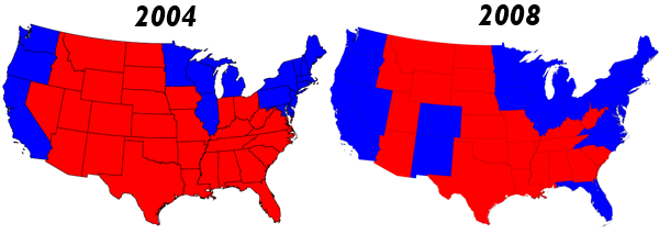
However, actual voting results suggest the map only shifted slightly at the margins from the 2000 and 2004 elections and that our geographic voting patterns may be more durable than we think. Here is a comparison of the famous red-blue divide:
Exit polls show that Obama received roughly two-thirds of the non-black minority vote and about 95% of the black vote. On top of that he got more than two-thirds of the 18-29 age cohort. But none of this data captures the electoral geography that drives the Electoral College results. The true shift from red to blue was actually driven by a slight shift at the margins of the divide. The tipping point was in the suburbs where middle and upper class suburbanites congregate and 49% of the electorate resides. These voters shifted to the Democratic candidate and tipped the balance in those swing states of Florida, Ohio, Iowa, Indiana, Colorado, New Mexico, Virginia and North Carolina. They found Obama more convincing on economic matters and fundamental change from the previous administration, but it would be a mistake to assume this means they embrace a radically new governing ideology.
To examine the results more closely we can compare the demographic characteristics of counties won by Obama and McCain and also compare these to Bush and Kerry in 2004. The following maps illustrate county vote shares in shades from blue to purple to red to show how the underlying vote compares between 2004 and 2008. Not a big difference, is there?

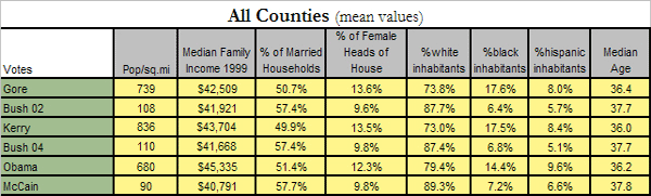
The following table compares the demographic profiles of 3115 counties and how they voted in the past three presidential elections. We can see that Obama captured more suburban counties outside the urban core than either Gore or Kerry. These counties not only have lower population densities but also higher incomes and more white inhabitants. So much for race.
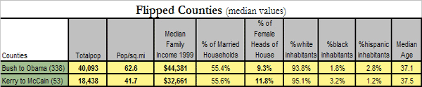
This conclusion is confirmed by looking only at those counties that flipped from red to blue (Bush to Obama) or blue to red (Kerry to McCain). Is this case we can see that Obama won more populous, whiter, and richer counties than McCain. Interestingly, the older, female heads-of-household gravitated slightly toward McCain.
Finally, we can look at an important subset of metro counties, meaning those counties that border the 50 largest metro areas in the country. There are 417 of these counties and they are classified by concentric rings from the urban core outward to the exurbs.
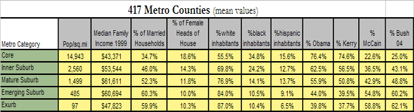
These data confirm where the major shift took place. Obama had gains of roughly 5-6% over Kerry’s results in suburban counties. Obama won handily in the mature suburbs where Bush and Kerry had evenly split. This is also where much of the non-black minority support for Obama resides. On the other hand, we again see a consistent monotonic relationship between party preference and population density: as we move outward from the urban core voting preferences shift from blue to purple to red. This suggests that the urban-rural split in American politics is still very much with us. This should not surprise us if these political differences are based on lifestyle preferences that do not change from election to election or candidate to candidate.
*State and county maps courtesy of Mark Newman: http://www-personal.umich.edu/~mejn/election/2008/
Michael Harrington is a political scientist, policy analyst and writer living in Los Angeles. He has extensively researched the red-blue divide of the past three presidential elections by focusing on county level census and voting data.


