
For the past eight years our politics has been riven by the red versus blue state narrative. While the popular media cast red versus blue as a culture war rooted in the ‘60s, subsequent research shows our divisions have much to do with geography. As Obama and McCain distance themselves from partisan stereotypes, many hope the upcoming election will break this pattern, but recent primary results should give us pause. (We should note that explaining overall election results is different than explaining geographic patterns. For instance, all women voters could vote the same and since women voters are a majority of the electorate, that would explain how their candidate won. But since women are fairly evenly distributed across the population, no geographic pattern would emerge.)
Our political geography has been deciphered by several studies by the Metropolitan Institute at Virginia Tech, political scientist James Gimpel with The Christian Science Monitor’s Patchwork Nation website, and journalist Bill Bishop in his book titled, The Big Sort. All these studies show how the basic divisions plays out among urban, rural, and suburban communities. The best way to examine this phenomenon is with census demographic data by county.
The following table shows how presidential voting in 2000 and 2004 broke down by county characteristics. The relevant county data include population per sq. mi., median family income, share of married households, share of female heads-of-household, as well as shares of white and black households.
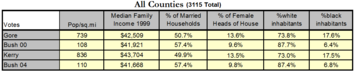
Regression analysis confirms that population density and marriage status explain most of the differences in voting patterns. One might guess that race was a more significant factor, but female heads-of-household and black households were very highly correlated—at .81, where 1.0 is perfect correlation—and female heads-of-household dominated the racial factor.
Fast forward to 2008 and this is where it gets interesting. We apply this same methodology to recent hotly contested Democratic primaries and what we discover about how different communities voted may surprise those banking on a new post-partisan geography.
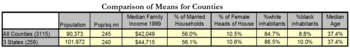
The following table displays the county profiles of three state primaries in Pennsylvania, North Carolina and Indiana compared to the national profile. Amazingly, these 259 counties offer almost a perfect demographic sample for the total set of the nation’s counties, so these three primaries taken together offer a good proxy for the national profile.
Comparing the primary results for these three states to the election results for the same counties in 2000 and 2004, yields the following results.
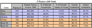
We see that the voters in these three states’ counties voted in a distinct red vs. blue pattern. Counties that voted for Obama align closely with those who voted for Gore and Kerry and those that voted for Clinton align almost perfectly with Bush. But remember, all these voters were Democrats! So partisanship has been taken out of the equation and what we’re left with is political preference based upon lifestyle, economic, and community interests.
Regression results are a bit more mixed for these votes because of how identity groups voted. For example, black households and female heads-of-household were even more highly correlated (.9), but black women tended to vote for Obama and white women tended to vote for Clinton. In general, exit polls confirmed that urban, black and college-educated voters favored Obama while older women, suburban and rural, working class whites favored Clinton.
Unless something else changes, the upcoming presidential campaign’s increased ideological rhetoric will likely push voters toward their communal red vs. blue comfort zones. It’s doubtful the personal strengths and campaign strategies of McCain and Obama will be enough to overcome this. Rather, campaign incentives to win at any cost will probably exploit it.
See more of Michael Harrington's work at Red State Blue State Movie and his blog at Purple Nation Blog.


hi
Thanks for the good write up Good studies and review about the topographic specifications and ballot banks in the country. This can be useful for my degree exam preparations. It was fulfilling to read about the surveys and the methods of detection. Thank you! windows 8 toolbar
Great post, and great
Great post, and great website. Thanks for the information!
Gia Sardegna Website
Your work is very good and I
Your work is very good and I appreciate you and hopping for some more informative posts. Thank you for sharing great information to us.
Look Here
Strongest or tricky wins in
Strongest or tricky wins in the election. No revenge on the war, and the elections are constantly phenomenon.
platform shoes
high heels shoes
prom shoes girls
pink shoes
wine accessories
310 shoes