
Last week I was fortunate to be a part of a fantastic symposium, called Policies to Promote Inclusive Urban Growth. It was held in Dallas at the George W. Bush Presidential Center on the campus of Southern Methodist University, and the event also served as the public release of a report which I worked on, Beyond Gentrification: Towards More Equitable Urban Growth, published by the Center for Opportunity Urbanism (If you get a chance I encourage you to check out the video of the event, found at the first link above). The report took a look at recent development activity and their impacts in three very different cities: Chicago, Los Angeles and Dallas.
As you might expect, I worked on the Chicago portion of the project. My work followed what's become a familiar theme to regular readers here -- Chicago is a study in contrasts. I found that it's becoming wealthier while simultaneously increasing its impoverished areas. It's becoming exceedingly expensive and astonishingly vacant, more educated and less educated, all at the same time. How so? The city has drawn in and concentrated affluent new residents along the city's beautiful lakefront, but there's been continual decline in many of the city's neighborhoods, particularly on the South and West sides. It's become the prime example of a bifurcated city, gaining high-income and retaining low-income residents, while squeezing out those in the middle. This has most directly impacted Chicago's black middle class living on the South and West sides, leading to a decline of the city's black population by 25% since 2000, the leading edge of Chicago's 7% population decline since 2000. Chicago's concentration of revitalization is a concern.
But there's some analysis I conducted that didn't make the final report.
We used data from the U.S. Census and American Community Survey to evaluate conditions within the respective cities. I used that, and data aggregated by Chicago Community Area (CCAs) by Rob Paral (robparal.com) from 1990, 2000 and 2008-2012 (the five-year ACS estimate that can broadly be used as 2010 data) to look at population, households and income by CCAs.
First, I took a median household income measure for all 77 CCAs in 1990, 2000 and 2008-12 and grouped them in three categories -- high income, meaning a CCA had a median household income above the Chicago metro area's median household income; middle income, meaning a CCA's median household income was between the city's median and the metro's median; and low income, meaning a CCA's median was below the city's median. Here are those thresholds, all in 2017 dollars:
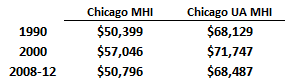
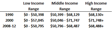
I know, I know, those numbers aren't really grounded in any real measure of socio-economic status, but they're real enough to use as points on a spectrum.
So we've established the thresholds. Here's how the CCAs look on a map at the 1990, 2000 and 2008-12 intervals, with green representing the high income areas, yellow indicating middle income areas, and blue used to show low income areas:
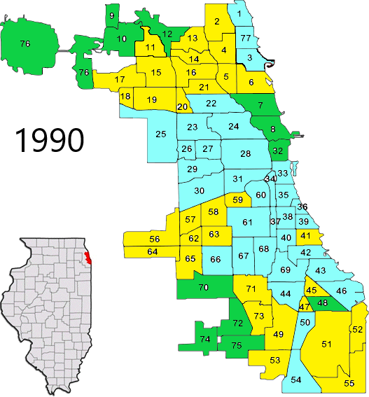


What do these maps illustrate, over time? I say four key points:
1) The gradual spread of high income CCAs (green) along the lakefront, and moving inland;
2) The erosion of some suburban-style high income CCAs in the far northwest and far southwest sides;
3) The dramatic loss of the number of middle income CCAs (yellow); and
4) The dramatic increase in the number of low income CCAs (blue) throughout the city.
Incomes did not change dramatically for those in the different income categories. High income CCAs had an average median household income between $79,000 and $83,000 from 1990 to 2008-12. Middle income CCAs were at $58,000 in 1990 peaked at nearly $64,000 in 2000, and fell to $59,000 in 2008-12. Low income CCAs were between $33,000 and $37,000 over the period. I'm guessing incomes were pretty static because this came on the heels of the 2008-09 Great Recession.
Incomes in Chicago didn't change much, but the composition of incomes at the neighborhood level did. There are 77 CCAs in Chicago. In 1990, 12 could be considered high income, 32 were middle income and 33 were low income. By 2000 that profile shifted to 15-20-42, and by 2008-12 it was 14-14-49. Slightly more high income CCAs, far fewer middle income CCAs, and far more low income CCAs.
But the population and household figures within the CCAs tell the story, and it challenges the way we think about space and income inequality. The number of people living within high income CCAs increased by a staggering 81%, from 337,000 to 610,000. Those living in middle income CCAs fell be a just as staggering 50%, from 1.05 million to 527,000. And those living in low income CCAs rose by 12%, from 1.4 million to just under 1.6 million.
In other words, while not everyone who lives in a neighborhood of a certain income category may fit that profile, the lines drawn between them are hardening and those in the middle are getting squeezed hardest.
This piece originally appeared on The Corner Side Yard.
Pete Saunders is a writer and researcher whose work focuses on urbanism and public policy. Pete has been the editor/publisher of the Corner Side Yard, an urbanist blog, since 2012. Pete is also an urban affairs contributor to Forbes Magazine’s online platform. Pete’s writings have been published widely in traditional and internet media outlets, including the feature article in the December 2018 issue of Planning Magazine. Pete has more than twenty years’ experience in planning, economic development, and community development, with stops in the public, private and non-profit sectors. He lives in Chicago.
Photo: Homes in Chicago's Auburn-Gresham neighborhood on the South Side. It's a community that was once strongly middle class but has become considerably poorer since 2000. I lived there until 1995. Source: wttw.org


