
June 2019 transit ridership was 2.9 percent lower than in June 2018, according to the Federal Transit Administration’s most recent data release. Ridership dropped in all major modes, including bus, commuter rail, heavy rail, and light rail. Ridership also dropped in 41 of the nation’s 50 largest urban areas, declining even in Seattle, which had previously appeared immune to the decline that is afflicting most of the nation’s transit industry.

Click here to download a three-page PDF of this policy brief.
June had 20 workdays in 2019 compared with 21 in 2018. The National Household Transportation Survey estimates that about 40 percent of transit ridership is work-related, so one fewer day accounts for about 1.9 percent of the decline in ridership. So at least a third of the decline must be due to other factors.
SEPTA Is Sinking
Philadelphia suffered the largest decline both numerically and on a percentage basis. Transit systems there carried 6.2 million fewer June riders in 2019 than in 2018, a 21.1 percent drop. Part of this decline may have been due to maintenance-related disruptions to the city’s trolley system, which lost 0.5 million riders (21.0 percent). But Southeastern Pennsylvania Transportation Authority (SEPTA) buses lost 4.6 million riders (31.1 percent), while SEPTA heavy rail lost 1.2 million riders (15.5 percent). More disruptions have taken place since June or are planned so expect further declines in July, August, and future months.
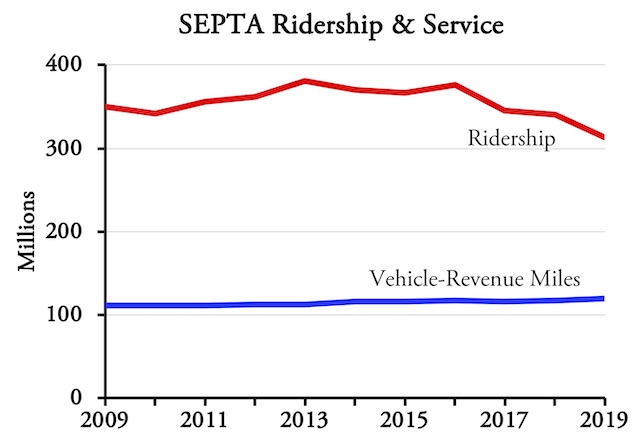
SEPTA ridership dropped 18 percent since 2013 despite a 6 percent increase in vehicle-revenue miles of service.
While a 21.1 percent drop is pretty drastic, this is just a continuation of declines since at least 2016. Moreover, SEPTA ridership is falling despite a modest increase in transit service. Since 2013, SEPTA’s vehicle-revenue miles of service have increased by nearly 6 percent, yet ridership has dropped by nearly 18 percent.
At 5.5 million people, the Philadelphia urban area is much larger than Washington (5.0 million), Boston (4.4 million), or San Francisco-Oakland (3.6 million), yet Philadelphia has lower transit ridership. This is mainly because Washington, Boston, and San Francisco have more downtown jobs than Philadelphia, though in Boston’s case the edge is slight.
Philadelphia continues to decentralize, as the city is relatively unhampered by rural growth restrictions. This also makes housing in Philadelphia more affordable: according to Zillow, median home prices in the Philadelphia area were 3.2 times median family incomes as of the first quarter of 2019, compared with 3.9 in Washington, 5.2 in Boston, and 8.8 in San Francisco-Oakland. Decentralization may weaken the transit system, but given the trade-off — affordable housing vs. somewhat higher transit ridership — I’d live with a weaker transit system.
Double-Digit Declines
Philadelphia is not the only urban area to see double-digit declines in transit ridership last June. Ridership fell by 11 to 15 percent in Cleveland, Kansas City, Louisville, Memphis, San Antonio, and Virginia Beach.
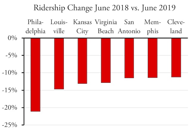
Seven urban areas had double-digit declines in transit ridership between June of 2018 and 2019.
While not double digits, the 2.4 percent ridership drop in Seattle is almost as shocking given that Seattle was the one place where transit ridership has been consistently growing. As I’ve previously noted, Seattle’s ridership growth was primarily due to a rapid increase in the number of downtown jobs. The recent decline is probably due to a slowdown in downtown job growth, as Seattle’s city council has proven itself hostile to downtown employers such as Amazon and Microsoft.
Ridership fell by 4.2 percent in Houston, another place where transit was doing relatively well due to improvements in the bus system made four years ago with the help of Jarrett Walker. While I endorse Walker’s concept as an inexpensive way to boost ridership, I’ve suspected that it would lead to a short-term improvement in ridership but not prevent long-run decline. Houston’s recent drop seems to affirm that.
Richmond, which implemented Walker’s ideas last year, saw a 16.6 percent increase in ridership for the year to date, but only a 1.9 percent increase for June. Perhaps following Houston’s pattern, the growth is flattening out and may turn into a decline in another year or three.
While a few urban areas saw small increases in ridership — 3.2 percent in Austin, 2.0 percent in Denver, 1.2 percent in Tampa-St. Petersburg — the only large increase was 10.4 percent in Dallas-Ft. Worth. This is a surprise for, as far as I know, Dallas hasn’t overhauled its bus system the way Houston has (and in fact has been locally criticized for not doing so). It hasn’t even increased service; the FTA data file shows that June 2019 bus service was 11 percent less than in June 2018.
Comparing the first six months of 2019 with the same months in 2018, overall transit ridership declined by 1.2 percent and ridership fell in 36 of the nation’s 50 largest urban areas. The largest losses were in Louisville (-11.6%), San Antonio (-9.8%), Philadelphia (-8.9%), Milwaukee (-8.6%), and Phoenix (-6.9%).
Rust Belt, Sun Belt, new city, old city, rails, buses, all are experiencing declining transit ridership.
The most devastating results come from comparing the last full year — July 2018 through June 2019—with the same time period five years before — July 2013 through June 2014. Over that five-year period, a dozen of the nation’s 50 major urban areas lost 20 percent of their riders or more; 30 lost 10 percent or more; and only 7 saw ridership grow. Thanks to New York’s dominance — it now hosts 44 percent of the nation’s transit trips — and the fact that it lost only 3.3 percent of its riders in that period, the nationwide decline was 8.1 percent. But that still translates to a loss of 845 million rides per year.
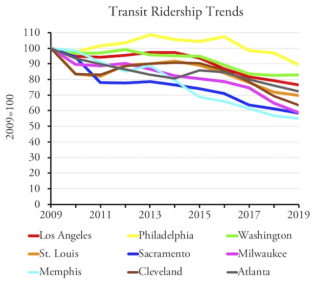
Over that five-year period, the biggest losers include Rust Belt regions such as Cleveland, Milwaukee, and St. Louis; Sun Belt regions such as Charlotte and San Antonio; dense California regions including Los Angeles, Sacramento, and San Jose; sprawling regions such as Atlanta and Phoenix; and older regions with dense downtowns such as Providence and Philadelphia. Charlotte, Los Angeles, Sacramento, and St. Louis have all spent heavily on rail transit. Milwaukee and San Antonio both focused on bus transit. In other words, no type of urban area and no mode of transit appears to be immune from the decline.
Increasing Service Doesn’t Help
Some have suggested that ridership declines can be reversed by increasing transit service. But at least a dozen major urban areas that have increased transit vehicle-revenue miles by more than 10 percent in the last five years have nevertheless seen ridership decline by more than 10 percent.
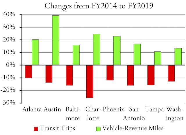
In many regions, ridership fell by 10 percent or more despite at least a 10 percent increase in vehicle-revenue miles of service.
The biggest disparities are Austin, which increased service 39 percent only to see ridership fall 14 percent, and Charlotte, which increased service 25 percent as ridership fell 26 percent. Others in this category include Washington, Atlanta, Phoenix, Tampa, Baltimore, Riverside, San Antonio, Sacramento, Indianapolis, and New Orleans.
Not every urban area has increased service, and several appear to be in a transit death spiral, where reduced ridership forces reductions in service which further reduces ridership. Cleveland, Hartford, Pittsburgh, and Providence show ridership and service levels down for June, the year to date, and the last five years, and thus appear to be in death spirals. Miami may also qualify, but service levels there are unclear as Broward County Transit appears to have failed to submit data to the Federal Transit Administration for the last few months. Beyond the top 50 urban areas, Tucson and Omaha also fit this pattern.
Other urban areas were able to increase service levels since 2014, but ridership dropped, which may have force them to enter a death spiral by reducing service in the last few months to a year. These include San Jose, Cincinnati, Milwaukee, and Nashville. Memphis, which has lost a greater percentage of riders over the last five years than any other major urban area, managed to increase service slightly in June, but still lost 11 percent of riders from the previous June.
Per Capita Ridership
The populations of most urban areas are growing, so declining ridership means that per capita ridership is dropping even faster. The Census Bureau has published population estimates for urban areas from 2012 through 2017. A change in the definition of urban areas in 2012 means that population numbers before then are not strictly comparable. The largest changes in per capita ridership over this time period are shown in the chart.
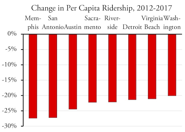
Population growth combined with declining ridership leads to dramatic drops in per capita transit ridership in at least a dozen major urban areas.
Per capita ridership is one of the best indicators of transit’s importance to an urban area. Transit in the New York urban area carries 224 trips per resident per year, which makes it pretty important. In San Francisco-Oakland it carries 128 trips, which is still fairly high. Boston and Washington are in the 80s, Chicago, Seattle, and Philadelphia are in the 60s, Portland is 55, and everywhere else is below 50. In half the nation’s 50 largest urban areas transit carries fewer than 20 trips per capita. Beyond the top 50, transit carries 83 trips in Honolulu, but otherwise is less than 20 except in a few college towns such as Ann Arbor, Durham, Eugene, Gainesville, and Madison, where it is in the 30s or 40s.
Data File
As with previous data releases, I’ve posted an enhanced spreadsheet that includes annual totals and totals for each transit agency and the 200 largest urban areas. Calendar year totals for 2002 through 2019 (to date) are in columns HL through IC. Column ID shows the percentage change from June 2018 to June 2019 and IE shows the percentage change for the year to date in 2019 from 2018. Column IF has the numeric change from June 2018 to June 2019.
Some but not all transit agencies end their fiscal years on June 30, so my use of the term “fiscal year” is a bit loose. But columns IG through IW have fiscal year totals, i.e., July through June of each year. Columns IX and IY compare percentage changes from FY 2009 and FY 2014 to FY 2019 while IZ and JA have numeric changes.
Rows 1 through 2146 and columns A through HK have the raw data for each transit agency and mode. Rows 2148 through 2155 show totals by major mode: commuter rail, heavy rail, light rail, streetcar, hybrid rail, and bus (which combines motor bus, trolley bus, commuter bus, and rapid bus). Rows 2160 through 3159 show totals by transit agency. Rows 3170 through 3370 show totals by urbanized areas.
I’ve made these enhancements on both the ridership (UPT) and service (VRM) worksheets. Of course, some of these numbers are preliminary and some agencies have not reported numbers to the FTA, which could lead to misleading conclusions. As noted above, for example, Broward County Transit seems to have not reported data for several months, which means data for the Miami urban area are compromised. The “estimates” worksheet shows where FTA has inserted its own ridership estimates, but it hasn’t attempted to estimate vehicle-revenue miles, leaving a few gaps in the data. Be wary of these potential gaps before quoting this spreadsheet.
This piece originally appeared on The Antiplanner.
Randal O’Toole is the director of the Independence Institute’s Transportation Policy Center and author of the recent book, Romance of the Rails: Why the Passenger Trains We Love Are Not the Transportation We Need.
Photo credit: Yesums [CC BY-SA 4.0], via Wikimedia Commons


