
There is wide consensus that the COVID-19 virus spreads person-to-person, especially in confined spaces that are insufficiently ventilated. It is exacerbated by prolonged proximity, which John Brooks, the Centers for Disease Control and Prevention’s chief medical officer indicates is 15 minutes or more of unprotected contact with someone less than 6 feet away. Avoiding such proximity is the justification for social distancing and face masks and the lockdowns that have been implemented around the world.
Preventing infection means minimizing exposure density, which is the duration of risky contacts that can be estimated using factors from population density to much more precise measures of crowding that vary by personal lifestyles and living conditions.
The best (lowest) geographic level for which there is comprehensive national COVID-19 death data available now is for counties. It may be tempting to evaluate death rates using county population densities, which are readily available. However, many counties have very large rural areas that drive down overall densities and can mask significant urban densities.
By definition, a disease spread by personal contact is likely to be associated densities the reflect the risk of exposure — the sum of exposure densities, duration weighted. Exposure density is far greater in urban areas than in rural areas and strongly associated with higher urban densities, as indicated below.
This article is provided from a perspective of COVID-19 death rates by categories of county urban, rather than total county densities, through July 8, 2020, based on data published by USAFacts.org.
The Influence of Large Rural Areas on County Densities
Overall county densities differ markedly from their urban densities.
The ultimate example may be a comparison between Cuyahoga County Ohio (Cleveland) and San Bernardino County (in the Los Angeles combined statistical area).
In 2010 Cuyahoga County’s 1.2 million residents lived at an overall population density of 2,800 per square mile and an urban density of 3,063 per square mile. In other words, Cuyahoga’s urban density was about 9% denser than its overall density.
In 2010 San Bernardino County’s 2.2 million residents lived at an overall population density of 101 per square mile and an urban density of 3,090 per square mile. San Bernardino’s urban density was about 3,000% more (30 times more) than its overall density.
San Bernardino’s huge rural area drives down the overall density. For the purposes of COVID-19 analysis, the urban density is more appropriate than the total density, because the urban density is a better surrogate for the proximities that can are associated with infection.
This applies to much more than Cleveland and San Bernardino. For example, other million-plus counties with under 1,000 per square mile densities include Maricopa (Phoenix), fifth most populous county in the nation, San Diego, Riverside (California) and Palm Beach (Florida). Their much higher urban densities are substantially diluted because their rural areas are so large.
This problem was identified by the Census Bureau with respect to metropolitan areas in 2012: “Overall densities … can be heavily affected by the size of the geographic units for which they are calculated.” Counties are the building blocks of metropolitan areas, and their often-overwhelming rural land areas create this difficulty.
Perspective: County Urban Densities
County densities can differ materially from county urban densities.
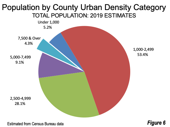
There are 955 counties with urban densities below 1,000 per square mile. This is less than one-third of the nation’s counties. By contrast, 95% of US counties (2,996) have densities below 1,000 per square mile (Figure 1).
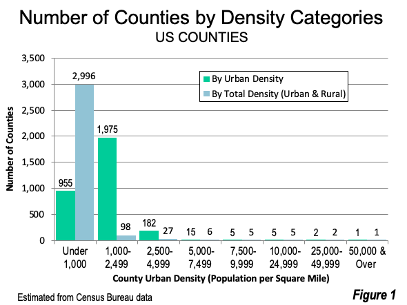
Counties with urban densities under 1,000 per square mile (including counties without urban areas) are estimated to have 17 million residents. By comparison, using total density, counties with under 1,000 per square mile are estimated to have 204 million residents --- 12 times as many (Figure 2). The analysis below describes reallocating more than 185 million US residents from counties with overall densities of less than 1,000 to the urban density categories from 1,000 to 7,499 per square mile. All of this reallocation is within the suburban range (under 7,500) as defined in the City Sector Model (See “Population Growth Concentrated in Auto Oriented Suburbs and Metropolitan Areas”).

Using urban densities rather than total densities reclassifies counties with overwhelming urban populations to higher density categories. For example, Los Angeles, San Bernardino, Maricopa, and Miami-Dade counties move up two density categories. King County, Washington (Seattle) moves up one category. Other highly urbanized counties with smaller rural land areas remain in the same density categories, such as Cuyahoga County, Dallas County, Texas, Harris (Houston), Hennepin County (Minneapolis) Cook County (Chicago), Mecklenburg County (Charlotte) and Franklin County, Ohio (Columbus).
Coincidentally, the US Census Bureau generally considers 1,000 per square mile to be the minimum urban density in its urban area criteria.
County Death Rates by Urban Density Categories
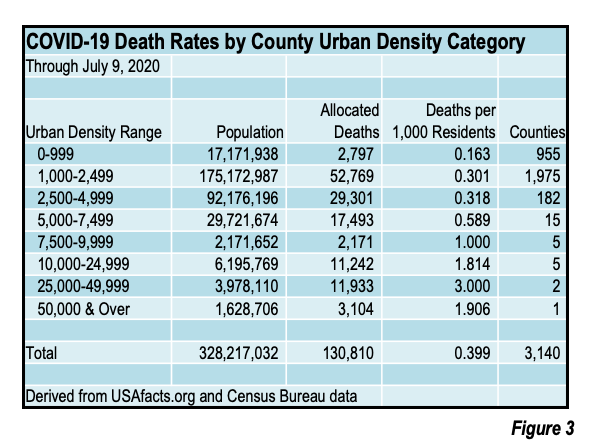
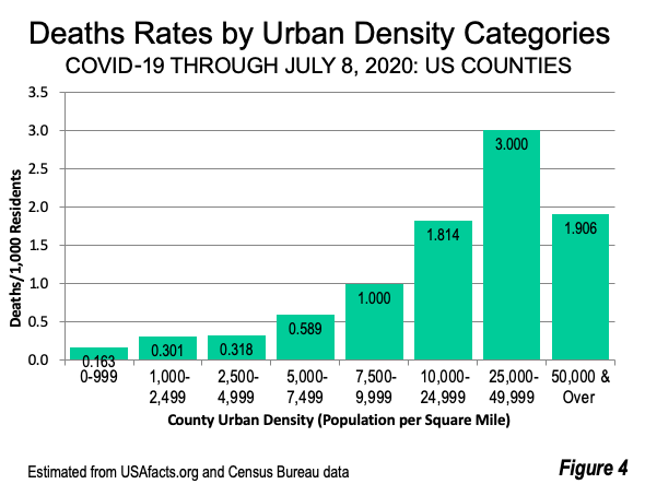
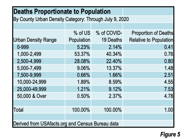
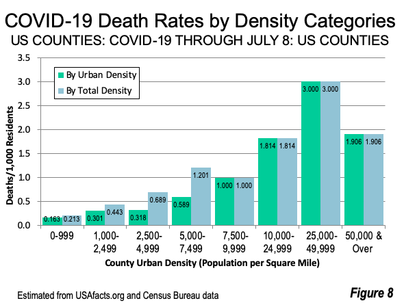
Counties with higher urban densities have a far higher percentage of the COVID-19 deaths, as is illustrated in Figures 3 and 4. Further, the higher urban density counties tend to have proportionally more deaths than their share of the national population (Figure 5). With just 4.3% of the nation’s population (Figure 6), counties with 7,500 per square mile urban population densities have 21.7% of the COVID-19 deaths (Figure 7) as of July 8, 2020.
- New York County (Manhattan), the nation’s densest and the only county with greater than 50,000 urban density is estimated to have a death rate of 1.906 per 1,000 population. Manhattan has 4.8 times its proportional share of deaths, with 2.4% of the nation’s deaths. However, Manhattan’s death rate is lower than the 2nd highest urban density category (25,000 to 49,999), and is discussed further in “The Manhattan Anomaly,” below.
- The highest death rate is among counties with from 25,000 to 49,999 urban densities, at 3.000 per 1,000 population. This includes two counties, both in New York city, Bronx County and Kings County (Brooklyn). These two counties have 7.5 times their proportional share of deaths, with 9.1% of deaths and only 1.2% of the population.
- The counties with from 10,000 to 24,999 urban densities are estimated to have a death rate of 1.814 per 1,000 population. These include Queens (New York city), San Francisco, Hudson (which includes Jersey City), Suffolk (which includes Boston) and Philadelphia. These counties have 4.6 times their proportional share of deaths, with 8.6% of deaths and only 1.9% of the population.
- The 7,500 to 9,999 density category is estimated to have a death rate of 1.000 per 1,000 population. These include 5 county-equivalent jurisdictions, the District of Columbia (Washington) the city of Alexandria, VA, Richmond County, VA, Arlington County, VA and the city of Baltimore. These counties have 2.5 times their proportional share of deaths, with 1.7% of deaths and only 0.7% of the population.
- The 5,000 to 7,499 density category (similar to the highest density suburban areas) is estimated to have a death rate of 0.589 per 1,000 population. This includes 15 counties, such as Los Angeles County, Essex County, NJ (Newark) Miami-Dade County (Florida), Cook County, IL (Chicago), Orange County. CA (Anaheim & Santa Ana), Alameda County CA (Oakland), and Denver County, CO. These counties have 1.5 times their proportional share of deaths, with 13.4% of deaths and only 9.1% of the population.
- The 2,500 to 4,999 density category is estimated to have a death rate of 0.318 per 1,000 population. These counties have less than their proportional share of deaths (0.8), with 22.4% of deaths and 28.1% of the population.
- The 1,000 to 2,499 density category is estimated to have a death rate of 0.301 per 1,000 population. These counties have less than their proportional share of deaths (0.8), with 40.3% of deaths and 53.3% of the population.
- The under 1,000 urban density category is estimated to have a death rate of 0.161 per 1,000 population. These counties also have proportionately fewer deaths (0.4), with 5.2% of deaths and 2.1% of the population.

The use of urban densities reduces the death rates in the lower density categories, by transferring counties with substantial masked urbanization into their urban density categories. There are no changes, however, among the counties with 7,500 or higher density since their rural influence is virtually zero (Figure 8).
The Manhattan Anomaly
There has been surprise that the nation’s densest county, New York County (Manhattan) has a lower death rate than other boroughs (counties) with lower densities: The Bronx, Queens, and Brooklyn (Kings County). Manhattan has advantages that are associated with lower exposure densities, such as:
- Manhattan residents are exposed to considerably less prolonged risk of infection on transit than in the outer boroughs. The average Manhattan transit commuter has a 37.5-minute one-way work trip. In contrast, the average one-way transit work trip for residents of the Bronx and Queens is 18 minutes longer. Brooklyn transit work trips are 13 minutes longer and Staten Island work trips are 36 minutes longer.
- Higher rates of poverty have been associated with higher death rates, while higher incomes are associated with less infection risk. Median household incomes in Manhattan are 55% higher than in The Bronx, 44% higher than in Brooklyn, 27% higher than in Staten Island and 19% higher than Queens.
Even so, Manhattan’s COVID-19 deaths rate are 4.8 times its share of the national population.
The “Surge” in Context
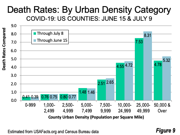
A number of recent articles have described a “surge” in infections; However, the surge has not produced a surge in deaths. Comparing A comparison of the last three weeks indicates reveals about 10% reductions in hard hit New York City, with the three counties that comprise the two highest urban density categories (New York, Kings and Bronx). The New York City declines have been attributed to social distancing and a strict lockdown, both of which required a more substantial change in behavior due to the city’s much higher density and transit ridership than anywhere else in the nation.
There were smaller reductions in the 7,500 to 9,999 and 10,000 to 24,999 urban density categories. There were small increases in the lower urban population density categories. The strong relationship between higher death rates and higher urban density categories remains (Figure 9).
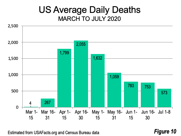
The good news is that death rates have dropped substantially. During the first eight days of July, daily deaths declined 73% from the peak daily rate of April 16-30 (Figure 10). What seems clear is although the virus has spread widely, its most lethal impacts have, for the most part, been felt where urban densities are greater.
Methodology Note:
The analysis uses death data as allocated to counties on a daily basis by USA Facts. County urban population density is estimated from 2010 Census data and scaled to 2019 using the rate of change in the total populations. This is by no means the optimal method for analyzing the association between COVID-19 deaths and urban densities. But it is about as far as such analysis can go at the national level until more local COVID-19 death data is available.
Photograph: The Bronx (foreground), Queens and Manhattan (background), by author.
Wendell Cox is principal of Demographia, an international public policy and demographics firm. He is a Senior Fellow of the Center for Opportunity Urbanism (US), Senior Fellow for Housing Affordability and Municipal Policy for the Frontier Centre for Public Policy (Canada), and a member of the Board of Advisors of the Center for Demographics and Policy at Chapman University (California). He is co-author of the "Demographia International Housing Affordability Survey" and author of "Demographia World Urban Areas" and "War on the Dream: How Anti-Sprawl Policy Threatens the Quality of Life." He was appointed by Mayor Tom Bradley to three terms on the Los Angeles County Transportation Commission, where he served with the leading city and county leadership as the only non-elected member. Speaker of the House of Representatives appointed him to the Amtrak Reform Council. He served as a visiting professor at the Conservatoire National des Arts et Metiers, a national university in Paris.


