Here's some cool maps from radicalcartography.net looking at income dispersion in the country's 25 largest metropolitan areas by population. From the page:
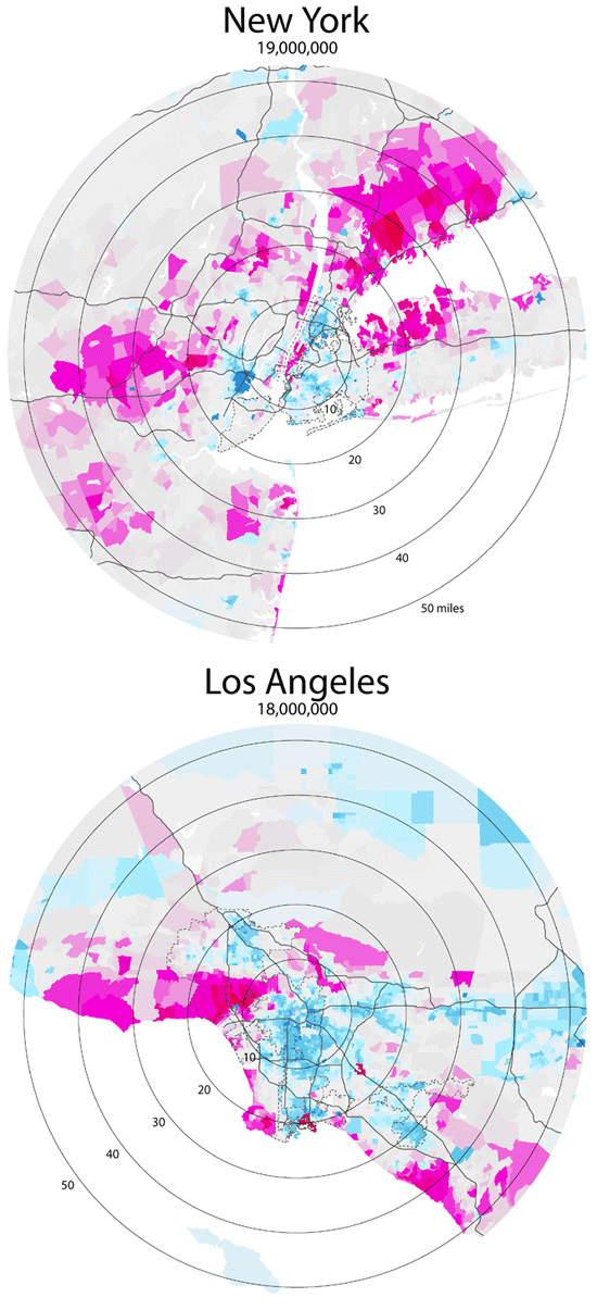
These maps show the distribution of income (per capita) around the 25 largest metropolitan areas in the US (all those with population greater than 2,000,000). The goal was to test the "donut" hypothesis — the idea that a city will create concentric rings of wealth and poverty, with the rich both in the suburbs and in the "revitalized" downtown, and the poor stuck in between.
This does seem to have some validity in older cities like Boston, New York, Philadelphia, or Chicago, but in newer cities it is not the case. Instead of donuts, one finds "wedges" of wealth occupying a continuous pie-slice from the center to the periphery.
Just from visual inspection, it also seems that poverty donuts all tend to have about a five-mile radius, regardless of the size of the city. Perhaps this is the practical limit for commuting without a car?
All maps are at the same scale, and all use the same color values for income.


nice one
"This does seem to have some validity in older cities like Boston, New York, Philadelphia, or Chicago, but in newer cities it is not the case. Instead of donuts, one finds "wedges" of wealth occupying a continuous pie-slice from the center to the periphery." what do you mean this?
Cool gadgets