
No one knows this answer for sure, but the data show some interesting trends for what's possible. This analysis takes two approaches to answer this question, including:
- Total employment: suggests recovery in 2012
- Employment growth rates: suggests recovery in mid-2010 ... but ...
This is a work in progress. Tomorrow the future will change.
Current status
June 2009 was the 18th month of the current and the longest recession since 1940. There were 14.7 million unemployed, more than double two years earlier, and the most since 1940 (the previous high was 12 million in 1985). Unemployment was 9.5%, almost double two years earlier, but less than the previous high of 10.8% in 1982.
For most of the workforce, this is the worst recession of their lifetimes, and what some are calling the "Great Recession."
Total employment Anaysis
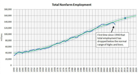
The graph below shows total nonfarm employment (blue line) and the statistical average (green line). Two additional lines were added to show the normal high/low ranges. The blue dot is the BLS total nonfarm employment projection for 2016.
Notice that total employment in June 2009 was significantly below the normal range for the first time since 1940. In fact, we have been below this normal range for about one year.
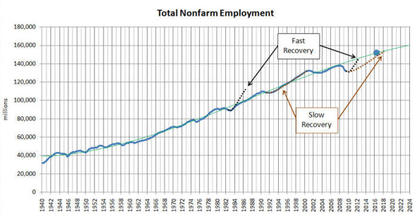
The next graph (below) shows the same total nonfarm employment (blue line), the statistical average (green line), and adds two possible recovery timelines - fast (black) and slow (brown) - estimated from previous recovery timelines on the graph.
When we plot the fast and slow recovery timelines starting in July 2009 and until we reach the average, here is are the results.
- Fast recovery => beginning of 2012
- Slow recovery => beginning of 2018
The requirements for a fast recovery are high. The most jobs ever created in one year was 5 million in 1984 and 1941. To recover by 2012, the US would have to add 5 million jobs per year (400,000 per month) for the next two and a half years - and this has never been done before. We've added jobs at 400,000 per month, but never for two and a half years in a row.
Employment growth rates
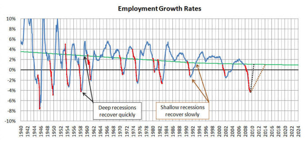
Employment growth is the annual rate of change between a given month and 12 months earlier. These monthly data points are plotted on the graph below, and include the employment growth (blue line), the statistical average (green line) and the recessions (red dots that cover up the blue line).
Then we added two possible recovery timelines - fast (black) and slow (brown) - estimated from previous recovery timelines on the graph.
When we plot the fast and slow recovery timelines starting in July 2009 and until we reach the average, here is are the results.
- Fast recovery => middle of 2010 (read the next paragraph)
- Slow recovery => beginning of 2014
HOWEVER, AND THIS IS IMPORTANT, the current recession has now lasted longer than one year, and the employment growth rates only look back 12 months. This introduces a cumulative effect that has not been compensated for in this graph. This makes both recovery estimates too optimistic. Plus, even when growth rates return to the average, we will have a backlog of millions who have yet to find a job.
Employment growth rates are a revealing trending tool with some interesting benefits:
- This graph comes close to a "real feel." We can tell at a glance how difficult it is to find a job.
- When employment growth is above the green line, jobs are relatively easy to find because demand exceeds supply. A case-in-point is the late-1990s.
- When employment growth is between the green line and zero, jobs are harder to find, even though employment is growing, because job growth is not keeping up with workforce growth.
- When employment drops below zero, jobs are difficult to find. Supply exceeds demand.
- Notice that the deep recessions of the 40s, 50s and early 60s recovered quickly, and shallow recessions like 1991 and 2001 recovered slowly. This may seem like good news given that we're in a deep recession (this should recover quickly), but there's more - deep recessions cycle quickly, going from highs to lows every 4 years (two good years followed by two bad years). By contrast, the last 6 recessions were shallow and separated by about 8 years.
- Notice that the recessions (red dots that cover up the blue line) almost always start as soon as the blue line crosses the green line on the way down. This seems to be a much better and real time indicator than waiting for the
NBER to formally announce the beginning of a recession - always many months after the recession has already begun. (last time it took them 11 months) - Notice that in almost every case, the end of a recession occurs as soon as the blue line turns back up. This too is a much better and real time indicator than waiting for the NBER to formally announce the end of a recession, months after the fact.
The current recession appears to be slowing down significantly.
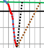
Notice that the distance between the red dots (monthly growth rate changes) has been getting smaller in recent months. The data are hard to see, and a small piece of the graph above is blown up here on the right.
The smaller distance between the most recent three or four red dots indicate a slowing in our decline - what some call "getting less bad." When the red dots are spaced far apart, as they were earlier, employment was declining quickly.
When the blue line on our employment growth rate graphs turns up, chances are high that we've hit the bottom. However, this has not happened yet.
Interestingly, some forecast the end of the recession for 2009, and they could be right! It's not the end that matters so much, it's how long it will take to recover - there are millions of unemployed that need to get back to work, and our workforce is expanding at about 1.5 million per year.
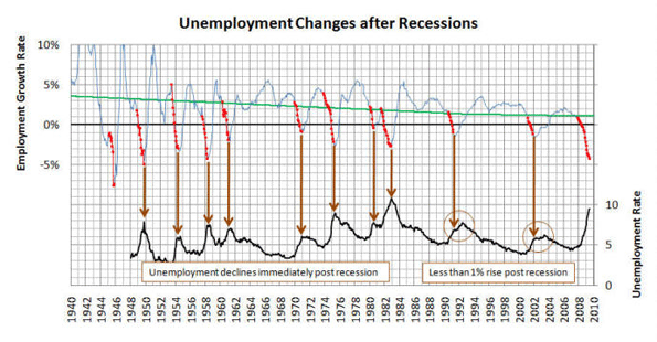
Post recession unemployment changes
Between 1950 and 1984, the unemployment rate dropped immediately after the "official" end of every recession. In the last two recessions (1991 and 2001) unemployment increased by less than 1%, shown with brown circles.
It remains to be seen what will happen to unemployment after the end of the 2009 recession. From these data, one might conclude that it will rise a maximum of 1%. However (read the Total Employment analysis at the top of this page), we are outside the normal limits of employment variation for the first time.
The take-away
- This is the worst recession of a lifetime for almost everyone in the workforce
- We're not at the bottom yet, but we could be close - this recession could end in 2009
- The most likely "fast" recovery date (to be fully recovered) is the beginning of 2012
If you'd like to join a discussion about this page on July 21st,
click here and sign up ... it's free.
This report was written by Mark Hovind, President of JobBait. Mark helps six and seven figure executives find jobs by going directly to the decision-makers most likely to hire them. Mark can be reached through www.JobBait.com or by email at [email protected].


Re
I guess that at this time men need essay writing example just about this good topic, because it is our business to ply people with the interesting outcome connecting with discount-program.