As the Los Angeles County Metropolitan Transportation Authority (Metro) prepared for its most recent round of major bus operations reductions, Metro CEO Art Leahy has been quoted:
"(T)oo many bus lines with excessive service has led to regular budget deficits1."
"How full are Metro buses today? Overall, Metro buses are running at an average of 42 percent capacity. Of course, that doesn’t mean that all Metro buses are less than half full. Another measure to gauge bus usage is called ‘load ratio’ — the ratio of passengers to bus seats at the most crowded part of a bus route. By that count Metro’s average load factor is an average of 1.2. (For example, 48 passengers on a 40 seat bus). Many other large transit agencies are running load factors of 1.5 to 1.72 ."
The "42 percent" capacity is evidently the average passenger load (APL) divided by the number of seats – in other words, on average for the full year, each 40-seat MTA bus had about 17 passengers on board.
Forty-two percent might appear to be a low value, particularly in comparison to other modes of transportation like scheduled airlines, where it is common to have a 100% load factor on some flights. However, Lufthansa doesn't stop at Wilshire/Vermont to pick up passengers between LAX and JFK – transit service is scheduled for peak load factor; that is, attempting to approach, but not exceed, a maximum load factor at the point on the line where the number of people on board is largest.
In the second quote, we have a mixture of load factors terms and data. Almost all transit operators have load factor standards, which they set for each mode of service (bus, light rail), time of day, day of week, and type of service (main line arterial bus service, long-haul commuter, neighborhood circulator). For Metro, the peak load factor criterion had been 1.20 – the 48 passengers on a 40-seat bus – since this was imposed by the Consent Decree that settled Labor/Community Strategy Center v MTA in late 1996 until very recently.
In that quote, Metro is comparing services standards to actual performance. It is certainly true that, until the passage of the new policy a few months ago, Metro's 1.20 service standard was one of the lowest in the industry for larger city operators. However, Metro routinely failed to meet this standard, which was a major source of complaints by the plaintiffs in L/CSC v MTA – and MTA's overall average passenger loads have among the highest in the industry for decades.
Comparing actual results to actual results is far more meaningful than comparing service standards to service standards. Is 42 percent low, high, or what? The standard methodology for determining this is peer group comparison. The Federal Government makes transit data available though its National Transit Database – which we used for the 2009 reporting year3.
We then constructed our peer group, the twenty largest U.S. transit operators by annual unlinked passenger trips that operate both bus and rail service4 and developed the data for:
APL: Average Passenger Load
BHr: Boardings/Hour
FRR: Farebox Recovery Ratio
SP: Subsidy/Passenger
SPM: Subsidy/Passenger Mile
The results are:
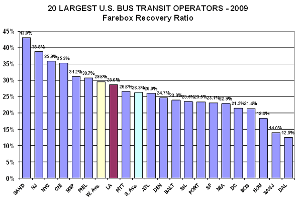
1. FRR: Higher is better - but, this statistic can often be misunderstood. For example, a high cost operator with high fare can have a higher FRR than a low cost operator, but the low cost operator will be providing a better deal, financially, for both the riders and the taxpayers.

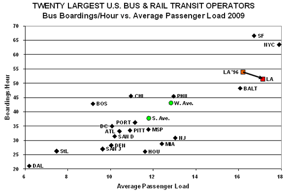
2. APL/BHr: Appearing and to the right on the next graph indicates higher load factors. Higher is better; however, at some point, overcrowding impacts service quality and reliability.

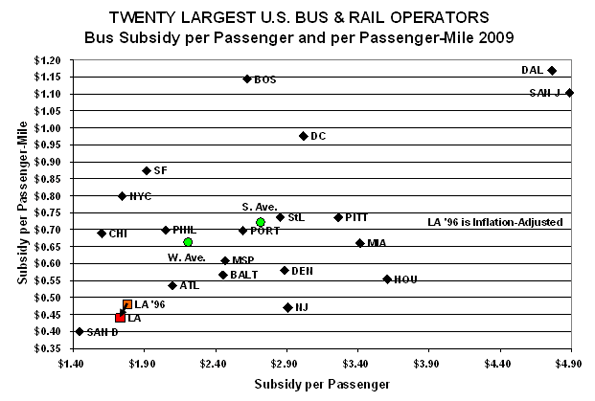
3. SP/SPM: On this graph, lower is better, so down and the left is superior - except that, at some point, low cost can indicate concerns about quality of service and safety.

While Metro is not among the highest in FRR, it has more than twice as many ranked below it (13) than above it (six). Considered with the subsidy metrics, Metro bus service is a fair deal to the riders and a great deal for the taxpayers.
On the service utilization graph, Metro is second highest in APL, beaten by NYC, and third on BHr, beaten by NYC and SF. We added, "LA '96," for 1996, the year before the Consent Decree went into effect part-way through Metro's 1997 fiscal year. BHr has decreased slightly (53.9 to 51.4, or ~4.6%), while APL has increased slightly (16.2 to 17.1, or ~5.6%). The increase in APL is interesting because Metro's on-going replacement of primarily 43-seat "hi-floor" with 40-seat "low-floor" buses means that Metro is carrying more people in smaller buses.
Metro bus service again does well on cost-effectiveness. San Diego beats Metro on both SP and SPM and Chicago beats Metro on SP. Metro reduced both of these from 1996 to 2009 after adjusting for inflation5.
Finally, we decided to do a combined performance index, based on Metro's own "Route Performance Index" (RPI), which Metro utilizes to eliminate low performers6:
We have adapted METRO's RPI in three ways:
1. We use it for bus system performance, rather than route performance.
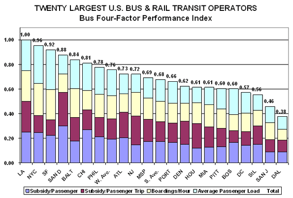
2. The "standard" is Metro's performance on each individual indicator. The overall score is set at 1.00 for Metro, broken into four components, each of which Metro scores .25. Operators scoring better on an indicator receives a score higher than .25; performing poorer, lower than .25, with the specific score a direct ratio against Metro's score (remember that, for subsidy, lower is better, while for route utilization, higher is better).
3. Metro utilizes three metrics in its RPI, SP, BHr, and APL. We added SPM.

What we see is Metro rated the highest overall among its peers. Metro does not win on any single criterion, but its two seconds and two thirds put it ahead of the rest overall.
Metro's Transit Service Policy (page 32) states:
"Lines with an RPI lower than 0.6 are defined as performing poorly and targeted for corrective action. Lines that been subjected to correction actions and do not meet the 0.60 productivity index after six additional months of operations may be cancelled …"
If this .60 cut-off is applied to the 20 bus systems, several would be in major trouble. Dallas (.38), San Jose (.46), Saint Louis (.56), and Washington, DC, (.57) are below the cut-off. Boston and Pittsburgh (both at .60) are right on the line, and Miami (.61), Houston (.61), and Denver (.62) only slightly above.
If one takes the Metro RPI and applies it to the nation's Top 20, nine of the 20 are either below or very close to the cut-off point. This implies that a high portion of the individual lines, a majority in at several cases, are below the Metro route-by-route cutoff point.
Circling back to Metro routes, this could mean that many of the routes that Metro would cut, using its RFI procedure, would be average or even above-average routes for many of the nation's larger bus systems. Failing to meet the Metro average is actually a very high cut-off point when compared to the national performance.
This is not to say that no Metro service should ever be cut or eliminated. What we are saying is, don't make the cut-off point too high; there is a lot of well-utilized service, by national standards, that does not pass Metro's methodology. More important, where there are bus lines with service reduced, put that back on the many, many Metro bus lines that are underserved – which is the usual condition.
From the above, we see Metro working very hard to cut to reduce the service operated by the most cost-effective and productive major city bus system in the nation – why? Unlike most other U.S. transit operators, it is not due to lack of funding – but the explanation will have to wait for my next blog entry.
