
The recently released estimates of population change and the natural increase and migration components of that change for 2010-2011 contain a few surprises, as well as much what has come to be expected. What we population freaks have been awaiting are estimates of the components of change for the whole 2000-2010 decade, but these are still being adjusted, in part because of the tremendous complexity of migration and immigration and, yes, estimating just who is in the country!
I provide four simple maps, one of population change, 2010-2011, one for the portion f that change due to natural increase (births less deaths), one for immigration and one for domestic or internal migration between the states. Overall the big news is a slowdown of growth, to only .92 %, the lowest since the 1940s. This was due to a fewer births, and thus of natural increase, because of folks not marrying or marrying later, and or postponing births because of the recession. It also has to do with a reduction in immigration, again because of the recession, and possibly because of anti-immigrant sentiment and policies.
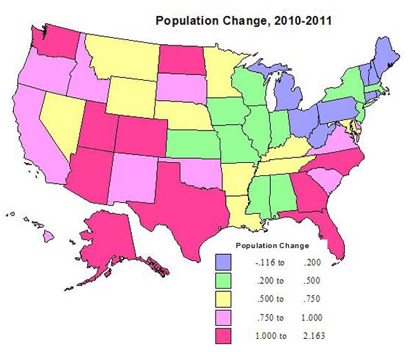
The second big news is the somewhat surprising shift of some rapid growth to areas beyond the sunbelt and towards the northern tier. Still impressive absolutely, the pace of growth has slowed in states such as Florida and Georgia, more so in Arizona and even more in Nevada, from the housing collapse and lower immigration. The South Atlantic region remained strong, but the new locus of faster growth is the “northern tier” from Minnesota through the Dakotas to Oregon and Washington. The Dakotas’ growth, also affecting Montana and Wyoming, is energy related, while that of Washington, now the 6th fastest growing state, is a reflection of a young population, continuing immigration, both high tech and agricultural growth, and a relatively robust economy.
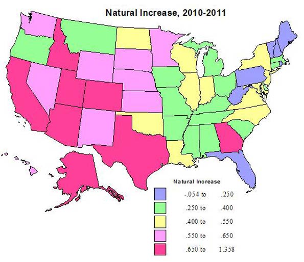
Natural increase. Natural increase is low in the states with the highest shares of the elderly, most obviously Florida, Pennsylvania, West Virginia and northern New England, in general regions and states from which young people have moved, e.g., MI, OH, KY, MO, AR, LA, MS, AL and IA, across the eastern heartland. But natural increase may have picked up a little in economically stronger states like NY, NJ, IL, IN and WI. Natural increase rates are higher, as might be expected, across the southwest and in Mormon states like Utah and Idaho. The bigger surprise once again is in the the upper Plains, including MN, ND, SD, and NE. Again Washington surprises, behaving like a sunbelt state, due more to an influx of a young population, than high fertility.
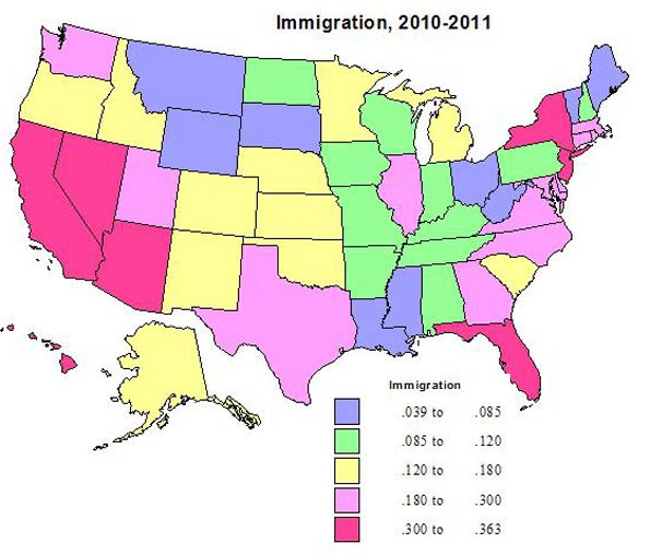
Immigration. Immigration overall has slowed, but was a relatively significant part of growth for much of the northeast, especially NY, NJ, MA, CT, RI, MD and DE, and remained important in FL, CA, NV, AZ, and WA (and yes Texas, but at a lower rate). The pace of immigration fell most in Nevada and Arizona.
Domestic migration. This map is the one that most closely reflects the perceived and/or actual attractiveness of the states in the recent past. The states with the highest rates of net out-migration are mainly in the old urban-industrial core, including IL, MI, OH, NY, NJ and even CT, KS in the Plains and now Nevada. Even Alaska, Hawaii and especially California lost through domestic migration. The biggest change is the shift from net out-migration to net gains for the District of Columbia, Louisiana (after years of loss), and especially North Dakota, which made strong gains for the first time in decades. Missouri, New Hampshire, Utah and especially Nevada shifted from net gain to net loss.

The gains of Texas and Florida, and at a lower rate, North and South Carolina and Tennessee, continue a pattern seen throughout the 2000-2010 decade. But Arizona, Georgia and Virginia have slowed down, and Nevada went from big gains to a loss. The biggest winners are South and especially North Dakota and Montana, in a dramatic turnaround, Colorado, now with the 4th highest rate, and Washington, with the 5th highest. Colorado appears especially popular with retiree migrants, particularly from California. DC and ND, losers for 2000-2009 had the two highest rates of gain for 2010-2011!
Warning: These trends are fascinating, but we should remember that economic conditions – and even perceived attractiveness of states for cultural or environmental reasons – are volatile and can change again and again.
Richard Morrill is Professor Emeritus of Geography and Environmental Studies, University of Washington. His research interests include: political geography (voting behavior, redistricting, local governance), population/demography/settlement/migration, urban geography and planning, urban transportation (i.e., old fashioned generalist).


