
David Jarman of Daily Kos Elections provides an excellent analysis of the absolute change in the Democratic and Republican vote for president from the 1988 through the 2012 elections, together with valuable tables and maps. The maps, tables, and narrative clearly demonstrate that, while the map looks mostly red as if Republicans were the big winners, the reality is that the Democrats were the beneficiaries of vastly more added votes, because of Democrats’ stupendous domination of the denser, bigger, metropolitan territory. For example, Los Angeles County by itself provided a Democratic gain of 1.2 MILLION, while the largest Republican gain was Utah county, Utah (Provo) with a paltry 90,000 gain. Republicans dominate the vast non-metropolitan expanses, Democrats the urban cores.
But the title of the piece, “Democrats are from cities, Republicans from exurbs”, is not quite right. Density is only one factor in elections; Democrats did quite well in much of exurbia as well as much of suburbia, relegating Republicans to rural, small city, non-metropolitan America. But the story is as much one of social change as of city versus country. Not only the big central cities, but their suburbs and even exurbs have evolved to house the more socially liberal population, with issues of race, women’s rights, and sexuality converting many middle and upper class to the Democratic side, even while rural small town America and much of the South remain socially conservative and supportive of Republicans.
This analysis extends Jarman’s findings by disaggregating the net change in the D and R vote by first looking at the degree of change in the Democratic share of the presidential vote from 1988 to 2012 and second by classifying by the change by such categories as:
- increased R vote shares, 1,
- declining R votes, 2,
- shift to Democratic to Republican,3,
- increased D vote shares, 4,
- decreased D vote shares, 5, and
- 6, a shift from Republican to a Democratic majority
This permits a more subtle geographic evaluation of the evolution of Red and Blue America. I want to thank the Daily Kos Elections which generously provided the necessary data files. This analysis considers only the vote for president, as the story of votes for congress is complicated by gerrymandering and other issues.
Change in the Democratic vote by type of change (see Table 1)
| Table 1: Net Change by Type of Change | |||||
| Number of Counties | 2012 %D | 1988 %D | Change in D% | 88-12 net change | County Type (Code) |
| 1411 | 30.8 | 39.8 | -9 | -4,605,125 | 1 Total |
| 448 | 40.3 | 55.1 | -14.5 | -1,517,300 | 3 Total |
| 108 | 55.8 | 57.2 | -1.4 | -62,214 | 5 Total |
| -6,184,639 | R gain | ||||
| 274 | 71.1 | 58 | 12.8 | 8,835,866 | 4 Total |
| 313 | 59.7 | 42.9 | 16.4 | 8,917,699 | 6 Total |
| 572 | 42.4 | 35.3 | 7.1 | 463,743 | 2 Total |
| 18,217,308 | D gain | ||||
| 12,032,669 | Net D Gain | ||||
Almost half of all counties, 1411, experienced Democratic declines and net Republican gains, totaling a net change of 4,605,000, with the Democratic share dropping nine points from 39.8% to 30.8%. Next in importance for Republicans was the gain of 1,517,000 votes in 448 counties taken from the Democratic column in 1988, with a decline in the Democratic share from 55.1% to 40.3%, a big drop of 14.8 points. Finally a smaller number of counties, 108, remained Democratic but with a declining share (type 5), giving Republicans a small net gain of 62,000. These Republican gains totaled 6,184,000 and look impressive on a US map.
But what the Democrats lose in vast America, they make up in the crowded parts. Although their increased shares took place in only 274 counties, the gains were populous enough to provide the Democrats with a massive gain of 8,836,000 total votes. The D share rose an impressive 12.5 points from 58.8% to 71.1%. (This exceeds even the R share in the R gaining counties). But even this big number was exceeded by the gain of 8,918,000 in the again fairly small number of counties which switched from Republican to Democratic, with a change in share up 16.4 points from 46.1% D to 59.3%. Finally the Democrats gained a net 464,000 votes in 572 counties carried by Republicans but by a lesser margin than in 1988, with the D share rising from 35.3% to 42.4%. Overall the net Republican gains of 6,184,000 were surpassed by Democratic gains of 18,717,000 for a net D growth of 12,032,000, a rise in the D share of 5.9 points from 46.1% in 1988 to 52.6% in 2012.
Change By State
A short look at the state level is interesting (Table 2). Sixteen states became even more Republican, with a net gain of 2,681,000. Most important in total numbers is the southwestern set of TX, OK, LA, and AR (1,143,000), then the northern mountain states of UT,ID, WY, and MT (477,000), followed by the Great Plains states of ND,SD, NE, KS, and MO (376,000), and the Appalachian set of TN and KY (488,000). To the latter should be added West Virginia, 210,000, the only state which switched from Democratic to Republican and an apt example of the non-big-metropolitan and ideological shift in the US electorate. Only one state, Iowa, experienced a small Democratic decline.
Nine states became even more Democratic, but sixteen switched from Republican to Democratic, and thus spurring the major numeric and geographic manifestation of the 1988-2012 realignment, a total of 15,342,000. Combining the Democratic states into subregions reveals the overwhelming importance of greater northeastern Megalopolis, yielding a net vote gain of 5,660,000 and of the “Left Coast” with 4,115,000, both dwarfing the total Republican gains. And the gains in the Great Lakes of 2,740,000, northern New England of 443,000, and the southern Mountain states of 431,000 were significant. Finally the major change in the South Atlantic region is notable, with a gain of 1,383,000 in SC, NC, GA, and FL, even though all but Florida remained Republican. At the individual state level California is dominant, 3,367,000, followed by NY-NJ. For Republicans Texas dominated with 578,000 followed by much smaller Utah with 268,000.
County level
The first two maps are the traditional red and blue (sort of) choropleth maps, showing in Map 1 change in the share voting Democratic and in Map 2, the type of change. Map 3 depicts via graduated circles the absolute net change by counties, like the similar map in the Jarman article.
Percent change in the Democratic and Republican shares, 1988-2012, Map 1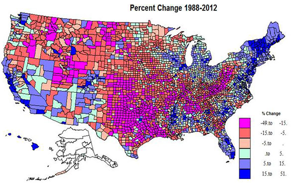
Somewhat over half the territory of the US experienced Republican gains, in red shadings, but on average, the populations of the counties are smaller than for the Democratic counties in the blue shades. The dominant swath of red in the center third of the country from TX and LA north through the Dakotas and MN is impressive, but also prominent is the extension across the border south from MO and southern IL to KY, WV and into western PA, and then the northwestern extension to the mountain west, as far as the Cascade range. The most extreme Republican gains were in the two cores of southern Appalachia and eastern TX and OK into LA, plus UT. Most are non-metropolitan. A few most extreme R gains were in Knott, KY, 50%, Cameron, LA, 45, Mingo and Logan, WV, 44 and 43, and Kent, TX, 43%.
Democratic gains were far more concentrated: in the northeast, in the urban Great Lakes, in much of FL, in the Black Belt of the south, in the metropolitan Left Coast, and in the southern mountain states. The highest gains were in central and suburban-exurban counties in the northeast, the west coast, and Great Lakes, and also in non-metropolitan northern New England. Lower Democratic gains were common beyond the big metropolitan cores or on the edges of the Black Belt in the south. A few of the more extreme Democratic increases were in Clayton, GA, 51%, Rockdale, GA, 33, both suburban Atlanta, Osceola, FL, 31, Prince George, MD, 30, and Hinds, MS (Jackson), 28%.
Kind of change, 1988-2012, Map 2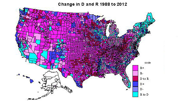
The 1411 counties becoming even more Republican (type 1) certainly dominate the interior Plains from Canada to the Gulf and the interior, mainly non-metropolitan far northwest. There are a few counties (typically university counties) in this heartland with counties still red, but less so in 2012. The dominant areas for Republican decline (type 2) are found in the Great Lakes states, in the non-metropolitan, often exurban edges of Megalopolis (NY, PA, NJ, MD, VA). Other areas of Republican decline include rural areas in the interior west, especially areas with environmental attractions and/or increasing Latino populations, and even in parts of the traditional south, such as MS, FL, SC,NC, and VA.
Most notable are such long term Republican strongholds as Orange, CA, Duval (Jacksonville), FL, and Maricopa, (Phoenix). Counties which switched from Democratic to Republican (type 3) are first and most impressively in Appalachia from western PA, then including most of WV, and into western VA, central TN into northern AL, second in the TX-OK-AR-LA zone, almost totally non-metropolitan.
Areas of Democratic gains, type 4, darkest blue, require a close look at the map, as they are mainly the metropolitan cores, most notably Los Angeles, Cook, King (Seattle), much of the New York SMSA, San Francisco-Oakland, Detroit, and Philadelphia. However there are also many majority-minority counties: in the Black Belt across the south, in a few Hispanic areas along the Rio Grande, and Native American areas across the west. Highest Democratic share gains were in metropolitan CA, FL, in exurban New York, Philadelphia, Washington, DC, and Chicago, northern New England and select amenity areas, popular with metropolitan migrants, even in WY and ID!
Democratic voter share declined (type 5) in some urban cores, like Allegheny (Pittsburgh), but the most prominent areas are in farming and forestry areas in the upper Midwest (IA, WI, MN, often adjacent to counties which switched from D to R), and traditionally D forest industry counties in OR and WA. Especially interesting are the counties switching from Republican to Democratic, type 6, most critical to understanding the connection to social liberalism. The most prominent area is northern New England and NY, and extending through Megalopolis snatching a large number of very populous suburban and EXURBAN counties (MA, CT, NY, NJ, MD, VA, PA).
A second large swath in territory and population is in CA, switching major metropolitan-suburban counties, and also increasingly Hispanic counties to the D column. This switching of suburban and exurban counties was also prevalent in CO, OR, WA, IL, and MI, as well as in parts of the south, e.g., FL and NC. Less visible is the shift of many university counties in most parts of the country. Last and increasingly important is the shift of rural environmentally attractive areas, mostly across the west, but also in the south Atlantic, upper New England and the upper Great Lakes, in part due to retirement of urban professionals. Some of the most important switches were Riverside, San Bernardino, San Diego, Sacramento in CA; Miami and Orlando, FL; Oakland, MI; Suffolk, Bergen and Westchester (all exurban New York); Mecklenburg (Charlotte); and Marion, IN (Indianapolis).
Absolute change in the D and R vote, 1988-2012, Map 3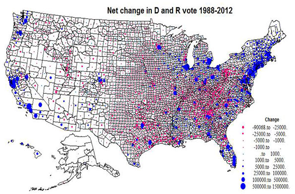
Map 3 plots the absolute size variation in the Democratic versus Republican change, via a simple blue versus red, to assist the reader in properly interpreting Maps 1 and 2. The map highlights the tremendous concentration of Democratic gains in the northeastern Megalopolis, metropolitan California, the big cities of the Great Lakes, and Florida, versus the much more widespread pattern of Republican gains, extensive in area but small in voter magnitude across the Plains, Mountain states, and most notably, Appalachia .
Overall, what emerges is a picture far more subtle than simply cities versus exurbs. The bad news for Republicans is that most of their gains occur in rural areas with little population while the Democrats have consolidated their increases in more populous urban, suburban, and in some places exurban areas. Whether these trends spell the death knell for the GOP in the post-Obama period may turn on how they learn to appeal to the next generation of suburban and exurban voters – many of them Hispanic or Asian – as they enter their 30s, buy houses and start businesses. Economic issues could help here, but an emphasis on social issues, or simple anti-tax dogmatism could spell the GOP’s descent into permanent minority status.
| Table 2: Greatest Changes by State | |||||
| State | 2012% | 1988% | % Change | Code | Net change (000) |
| TX | 42 | 43.7 | -1.7 | 1 | -578 |
| UT | 25.4 | 32.6 | -7.2 | 1 | -268 |
| KY | 36 | 44.7 | -8.7 | 1 | -254 |
| OK | 33.3 | 41.6 | -8.3 | 1 | -253 |
| TN | 39.5 | 41.8 | -2.3 | 1 | -234 |
| WV | 36.3 | 52.4 | -16.1 | 3 | -210 |
| WY | 28.6 | 39.5 | -10.9 | 1 | -62 |
| DE | 59.6 | 43.5 | 16.1 | 4 | 114 |
| VT | 68.2 | 48.3 | 19.9 | 6 | 115 |
| NV | 53.3 | 39.2 | 14.1 | 6 | 141 |
| NH | 52.9 | 37.7 | 15.2 | 6 | 157 |
| ME | 57.8 | 44.3 | 13.5 | 6 | 171 |
| WA | 58.2 | 50.8 | 7.4 | 4 | 435 |
| MA | 61.7 | 54 | 7.7 | 4 | 516 |
| VA | 51.9 | 39.7 | 12.2 | 6 | 598 |
| OH | 51.5 | 43.9 | 7.6 | 6 | 643 |
| MI | 54.8 | 46 | 8.8 | 6 | 739 |
| MD | 62.6 | 48.5 | 14.1 | 6 | 756 |
| IL | 58.6 | 49 | 9.6 | 6 | 979 |
| FL | 50.4 | 38.8 | 11.6 | 6 | 1,036 |
| NJ | 59 | 43.1 | 15.9 | 6 | 1,068 |
| NY | 66.2 | 52.1 | 14.1 | 4 | 1,720 |
| CA | 61.9 | 45.2 | 16.7 | 4 | 3,367 |
Richard Morrill is Professor Emeritus of Geography and Environmental Studies, University of Washington. His research interests include: political geography (voting behavior, redistricting, local governance), population/demography/settlement/migration, urban geography and planning, urban transportation (i.e., old fashioned generalist).


"Foot voting" versus rational ignorance in democracies
There is an interesting book here:
http://www.amazon.com/Democracy-Political-Ignorance-Smaller-Government/d...
One of the reviewers summarises it helpfully:
“…….When people make decisions for themselves, such as what car to buy or what state to live in, they invest far more energy to educate themselves than when they (for example) vote for President. They do so not because they believe buying a car is more important than choosing a President, but because they have far more influence in such instances of "foot voting" as opposed to ballot box voting. In other words, the marginal utility of educating oneself about what choices to make with one's life is infinitely greater than the marginal utility of educating oneself about whom to vote for, and therefore one makes a more educated decision.
From this point, Somin moves on to conclude that a Federal system (in which the central government is relatively weaker than the local government) is a rational response to political ignorance: It allows greater diversity in local environments, and hence frees up individuals to vote with their feet by, for example, moving to a locale whose laws and officials are more congenial. In contrast, a strong central government tends to create more homogeneity, and reduce the power of foot voting. Since foot voting is infinitely much more informed than ballot box voting, the effect of such homogeneity is to amplify the power of the most ill-informed of our decisions (ballot box voting), and to give political ignorance full expression……”
Partisan Daily Kos Analysis and New Geography Quality Control
This is the shoddiest, most partisan analysis that I've ever seen. It is totally dependent upon the years you choose. The Kossacks chose GHWB's victory vs. BHO's second victory which has a D swing of +11.58.
EVERY WINNING R YEAR WHEN COMPARED TO BHO 2012 IS GOING TO SHOW A SIGNIFICANT POSITIVE D SWING. EVERY WINNING R YEAR WHEN COMPARED TO A LOSING D YEAR WILL SHOW A SIGNIFICANT POSITIVE R SWING.
The adult way to do this analysis is to compare winning D years to winning D years and see how things are changing. For example 1992 vs. 2012: R +1.70 hmmm. 1996 vs 2012 (perhaps the most reasonable comparison - a 2nd term D win to 2nd term D win): R +4.65 Oh crap hmm. Or how about comparing BHO 1 vs BHO 2 (R +3.41) against GWB 1 vs GWB 2 (R +1.45)crap, crap, crap, hmm, hmm, hmm.
Which is why most observers think that BHO and the Dems are going to get crushed this year. Which would be inexplicable if you believed the Kossack's Kossified analysis. As I always say: believe a Kossack and you'll get Kossed on your Ossack.
I expect better QC out of New Geography.
The Professor's shoddy work has happened before
http://www.newgeography.com/content/002788-megalopolis-and-its-rivals
Bill Reeves,
Funny that you picked up on the shoddy analysis (sadly I missed it) because Professor Morrill has done this before. See the link above to an earlier article he posted on New Geography which has tables of data that are obviously wrong, just bad math. To save you some trouble look at Philadelphia's growth. I commented on it and asked him to revise his data for the article with no response and no data revisions. Now all the comments to that article have been taken off New Geography for some reason.
I don't know if New Geography has any QC on any of this stuff. Worse yet, when someone such as Professor Morrill has an idealogical agenda, which is fine as we all do to varying degrees, he seeks to disguise it in data and graphics to make it seem fact-based, which is of course deceptive as well as shoddy.
Some data is just too good to verify, I guess!
Good political analysis, but what are impacts to policy?
This is an interesting assessment, and helps show underlying trends that are not apparent at first blush. But of course it a political analysis, and does not venture into the realm of policy implications. What happens if the Democratic party does dominate and become a political party with minimal fear of electoral consequences? To a certain degree, we are presently experiencing in both domestic policy (ACA policy and implementation disasters, budget deficits and increasing debt burden) and foreign policy (Egypt, Syria, Russia, Europe) what happens when the left actually gets what they want policy wise.
Great news for democrats, liberals and the left of course, but what does this all mean for the country? Based on the data and analysis presented here, I think it means that we will have a federal government that continues to move leftward in terms of policy and ambition, yet does not have the money to fund the same. That can't end well. Expect an escalation of state rights issues with state attorney generals aggressively fighting the federal government. The states might be the only brake that could slow down the expected policy overreach created by a Federal government with one-party rule.
All politics is local
I thought this was a great exposition of the transitions which always have, will and continue to occur.
It does beg the question that there are only two ways to vote: Republican or Democrat. Nearly a third of all registered voters claim no party affiliation. A third of all potential voters are not registered to vote at all. Not voting and not being registered are also forms of voting. Non-voters do count. They bleed in from the edges, becoming active voters as they go from being enervated to energized by a prevailing issue or candidate and vice versa.
At the local level, party candidates vary from one state to the next. Republican candidates in Texas are nothing like Republican candidates in California. In Texas they are more apt to be pro-immigration and pro-individual rights. In CA they are more apt to be nativist and statist.
Nationally, my takeaway from the maps is that Democrats have mostly increased their strength where they were already strong but have not made gains where they are weak. This is not a strategy for growth in the legislative branch. If the Congressional delegation from metro NYC or LA or Philly is already solidly democrat, then it doesn't behoove the Democrat party to have more Democrat voters in those metros. They need more Democrats in the marginally Democrat or marginally Republican districts in order to pick up more seats in the house.
Depressing
For a Republican, Mr. Morrill's article is depressing. Fortunately it may not be the whole story. Mr. Morrill locates the divide between the Parties on social issues, and there is no question that the trend is Democratic. But many of us are Republicans because we believe that (echoing Larry Kudlow) free market capitalism is the best and only way to prosperity.
So it seems to me that people like Chris Christie and Andrew Cuomo muddy the waters. Christie is a free market guy, who is also "liberal" on many social issues. Cuomo is an ultra-liberal on social issues, but in practice is moving to a free-market policy. These two seem to converge in the free-market-friendly middle, and so I do see some hope on the horizon.
Bridgegate notwithstanding, I still think Chris Christie is a pretty amazing politician. (I also think he'd be able to knock Putin down a notch without getting us into a war.)