NewGeography.com blogs

Urban Containment: Land Price Up 5 Times Income & Smaller

The shocking extent to which urban containment policy (urban consolidation policy) is associated with higher land (and house) prices is illustrated by a recent press release from RP Data in Australia. The analysis examined the vacant building lot prices for the period of 1993 to 2013.
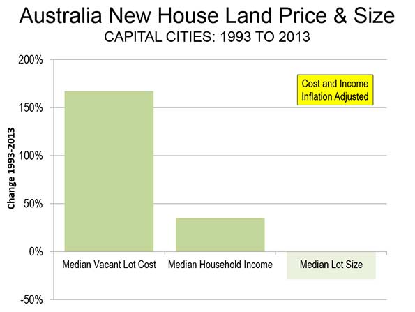
During the period, the median price of a vacant lot rose 168 percent after adjustment for inflation. This is nearly 5 times the increase in the median household incomes of the seven largest capital cities (Sydney, Melbourne, Brisbane, Perth, Adelaide, Canberra and Sydney).
But it gets worse. The median lot size was reduced nearly 30 percent. This should put paid to the myth that urban containment reduces lot prices as it reduces their sizes (Figure). The same dynamic has been indicated in the United States.

Australia has been plagued by huge house cost increases relative to incomes in association with urban containment policy. Before the adoption of urban containment policy, it was typical for house prices to average three times or less than that of household income. Now, Sydney has the highest median multiple (median house price divided by median household income) of any major metropolitan area in the New World, with the exceptions of Vancouver and San Francisco. Melbourne, the second largest metropolitan area in Australia, has a median multiple of 8.4, making it fifth most costly in the New World, behind San Jose. All of Australia's major metropolitan areas "severely unaffordable," including slow-growing Adelaide (6.3), as well as most smaller areas.
For a complete listing of median multiples by major metropolitan area, see the 10th Annual Demographia International Housing Affordability Survey.
Additional information on the RP Data research is available at Australian Property Through Foreign Eyes

Texas & Oklahoma Dominate Metropolitan Economic Growth

Texas metropolitan areas continue to dominate economic growth, according to the latest Metro Monitor, produced by the Brookings Institution. The four top metropolitan areas in overall economic growth through the recession and "recovery" (our parentheses) have been:

1. Austin

2. Houston

3. Dallas-Fort Worth

4. San Antonio

Oklahoma City took the 5th position. Oklahoma City, located 200 miles north of Dallas-Fort Worth may be experiencing some "overspill" economic growth from nearby Texas.

Watch Chicago’s Middle Class Vanish Before Your Very Eyes

Note: I owe both the concept for this measurement of income segregation and much of the actual data – all of it, except for 2012 – to Sean Reardon andKendra Bischoff, who wrote a series of wonderful papers on the subject and then were kind enough to send me a spreadsheet of their data from Chicago a while ago. The maps, however, are mine, as is all the data from 2012, and any mistakes in them or in the interpretation of the data is entirely my responsibility.

I think one reason I’ve felt less than compelled by Chicagoland, CNN’s reasonably well-made documentary series, is that its tale-of-two-cities narrative is so worn, so often repeated, that it’s become a little dull. Not the actual fact of inequality – which only seems to cut deeper over time – but its retelling.

In fact, I think the point has long passed at which simply repeating the story of Chicago’s stratification is equivalent to fighting it. For a lot of people, in my experience, it’s the opposite: an opportunity for distancing, for washing of hands. It’s a ritual in which we tell each other that this is the way it’s always been - The Gold Coast and the Slum was written about already well-entrenched institutions, after all, over three-quarters of a century ago – that these facts somehow seep out of the ground here, as much a part of the city as the lake, and that as a result there’s really nothing we can do about it.

But this obscures much more than it clarifies. Inequality has always been a part of Chicago – as it has always been a part of the United States, and a part of humanity – but the forms it has taken, and the severity of those many forms, have changed in truly dramatic ways. Take, for example, today’s monolithic segregation of African Americans: at the turn of the last century, black Chicagoans were less segregated than Italians, and not because Italians were then hyper-segregated.

Moreover, decisions made by people in the city have played, and continue to play, a huge role in determining what those changes look like. Had Elizabeth Wood received any serious support from white residents or their elected representatives – instead of meeting Klan-like violent resistance – the history of racial integration, economic integration, and public housing in this city would be very, very different. This isn’t to say that national and global factors aren’t important, since they obviously are. But neither do we lack responsibility.

Anyway, this is all by way of introducing the following maps: their goal is not merely to depress you (you’re welcome!), but to suggest just how dramatically the reality of Chicago’s “two cities” has changed over the last few generations, how non-eternal its present state is, and that a happier alternate reality isn’t just possible, but actually existed relatively recently.

I feel relatively comfortable telling the story of how Chicago came to be so segregated by race; I’m much humbler about my ability to explain this, except inasmuch as the ever-widening ghetto of the affluent could not exist without, yes, radically exclusionary housing laws, and I will take that up separately in another post. In the meanwhile, I’ll take a page from Ta-Nehisi Coates and ask you all, if you have some background in this, to talk to me like I’m stupid: what does the literature say about growing economic segregation? Who and what should I be reading?

One last piece: the obvious and immediate reaction to these maps is to see them as a direct consequence of rising income inequality. There is some truth to that, but the researchers from which much of this data came have already discovered that income segregation has actually risen faster than inequality. So that’s not the end of the story.

Anyway, here you go: the disappearance of Chicago’s middle-class and mixed-income neighborhoods since 1970, measured by each Census tract’s median family income as a percentage of the median family income for the Chicago metropolitan region as a whole.

Seg70aSeg80a


Seg90aSeg00aSeg07aSeg12a


IncSegGIF


This piece first appeared at Daniel's blog City Notes.

Growing Traffic Threatens Sydney

In the "letter of the week" in The North Shore Times, Save Our Suburbs President Tony Recsei decries the rising traffic congestion that is occurring in Sydney from the densification policies. Urban planners had misled residents into believing that higher population densities would reduce traffic congestion as more people shifted to mass transit. Recsei notes that "While in higher densities, a slightly higher proportion of people use public transport, this is completely overwhelmed by the greater number now in the area who still have to use their cars for all sorts of reasons." With an understandable pride typical of Sydneysiders, Recsei asks "Why should policies be allowed to transform beautiful Sydney into just another overcrowded city in the world?"

Why indeed. There are two overwhelming outcomes that are shared by cities that have climbed on the urban containment bandwagon: (1) destruction of housing affordability and (2) severely intensified traffic congestion. Sydney suffers from a particularly acute strain of the disease. The land rationing of urban containment policy has house affordability to a severely unaffordable level. Sydney's traffic congestion has also become among the worst in the world. Of course things could be worse. Vancouver, with an urban planning regime to which some Sydney leaders and planners aspire, is even worse in both categories.

Note: Tony Recsei is also a newgeography.com author (an example is Predictable Political Punditry Down Under).

Subjects:

High Frequency Trading Is Not Fast Enough

A new book by the original yellow journalist of Wall Street, Michael Lewis, initiated global coverage about the flaws of American capitalism. The culprit in Lewis’ new book is High Frequency Trading or “HFT.” There is no doubt that US capital markets are imperfect. New York Times DealBook writer Andrew Sorkin lays the blame at the feet of the stock exchanges of which there are so few remaining that the Federal Trade Commission could label them a monopoly.

Even defenders of HFT, like Tim Worstall at Forbes, have to admit that it has risks and problems. It pushes volatility when markets are under stress; programming errors and misuse of software packages have been known to bankrupt the trading companies. The argument in favor of HFT fails when its proponents bring in “free market” economic theories – primarily because the stock market is not “free” in any economic sense. There are a limited number of big players – 5 banks in the US control 85-95% of trading depending on which market you measure. That is still more like an oligopoly than a competitive market. There are barriers to entry set up by the SEC, the FRB, and state banking and securities commissions. Finally, the transaction costs are enormous. Anyone active in the market knows about trading commissions and management fees. DTCC took in over $1 billion in revenue in 2012 (latest available) and still lost over $25 million. You get the picture – there is no free market argument.

The programs used for high frequency trading are bastardizations of heat transfer dynamic equations. Those underlying equations are based on assumptions. First, they only hold true when time goes to infinity – but trades are executed in finite time. Next, they assume linear behavior – but markets are more like waves than straight lines. Finally, those equations require simultaneity of action. No matter how close the servers are located to the exchange, the computers are not fast enough to read the prices in one market and execute a trade in the next without some lag which violates the assumption. Richard Bookstaber called it A Demon of Our Own Design (Wiley, 2007). The university whiz-kids who built the programs knew they were violating the assumptions but they were under pressure from their Wall Street bosses so they decided to take the money and run the programs – warts and all.

Trading programs treat capital markets as if one security is indistinguishable from the next – and that defeats the purpose of having capital markets at all. The reason we have these markets is so that entrepreneurs can access capital to fund new opportunities. Instead of letting computer programs decide which stock has the best opportunity for a price change, investors should be deciding which business has the best opportunity for success. The funded opportunities create jobs that pay income to households who turn around and put some of those earnings into savings. Lots of little savings accumulate into a pool of loanable funds that become available to other businesses to fund other opportunities to create more jobs, etc., etc. The goal of high frequency trading is to make money – at any cost. And the cost is the ability of capital markets to serve their primary purpose.

Subjects: