On this episode of Feudal Future, hosts Joel Kotkin and Marshall Toplansky are joined by Michael Lind. Michael Lind is a professor of practice at the LBJ School. A graduate of the Plan II Liberal Arts Honors Program and the Law School at The University of Texas with a master's degree in international relations from Yale, Lind has previously taught at Harvard and Johns Hopkins. He has been assistant to the director of the Center for the Study of Foreign Affairs at the U.S. State Department and has been an editor or staff writer for The New Yorker, Harper's, The New Republic and The National Interest. A co-founder of New America, along with Walter Mead, Sherle Schwenninger and Ted Halstead, Lind co-founded New America's American Strategy program, and served as policy director of its economic growth program. He is a former member of the boards of Fairvote and Economists for Peace and Security. (LBJ Texas)
[6:40] Joel asks if national polarization will get worse in the upcoming weeks and how it will affect social platforms as well as the lives of ordinary people.
[9:00] Michael goes into detail how economic control has changed and shifted from the 20th century to today & how the ideas of demonetization plays out in the real economy.
[13:15] Joel and Michael discuss the power of the managerial elite and the historic function of companies and the organization and education of the elite.
[33:45] Joel asks Michael where he sees this clash ending up in the short term and long term.
You are invited to join Chapman University’s Vice President of Research Thomas Piechota who will host the next Ask the Experts Town Hall on Friday, January 22, from 11 – 12:30 P.M. (PST). The installment this month will be moderated by Dean Thomas Turk of the Argyros School of Business and Economics who will be joined by Joel Kotkin, Presidential Fellow in Urban Futures at Chapman University and Marshall Toplansky, Clinical Assistant Professor of Management Science at Chapman University. Together, Chapman faculty will be joined by local community experts: Lucy Dunn, President and CEO, Orange County Business Council; Tracy Hernandez, CEO, Los Angeles County Business Federation; Jim Wunderman, President and CEO, Bay Area Council; and Rob Lapsley, President, California Business Roundtable.
Alongside Chapman faculty, our distinguished guests will discuss how best California’s business climate can be revitalized to avoid the loss of companies, higher unemployment rates, and poverty. They will also explore how businesses can be key to correcting these problems including encouraging government to listen more to the challenges being faced.
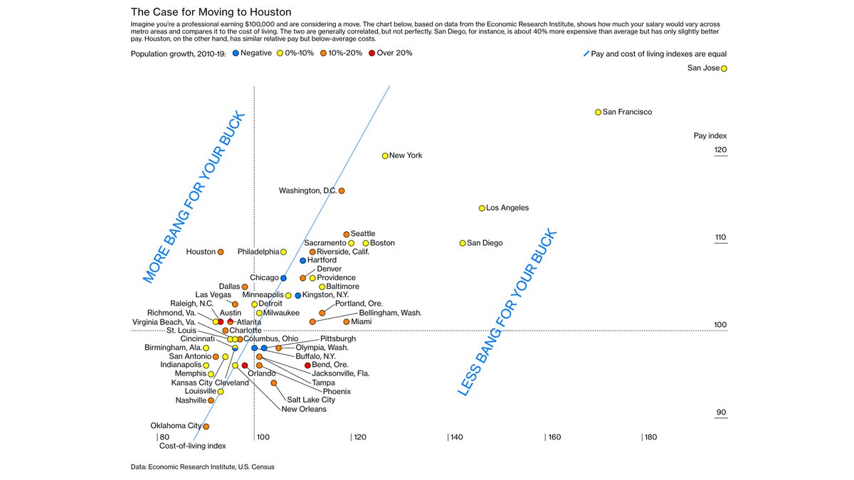
Happy new year everyone. Hope you enjoyed the holidays and the recent amazing weather (while staying safe). A lot of you probably had out-of-town family and/or friends visiting. Next time nonlocal friends or family say Houston is too hot, floods too often, or gets too many hurricanes, here's my recommended reaction: politely agree with them that Houston is not a city for the soft or irresilient - they should probably choose somewhere like California. Texas welcomes the tough.
"Consider Phyllis Njoroge, who grew up in Massachusetts. After graduating from Tufts University in 2019 with a degree in cognitive and brain science, she started making spreadsheets of places in the U.S. that had a warm climate, were diverse, and had a reasonable cost of living.Houston won out, and she moved there in March"
Having more remote workers means “wages in Texas are going up,” he says. So are housing prices. “You can’t have a $2 million, 2,000-square-foot house in San Francisco and a $200,000 house in Dallas that are basically the same for very long when there are airplanes and internet connections and Zoom.”
"I simply say, “no, please don’t be sorry. I love living in Houston. It’s a great place to live and I have a great life there. It’s actually not that place that you might imagine it to be. In fact, it’s one of the country’s most ethnically diverse and progressive cities. My children go to school with kids from all over the world. And the wine and food scene there is great, too.”
Tory Gattis is a Founding Senior Fellow with the Houston-based Urban Reform Institute – A Center for Opportunity Urbanism, and writes the Houston Strategies blog.
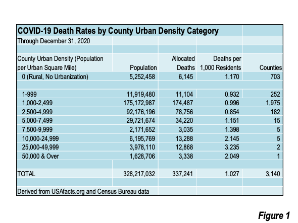
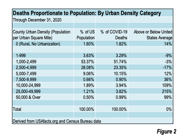
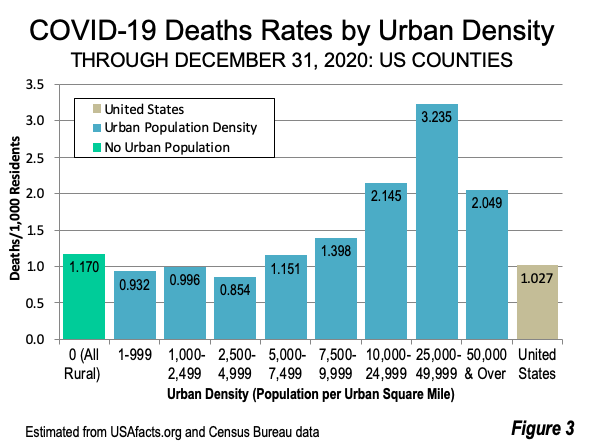
The latest death rates from COVID-19 are displayed by county urban density in Figure 1. Death rates remain at or below the national death rate in counties with urban densities of 5,000 per square mile or below (Figure 2). These counties have low to medium urban population densities characteristic of suburban and exurban areas and account for 85% of the nation’s population (279 million out of a total population of 328 million). All categories of counties with urban densities exceeding 5,000 per square mile have more than their population proportionate share of COVID-19 deaths. Counties without urbanization (fully rural counties) also have higher proportional death rates (Figure 3).
Higher COVID-19 death rates are associated with higher urban densities because of the overcrowding that often occurs in such environments. This leads to higher exposure densities, because the intensity and duration of risky contacts is likely to be greater.
Similar relationships are evident elsewhere, such as in the United Kingdom and Japan.
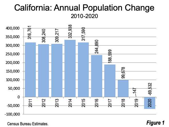
The Census Bureau has just published its 2020 state population estimates, which indicate that the state that has led growth in the United States for the last 170 years lost 70,000 residents last year. For the first five years of the decade, California had gained 300,000 residents, with a total gain over the period of 1.6 million. Since 2015, California’s population gain plummeted, reaching virtually zero in 2019 and the loss in 2020 (Figure 1). At the same time, the Census Bureau restated California’s 2018 to 2019 population change, which had been shown as a gain of 51,000 last year to a gain of only 147.
This may be California’s first annual population loss since statehood (1850). According to Census Bureau data reported by macrotrends.net, California had gained population in every year since 1900. Earlier annual data was not found.
National Trends
Overall, the national population growth rate has been falling throughout the decade. In 2011, the nation added 0.73% to its population, and fell to 0.35% in 2020. In 2019, the gain was 0.46%. The smaller gain in 2020 is likely attributable to the generally downward trend and smaller international migration flows in the COVID environment.
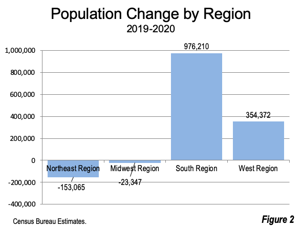
Over the past year, the South has accounted for 85% of the nation’s growth, adding nearly 1,000,000 residents. The West had 30% of the growth (350,000). The Midwest experienced a modest loss (20,000), while the Northeast lost more than 150,000 residents (Figure 2).
Fastest Gainers
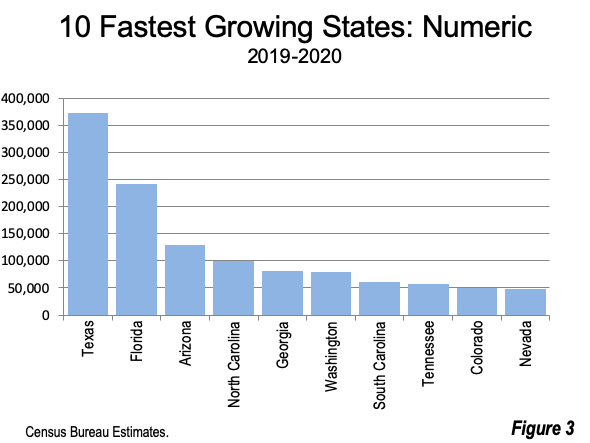
Texas added the largest number of residents in the last year, at 374,000. Florida was second, at 241,000 and Arizona was third at 130,000 (Figure 3). Among the top ten states, six were from the South and the other four from the Intermountain West. The five Pacific Coast states added about 25,000 residents, with an 80,000 gain in Washington and 25,000 in Oregon, which was nearly offset by losses in California, Hawaii and Alaska.
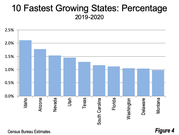
The largest percentage gain was in Idaho, which added 2.11% between 2019 and 2020. Arizona, Nevada and Utah all gained more than 1.40%. Texas ranked 5th, while Florida placed 7th (Figure 4).
Fastest Losers
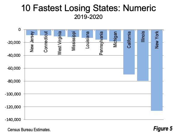
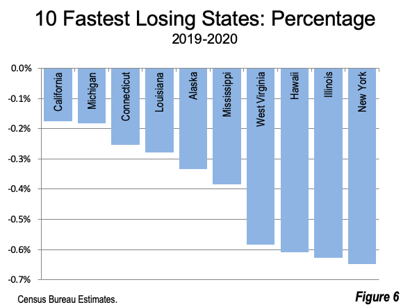
By far the largest losses were in New York (minus 126,000), Illinois (minus 79,000) and California (minus 70,000). Sixteen states had population losses (Figure 5). New York had the largest percentage loss from 2019 to 2020, at 0.65%. The largest percentage losses were in Illinois, Hawaii and West Virginia, all had losses exceeding 0.55%. California had the 10th largest percentage loss, at 0.18% (Figure 6).
As was the case in 2010, this year’s estimates did not include migration data, unlike the earlier years in the decade.
The 2020 estimates will be superseded by the 2020 Census counts, which will be released in the near future.
The table below shows the 2010 Census as well as the 2019 and 2020 population estimates.
Infinite Suburbia is the culmination of the MIT Norman B. Leventhal Center for Advanced Urbanism's yearlong study of the future of suburban development. Find out more.
Books
Authored by Aaron Renn, The Urban State of Mind: Meditations on the City is the first Urbanophile e-book, featuring provocative essays on the key issues facing our cities, including innovation, talent attraction and brain drain, global soft power, sustainability, economic development, and localism.