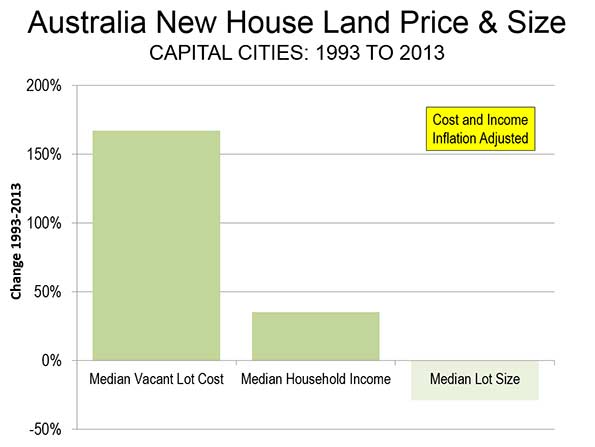
NewGeography.com blogs

Betting against the USA -- told ya' so!

More than once in this space, I’ve said that derivative financial products set up a perverse incentive where investors have more to gain from the failure of companies and homeowners than their success. If you haven’t seen it yet, take a look at the longer version of my description of the causes and consequences of the current crisis to understand how failed financial innovations, like credit default swaps, contributed to the meltdown of 2008. I wrote that article back in November.

Once again, only Bloomberg.com is out front on this story. More hedge funds are catching onto the casino-like qualities of betting against America’s economic success. Reporters Salas, Harrington and Paulden could have quoted my NewGeography writings directly: “companies [have] more credit-default swaps outstanding than the bonds the contracts protected…” and, referring to Clear Channel Communications, “some of its creditors stand to profit from its failure.”

Told ya’ so!

Moving Away from the City: The Reality Missed by the Fairfax County Survey

Political “spin” descended to a new low today with the publication of survey results purporting to suggest that suburban residents and workers are pining for city life. The Washington Business Journal dutifully reported that Today’s suburban workers and residents miss the amenities of cities. The survey sponsor, the Fairfax County (Virginia) Economic Development Authority noted that “almost half of workers who work in the suburbs, say they want more public transportation, more housing options, greater access to useable green space or a better variety of job opportunities – typical features of cities.”

All of this may sound impressive until you realize that no one urban “amenity” was mentioned by more than 25 percent of respondents. That means, for example, that 77 percent of responding suburban residents did not consider “access to convenient public transportation” important enough to mention, while 23 percent did.

According to the Economic Development Authority, the survey indicates that 52 percent of residents “say they would move to a community that offered more of these” urban amenities.

The survey got the moving part right, but missed by a mile on where they are moving. From 2000 to 2008, more than 100,000 domestic migrants left Fairfax County, 11 percent of its 2000 population. But they didn’t move to the city (Washington) or to more urban Alexandria or Arlington, because all of these lost domestic migrants as well. Indeed, the only counties in the Washington, DC area that gained domestic migrants are further from the city than Fairfax County.

Falling Off Bicycles in Portland

It has become customary for the fawning print media to lazily repeat whatever information is provided them by the urbanist lobby. The result is all manner of puff pieces that report as reality what is nothing more than hopes, or even delusions.

The latest puff piece is about Portland and is in today’s Wall Street Journal. The article indicates that 8 percent of Portlanders commute to work by bicycle, based upon data from a bicycle advocacy group. That number is more than five times the figure reported by the United States Bureau of the Census, (which is not a bicycle advocacy group). In 2007 (latest data available), 1.5 percent of Portland metropolitan area workers commuted by bicycle according to the Bureau of the Census.

It is, of course, possible that there is confusion about the definition of Portland. Domestic migration is the principal subject and it is clear from the data cited that the article is citing metropolitan area data, rather than municipal (city of Portland) data.

However, even if we allow that the editors might have erroneously substituted municipal for metropolitan data and that the advocacy group bicycle market share of 8 percent applies to the city of Portland; it would still be off by at least 100 percent. The Bureau of the Census data indicates that 3.9 of workers rode bicycles to work in 2007 in the city of Portland.

Of course, it is always possible that three quarters of metropolitan Portland’s bicycle commuters have fallen off their bikes or that, if the editors were confused as to the difference between metropolitan and municipal, that half have fallen off.

Who's Watching AIG?

The House Committee on Oversight and Government Reform held a hearing Wednesday – “AIG: Where is the Taxpayer Money Going?” Questions are being raised about whether the bailout better serves the interests of AIG’s customers and trading partners or the interests of U.S. taxpayers.

The highlight of the Committee’s questioning of Chairman and CEO Edward Liddy came when Chairman Town (D-NY) asked the blunt question: "Why would you give retention bonuses to AIG employees who failed? Plus, the economy is so messed up, where would they go?" On the minds of many committee members were the facts that AIG got $70 billion in TARP money, $50 billion through the Federal Reserve Bank of New York’s Maiden Lane LLC and another $60 billion directly from the Federal Reserve Bank of New York (the FRB-NY’s AIG Credit Facility). When compared to the fact that AIG is currently worth just $5 billion, the repeated question became: “How will taxpayers be repaid?” Mr. Liddy pointed to the value of some subsidiaries and other assets that can be sold off, but he had to admit that the timing and possibility of AIG repaying taxpayers really “depends on the economy and the capital markets.”

The Trustees of the AIG Credit Facility Trust testified in the second panel. The Trustees were named by the Federal Reserve Bank of New York, under then-President Timothy Geithner, in September 2008. The panel included one non-Trustee – Professor J.W. Verret of George Mason University School of Law. Professor Verret expressed concern over the form of the AIG trust agreement: “I am concerned by the AIG trust because of the precedent it sets. Secretary Geithner has announced his intention to create another trust to manage the Treasury's investment in Citigroup as well as other TARP participants. If the AIG trust, crafted during the Secretary’s tenure as President of the New York Fed, is used as a model for these new entities, the risk to taxpayers will be multiplied many times over. “ Professor Verret raised three specific problems with the agreement: 1) the agreement specifically expects the Trustees to act in the best interest of the U.S. Treasury, not the U.S. taxpayers; 2) the Trustees cannot be held liable for their actions; and 3) the Trustees can invest on information they gain in the course of their duties.

At the end of the hearing, the final question went to Representative Norton (D-D.C.). Too many of the AIG Trustees also serve or have served as directors and officers to other TARP recipients. Ms. Norton noted that all of the witnesses are connected to Wall Street and all know each other. Evidently, one of the Trustees, Jill Considine, is involved with a Bermuda company that provides services to hedge funds. Ms. Considine was uncomfortable naming the hedge funds that benefit from her advice because the Bermuda company is private – it is also foreign. Considine took Norton aside when hearing ended, engaging her in an animated conversation – off the record, of course.

It seems evident that some of the Trustees didn’t recognize the risks AIG was taking when they were in a position to have close contact with not only AIG but their counterparties – those final recipients of the bailout money. If the Trustees missed the AIG risk then, when they were regulators in the self-regulatory industry and serving on Boards at the Federal Reserve Banks, then what can we expect from them now?

Mapping Urban Income Dispersion

Here's some cool maps from radicalcartography.net looking at income dispersion in the country's 25 largest metropolitan areas by population. From the page:

These maps show the distribution of income (per capita) around the 25 largest metropolitan areas in the US (all those with population greater than 2,000,000). The goal was to test the "donut" hypothesis — the idea that a city will create concentric rings of wealth and poverty, with the rich both in the suburbs and in the "revitalized" downtown, and the poor stuck in between.

This does seem to have some validity in older cities like Boston, New York, Philadelphia, or Chicago, but in newer cities it is not the case. Instead of donuts, one finds "wedges" of wealth occupying a continuous pie-slice from the center to the periphery.

Just from visual inspection, it also seems that poverty donuts all tend to have about a five-mile radius, regardless of the size of the city. Perhaps this is the practical limit for commuting without a car?

All maps are at the same scale, and all use the same color values for income.

Entrepreneurship on the Rise?

The Kauffman Foundation, the "world's largest foundation devoted to entrepreneurship," recently released the 2008 edition of their "Index of Entrepreneurial Activity."

The index, which measures the rate of business creation at the individual owner level, reports that despite the recession, "new business formation increased in 2008." This growth was not present in all sections of the nation, however. According to the Kauffman survey, the Midwest saw a slight decline in business start-ups in 2008. Unfortunately, while entrepreneurship was apparently on the rise, there was a drop in the formation of the "highest-income-potential types of businesses".

On a more local level, the states of Georgia, New Mexico, and Montana led the pack, each showing over 500 per 100,000 adults creating businesses each month. Bringing up the rear were West Virginia, Iowa, and Ohio, with the last showing a rate of creation of 190 per 100,000 adults per month.

In general, 2008 rates of entrepreneurial activity as reported by the Kauffman survey are higher along the west coast and in the Rocky Mountain states, and lower in the midwest and mid-atlantic regions. These findings would seem to have some overlap with the patterns reported by Newgeography's "2009 Best Cities for Job Growth" rankings, which, in general, showed stronger conditions in the west (outside of California) and pockets of weakness in the midwest and mid-atlantic regions.

Can Wind Power be a Reliable Long Term Source of British Power?

The wind of change is blowing, but for once, that change might be affecting the wind.

Wind, often championed as a viable alternative-energy source in the United Kingdom, might not be as energy efficient as it was once thought to be. Independent reports of the wind-energy efforts in the UK “have consistently revealed an industry plagued by high construction and maintenance costs, highly volatile reliability and a voracious appetite for taxpayer subsidies.”

The cost for the energy alternative is sizable. Over the course of fiscal year 2007-2008, UK electricity customers paid a total of over $1 billion to the owners of wind turbines. That number is only expected to rise by 2020 to $6 billion a year as the government builds a national infrastructure of 25 gigawatts of wind capacity.

Currently, wind produces only 1.3 percent of the U.K.’s energy needs while a 2008 report from Cambridge Energy Research Associates warns that over-reliance on offshore wind farms would only further create supply problems and drive up investor costs.

Additionally, the average load factor for wind turbines in the UK was about 27.4 percent, meaning a typical 2-megawatt turbine only produced 0.54 megawatt of power on average. Dismissing the fact that low wind days would produce even less, all figures seem to point to poor return on investment.

Some have suggested the building of cheaper wind farms, but ultimately higher maintenance costs and spare gas turbines to replace broken ones would cancel out any perceived benefits, as gas for the turbines would only add to carbon dioxide emissions.

At this point, the outlook for wind to be a major source of UK electricity seems grim. Much like the wind itself, the problem just might be uncontrollable.

Unintended Consequences

Consider the tax credits for alternative fuels such as ethanol and biomass that were rolled into the 2005 Transportation Law to encourage energy independence. At the same time, re-consider the law of unintended consequences, enshrined in Adam Smith’s notion that the unregulated behavior of capitalists gives rise to an invisible hand “to promote an end which was no part of their intention.”

The tax law included a fifty-cent-a-gallon credit for the use of fuel mixtures that combined "alternative fuel" with a "taxable fuel" such as diesel or gasoline.

This ill-conceived legislation is now producing an $8 billion windfall for the nation’s paper companies that, in order to qualify for the subsides, began adding diesel fuel to a paper-making process that required none.

Paper has been produced in basically the same way since the 1930s, when scientists learned how to leach cellulose from wood chemically. The chemical reaction produces a sludge containing lignin, which is so rich in carbon that the paper makers use it as fuel in the process that transforms the pulp into paper. It's wonderfully efficient, and allows the nation’s paper companies to operate largely without foreign oil. But not, however, with subsides. That’s why the companies added diesel fuel to the lignin, effectively replacing a green technology with one that is dependent on foreign oil.

The road to hell, as Adam Smith’s contemporary Samuel Johnson ironically observed, is paved with good intentions. But one can arrive there just as easily with bad intentions and bad faith.

Subjects:

Visualizing our 2009 Best Cities for Job Growth Rankings

Here's some great maps of our annual Best Cities Rankings created by Robert Morton at Tableau Software. Robert used their software tool to plot a color coded point for each city in the rankings by size group, and immediate geographic patterns emerge:

Check out Robert's post for a map of the biggest gainers and losers from last year, and a rank change by size scatter plot of each place.

U-Haul Prices as Migration Indicator

Austin fared very well on this year's Best Cities Rankings, and here's another interesting indicator of the difference in migration between Austin and San Francisco:

"When comparing California with Texas, U-Haul says it all. To rent a 26-foot truck oneway from San Francisco to Austin, the charge is $3,236, and yet the one-way charge for that same truck from Austin to San Francisco is just $399. Clearly what is happening is that far more people want to move from San Francisco to Austin than vice versa, so U-Haul has to pay its own employees to drive the empty trucks back from Texas."

This anecdote comes from a report comparing business environments in Texas to California.

Here's a table of the latest domestic migration numbers from US Census for all metropolitan areas of more than 1.5 million total population (rate numbers are per 1,000 population):


NAME
Population, 2008
Net Domesitc Migration Rate, 2008
Ave. Net Domesic Mig Rate, 2001-2008
New York-Northern New Jersey-Long Island, NY-NJ-PA 19,006,798 -7.6 -12.0
Los Angeles-Long Beach-Santa Ana, CA 12,872,808 -9.0 -12.2
Chicago-Naperville-Joliet, IL-IN-WI 9,569,624 -4.4 -6.8
Dallas-Fort Worth-Arlington, TX 6,300,006 7.0 5.7
Philadelphia-Camden-Wilmington, PA-NJ-DE-MD 5,838,471 -3.8 -2.3
Houston-Sugar Land-Baytown, TX 5,728,143 6.6 4.5
Miami-Fort Lauderdale-Pompano Beach, FL 5,414,772 -8.7 -5.1
Atlanta-Sandy Springs-Marietta, GA 5,376,285 8.2 10.2
Washington-Arlington-Alexandria, DC-VA-MD-WV 5,358,130 -3.4 -2.9
Boston-Cambridge-Quincy, MA-NH 4,522,858 -1.8 -7.1
Detroit-Warren-Livonia, MI 4,425,110 -13.9 -9.1
Phoenix-Mesa-Scottsdale, AZ 4,281,899 12.3 17.9
San Francisco-Oakland-Fremont, CA 4,274,531 1.3 -10.5
Riverside-San Bernardino-Ontario, CA 4,115,871 -1.9 16.1
Seattle-Tacoma-Bellevue, WA 3,344,813 3.6 0.9
Minneapolis-St. Paul-Bloomington, MN-WI 3,229,878 -1.1 -1.0
San Diego-Carlsbad-San Marcos, CA 3,001,072 0.1 -4.8
St. Louis, MO-IL 2,816,710 -2.0 -1.8
Tampa-St. Petersburg-Clearwater, FL 2,733,761 2.4 12.9
Baltimore-Towson, MD 2,667,117 -4.6 -1.6
Denver-Aurora, CO /1 2,506,626 7.3 1.8
Pittsburgh, PA 2,351,192 -1.0 -2.9
Portland-Vancouver-Beaverton, OR-WA 2,207,462 8.3 6.2
Cincinnati-Middletown, OH-KY-IN 2,155,137 -1.7 -1.2
Sacramento--Arden-Arcade--Roseville, CA 2,109,832 2.2 8.7
Cleveland-Elyria-Mentor, OH 2,088,291 -7.1 -7.5
Orlando-Kissimmee, FL 2,054,574 1.6 15.9
San Antonio, TX 2,031,445 11.5 10.4
Kansas City, MO-KS 2,002,047 0.7 1.5
Las Vegas-Paradise, NV 1,865,746 7.9 23.7
San Jose-Sunnyvale-Santa Clara, CA 1,819,198 -1.5 -16.4
Columbus, OH 1,773,120 1.4 1.8
Indianapolis-Carmel, IN 1,715,459 4.0 4.8
Charlotte-Gastonia-Concord, NC-SC 1,701,799 20.9 18.2
Virginia Beach-Norfolk-Newport News, VA-NC 1,658,292 -9.4 -0.6
Austin-Round Rock, TX 1,652,602 22.0 17.2
Providence-New Bedford-Fall River, RI-MA 1,596,611 -6.6 -3.7
Nashville-Davidson--Murfreesboro--Franklin, TN 1,550,733 10.9 9.6
Milwaukee-Waukesha-West Allis, WI 1,549,308 -4.2 -5.9